
More sea shells please: assessing early signs of liquidity withdrawal
14-06-2018
The impact of liquidity withdrawal is a key theme for us from a macro perspective in 2018. This week we want to look at three charts which are seemingly unrelated, but we think each represent early signs of the impact of US monetary tightening.
Last year we suggested that the Federal Reserve was directly impacting commercial bank deposit growth through their Quantitative Easing program. That’s unusual; in the pre-QE days, credit creation (that is, the process of taking deposits and making loans by commercial banks) was the primary mechanism of deposit growth. When banks take deposits and make loans, total system deposits increase. Then, QE influenced deposit growth upward, because the private sector sold assets to the central bank, and received bank deposits in return. In that original piece in 2017, we suggested that if credit growth did not accelerate at the same time as Quantitative Tightening put downward pressure on deposit growth, deposit growth would slow, and perhaps even turn negative once QT reaches its maximum speed. Sure enough, credit growth in the US has not accelerated meaningfully during QT, and as a result, deposit growth has dropped. The chart below is an update of our original from 2017, and the run-rate of deposit growth during the QT period-to-date is markedly slower (red line) than when the Fed’s balance sheet was static, and also much slower than during QE periods.
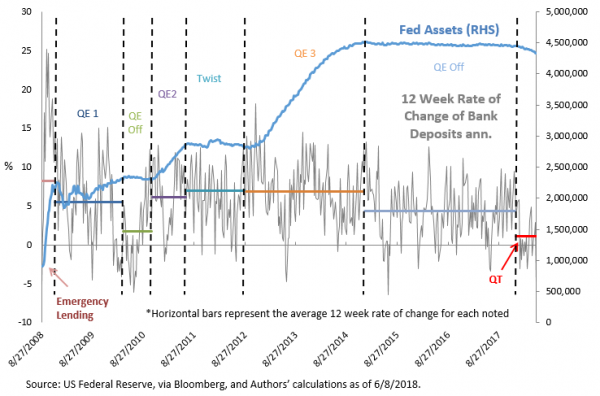
We think this drop in deposit growth is significant for two reasons. First, because it’s clearly visible even though the extent of balance sheet reduction is miniscule at this point. Secondly, as detailed in the sea shells analogy in Printing vs. Burning, we believe deposit growth is necessary over time for sustainable nominal GDP growth. We have not had a period of time of sustained downward impact on deposit growth directly related to central bank actions, and of course, this impact is set to intensify when the pace of QT steps up in July, and again in October.
The second chart compares the Fed’s Interest on Excess Reserves (IOER) rate to the Fed Funds Effective Rate. This quirky relationship is in the news this week because the Fed moved up the IOER rate by 5 basis points less than the upper bound of the Fed Funds target range, in order to more reliably keep the Fed Funds Effective Rate within the range. However, there are some more subtle messages from this chart.
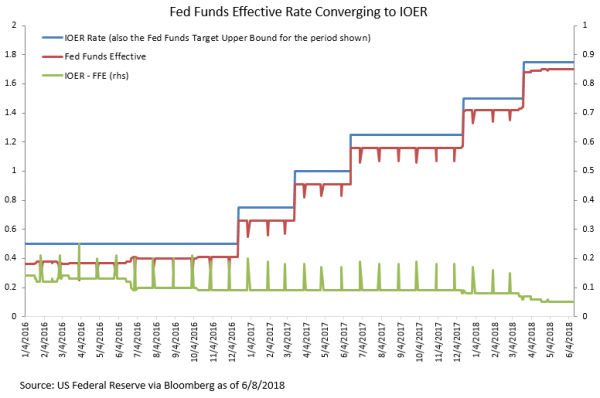
Generally, the gap between these two rates has represented the arbitrage profits available to US subsidiaries of foreign banks, who borrow reserves from the Federal Home Loan Banks and deposit them at the Fed to earn the IOER rate. The FHLBs do not earn interest on excess reserves, and US subsidiaries of foreign banks do not pay FDIC fees assessed on balance sheet size, so post-crisis there has been a bit of a symbiosis in the Fed Funds market for these two groups when there was otherwise little volume. However, let’s note a few things about this chart: 1) at recent hikes in the Fed Funds target range, the spread between IOER and the Fed Funds Effective Rate has narrowed. 2) The spread now appears to be slightly downward sloping intra-meeting, rather than just a stair-step lower concurrent with a rate hike. 3) The month-end dips in the Fed Funds Effective Rate, which widen this spread temporarily on the last day of each month, have almost disappeared completely.
The Fed has definitely noticed – especially the first item, which prompted the committee to move the IOER rate from the top of the target range to 5 basis points below the top of the range. But the second two items suggest there is a change going on under the hood in the Fed Funds market. The characteristic month-end spikes were caused by foreign banks temporarily removing the arb for period-end balance sheet reporting. The size of the arbitrage profits available to them through borrowing reserves from FHLBs is broadly unchanged through the intra-meeting period, so when the IOER-Fed Funds spread was generally flat with the month-end spikes, the market was dominated by the foreign bank – FHLB arbitrage trade. The new upward intra-meeting slope and de minimis month-end spikes suggest that for the first time post-crisis, there are US commercial banks in the system who have a genuine need or desire to borrow reserves, other than simply to carry out an arbitrage trade. Perhaps this is surprising given the glut of “excess” reserves in the system, but this demand for reserves is not to satisfy “reserve requirements” in the traditional fractional reserve banking sense, but rather banks are borrowing reserves as assets to satisfy Liquidity Coverage Ratio (LCR) requirements. There are alternatives, but at these prices, apparently there is net demand to borrow, as total reserve supply is slowly removed by the Fed. The Fed and keen observers have always acknowledged that there is some (probably large) level of excess reserves which is necessary for the smooth functioning of the money markets given the changes in monetary policy and regulatory capital requirements in the post-crisis era. What’s surprising is that we may be seeing signs of reserve scarcity after only nine months of slow-speed QT. This is sooner than expected.
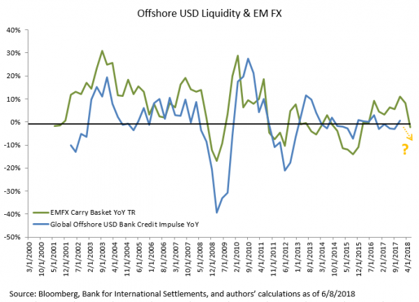
The third chart is an extension from last month’s discussion of the impact of waning offshore dollar liquidity on EM assets. Offshore dollar liquidity is a bit different than the kind depicted in the first two charts, because the Fed balance sheet has less direct impact on it. Indirectly, through tighter financial conditions onshore (primarily higher rates), dollars are attracted back to the US market more quickly all else equal. Dollars spend less time cycling through the offshore credit creation process, and as a result, offshore dollar deposit growth slows. As a proxy for this, we show the BIS data for offshore USD bank loan credit impulse for both EM and DM borrowers combined. This credit impulse (the acceleration/deceleration of credit creation) tracks pretty closely with EMFX performance. Though the data is not yet available for 2018, if the relationship holds, it looks like offshore credit growth may be decelerating. It certainly feels like it is.
Close scrutiny of these admittedly arcane variables in the market has led some Fed watchers to conclude that the Fed “can’t” reduce its balance sheet because of the restrictive LCR requirements, or because low cost excess reserves sloshing around are necessary to support asset prices and current economic growth rates. On the contrary, we think these charts illustrate that the Fed is succeeding in tightening financial conditions on the margin, and this is a welcome development. Poorly timed fiscal stimulus while potential growth rates remain slow encourages the Fed to intentionally tighten financial conditions, and these charts are evidence of it, both from balance sheet reduction and policy rate hikes.