logo
  • Products

    Funds

    • Performance & Yields
    • Liquidity
    • Ultra-Short
    • Short Duration
    • European Domiciled Product Offering

    Solutions

    • Cash Segmentation
    • Separately Managed Accounts
    • Managed Reserves Strategy

    Fund Information

    • Regulatory Updates
  • Insights

    Liquidity Insights

    • Liquidity Insights Overview
    • Audio Commentaries
    • Case Studies
    • Leveraging the Power of Cash Segmentation
    • Cash Investment Policy Statement
    • China Money Market Resource Centre

    Market Insights

    • Market Insights Overview
    • Eye on the Market
    • Guide to the Markets
    • Market Updates
    • ESG Explained

    Portfolio Insights

    • Portfolio Insights Overview
    • Currency
    • Fixed Income
    • Long-Term Capital Market Assumptions
    • Sustainable Investing
    • Strategic Investment Advisory Group
  • Resources
    • MORGAN MONEY
    • Global Liquidity Investment Academy
    • Account Management & Trading
    • Multimedia
    • Announcements
  • About us
    • Diversity, Equity & Inclusion
  • Contact us
  • English
  • Role
  • Country
  • MORGAN MONEY LOGIN
    Search
    Search
    Menu
    You are about to leave the site Close
    J.P. Morgan Asset Management’s website and/or mobile terms, privacy and security policies don't apply to the site or app you're about to visit. Please review its terms, privacy and security policies to see how they apply to you. J.P. Morgan Asset Management isn’t responsible for (and doesn't provide) any products, services or content at this third-party site or app, except for products and services that explicitly carry the J.P. Morgan Asset Management name.
    CONTINUE Go Back
    1. Food Fight: 2021 private equity update

    • LinkedIn Twitter Facebook Line

    Food Fight: 2021 Private Equity Update

    June 28, 2021

    Michael Cembalest, Chairman of Market and Investment Strategy

    LISTEN TO THE PODCAST

    pjct-0621-pb-50845-eotm pe_1400x450px

    Every two years, we take a close look at the performance of the private equity industry given its rising share of institutional and individual portfolios.  Our findings this year: the private equity industry is still outperforming public equity, but this outperformance narrowed as all markets benefit from non-stop monetary and fiscal stimulus, and as private equity acquisition multiples rise.  We examine manager dispersion, benchmarks, co-investing, GP-led secondary funds, the torrid pace of industry fundraising and manager fees in this year’s piece.

    Introduction

    The question of whether private equity outperforms public equity continues to be a hotly debated issue in investment finance.  In the latest food fight, Steve Kaplan at the University of Chicago takes on Ludovic Phalippou from the University of Oxford.  Phalippou is the author of “Private Equity Laid Bare”, has a podcast with the same name, and asserts that private equity managers have not outperformed net of fees.  Kaplan takes issue with Phalippou’s time period selection, his definition of private equity and choice of small/mid cap benchmark and cites consistent (albeit narrowing) outperformance of venture capital and buyout funds over time.  In this Executive Summary, we discuss the high-level conclusions from our biennial private equity review.  The full private equity paper contains our complete analysis with a broader discussion of topics, including the Kaplan-Phalippou debate.

    Buyout Performance

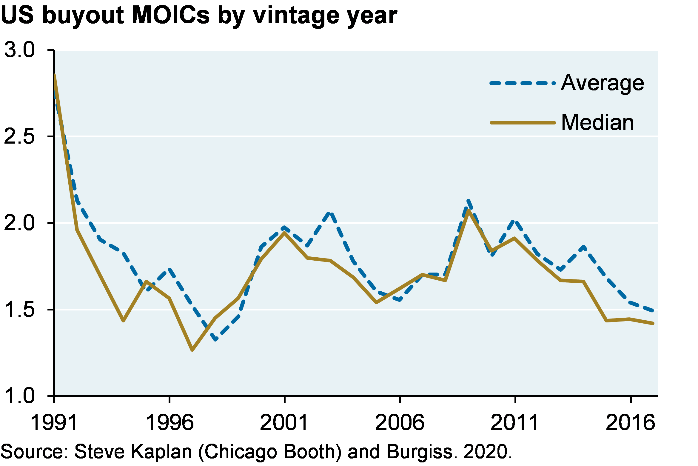
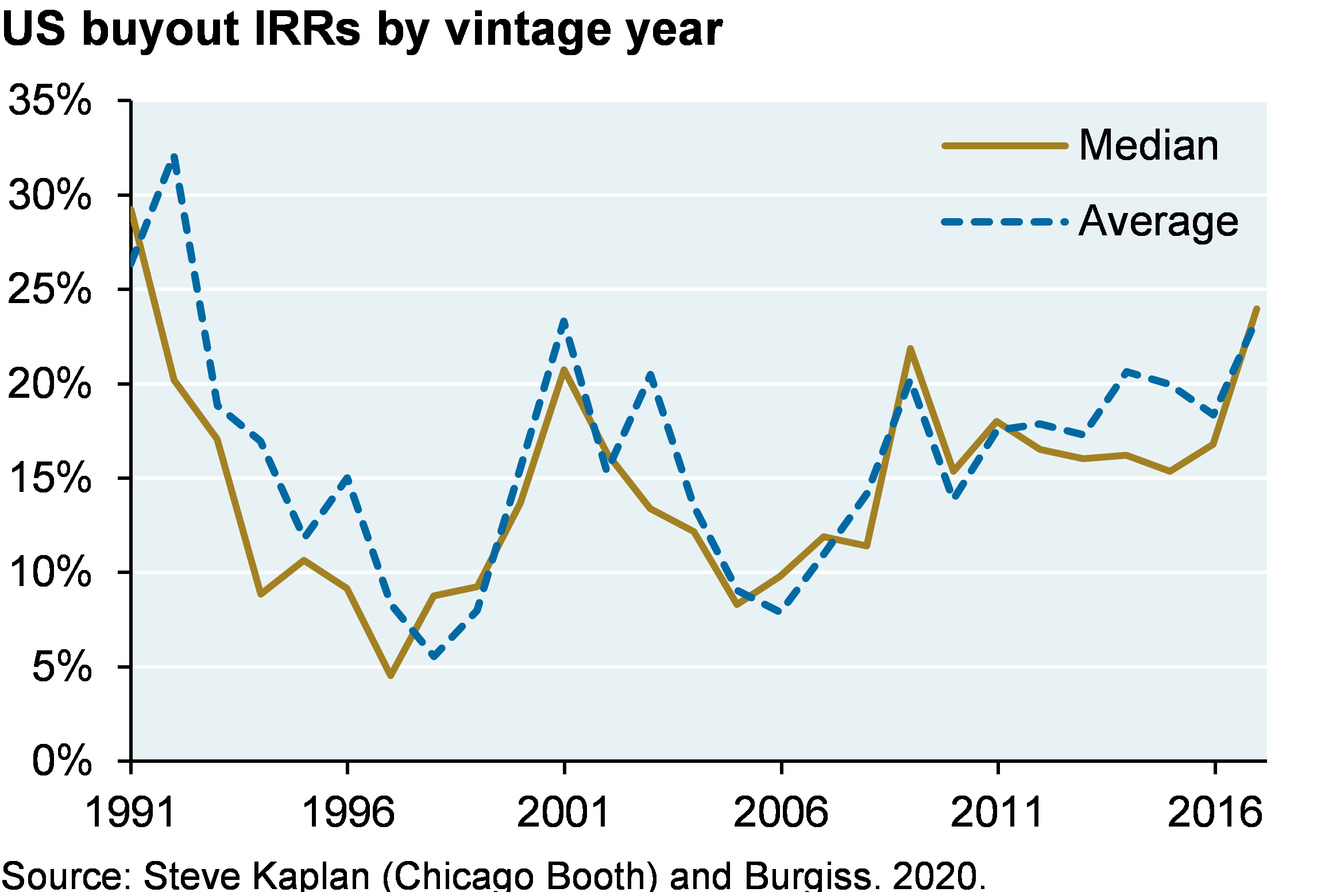
    The charts below show average and median multiples of invested capital (MOIC) and internal rate of return (IRR) for buyout funds since the early 1990’s.  MOIC is a simple measure of cash-in vs cash-out, while IRR is a time-weighted measure of return.  Note how there’s only a small gap between average and median buyout manager results.

    Before 2009, average MOICs and IRRs generally moved in tandem with each other.  Since 2009, MOICs have been declining while IRRs have been rising.  The primary reason: increased use of subscription lines, which allow managers to finance investments with bank loans and delay capital calls to LPs until later in the investment period.  This practice increases the IRR of a fund at the expense of a small rise in MOIC, since LPs end up paying subscription line interest.

    Line chart which shows average and median US buyout MOICs by vintage year. MOIC is a simple measure of cash-in versus cash-out. The chart shows that there is a small gap between average and median buyout manager results and since the 1990s managers have typically returned between 1.5-2x cash invested.
    Line chart which shows average and median US buyout IRRs by vintage year. Unlike MOIC, IRR is a time-weighted measure of return. The chart shows that there is a small gap between average and median buyout manager results and that managers have typically provided 10-25% IRR.


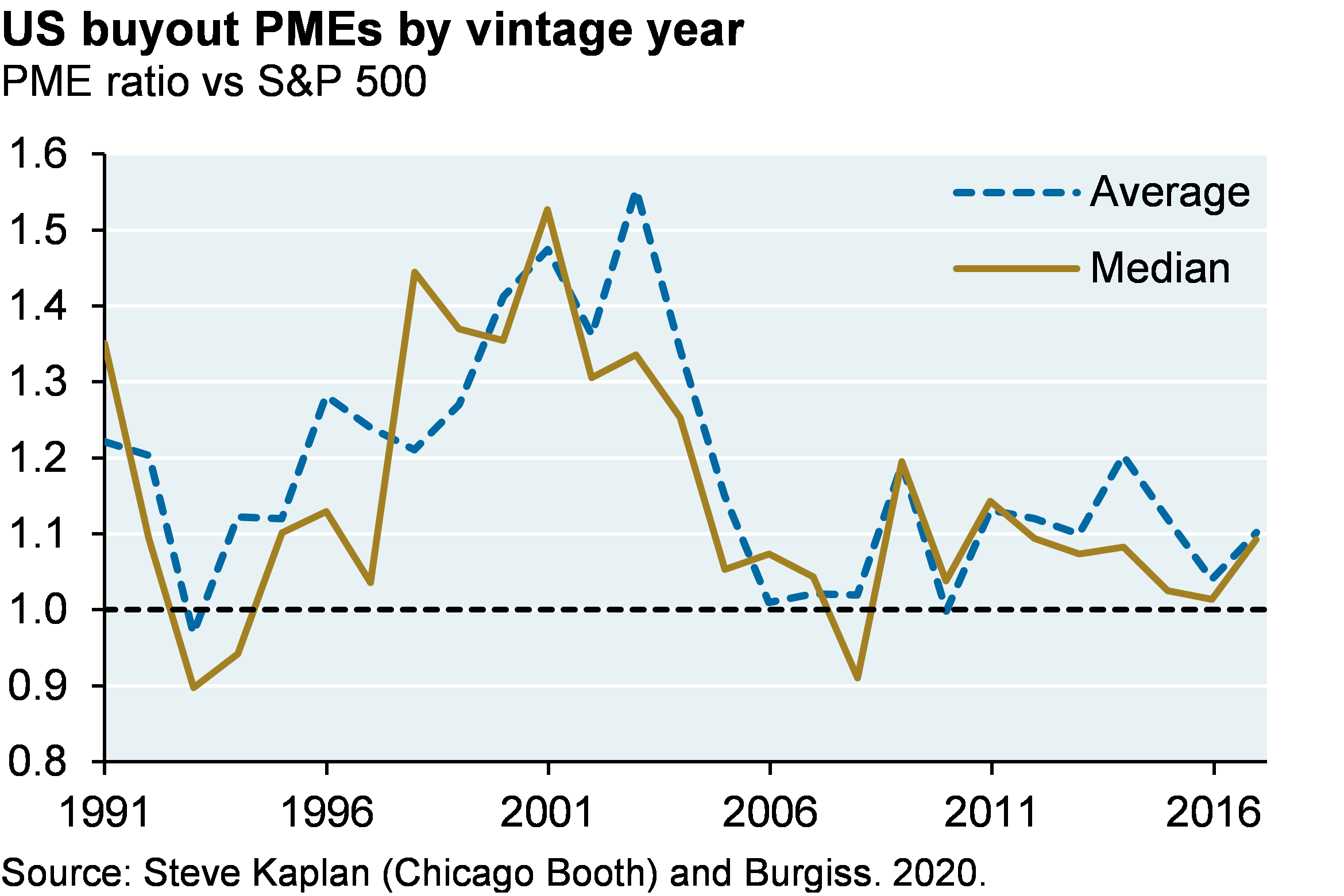
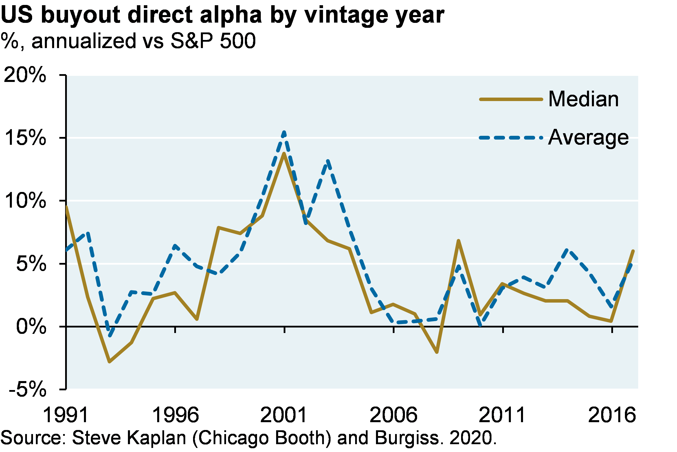
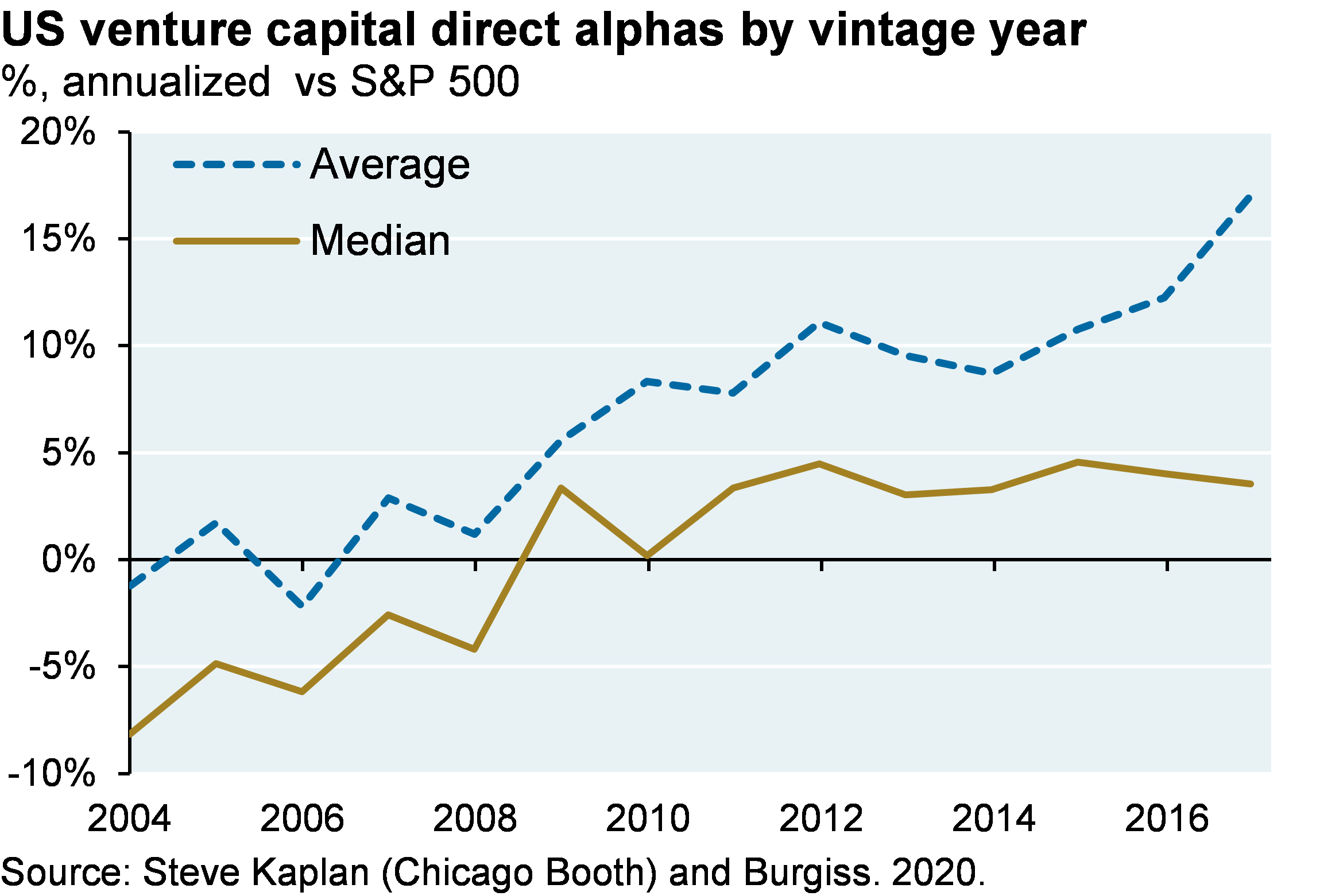
    MOIC is not time weighted and neither MOIC nor IRR measures performance vs public equity.  Analysts have converged on two concepts that address these shortfalls: the Public Market Equivalent ratio (PME) and Direct Alpha.  PME compares private equity commitments and distributions to investments in public equity markets in the exact same time periods. The result is essentially an MOIC ratio of private equity performance vs the public equity benchmark used.   Direct Alpha converts the PME into annualized outperformance in percentage terms.  Note how average and median results for buyout are similar, as they were for MOIC and IRR.  Since subscription loans impact the timing of upfront cash flows, they can materially boost Direct Alpha as well as IRR.

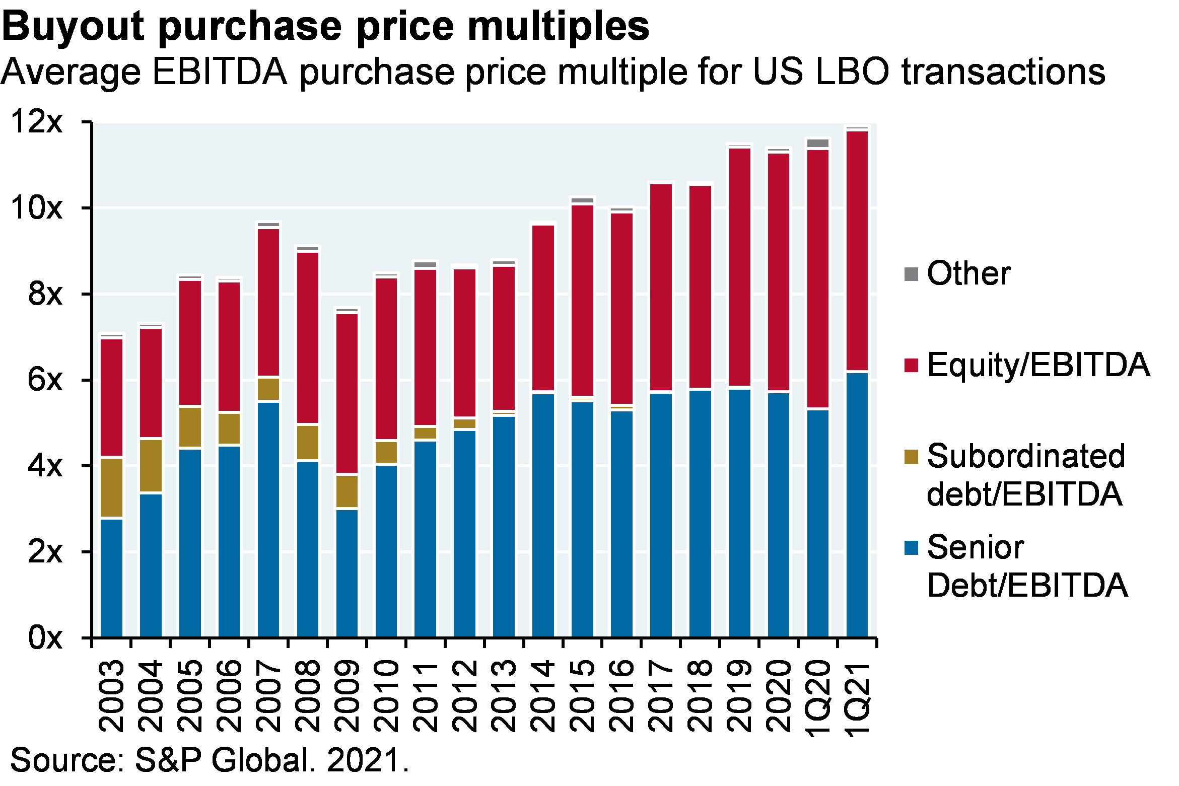
    Why have relative buyout returns declined?  After the financial crisis in 2008-2009, the Fed and other central banks adopted “maximum accommodation” policies. These policies led to a sharp rise in public equity valuations. In addition, buyout acquisition multiples have increased as the food fight over private companies continues, propelled further by the SPAC boom which we wrote about earlier this year. So, higher buyout purchase prices and better-performing public equities have reduced buyout outperformance. 

    Are the recent annualized 1%-5% excess returns over public equity markets since 2009 enough given the illiquidity of private equity?  Rather than apply an abstract derived cost of liquidity, most investors will judge for themselves whether these returns suffice based on their consistency and magnitude.

    Line chart which shows average and median US buyout PMEs versus the S&P 500 by vintage year. PME compares private equity commitments and distributions to investments in public equity markets in the same time period. The result is an MOIC of private equity performance vs the public equity benchmark. The chart shows that typically the average and median managers have been able to outperform the S&P 500, with 1993, 1994 and 2008 vintage years being the exceptions.
    Line chart which shows average and median US buyout Direct Alpha versus the S&P 500 by vintage year. Direct alpha converts PME into annualized outperformance. The chart shows on an annualized basis both the average and median manager typically outperformed the S&P 500 by around 4-5%.


    Stacked bar chart which shows average purchase price multiple (relative to EBITDA) for US LBO transactions since 2003. The chart breaks out the multiple into senior debt, subordinated debt, equity and other. The chart shows that multiples have been steadily increasing and are currently peaking at close to 12x.

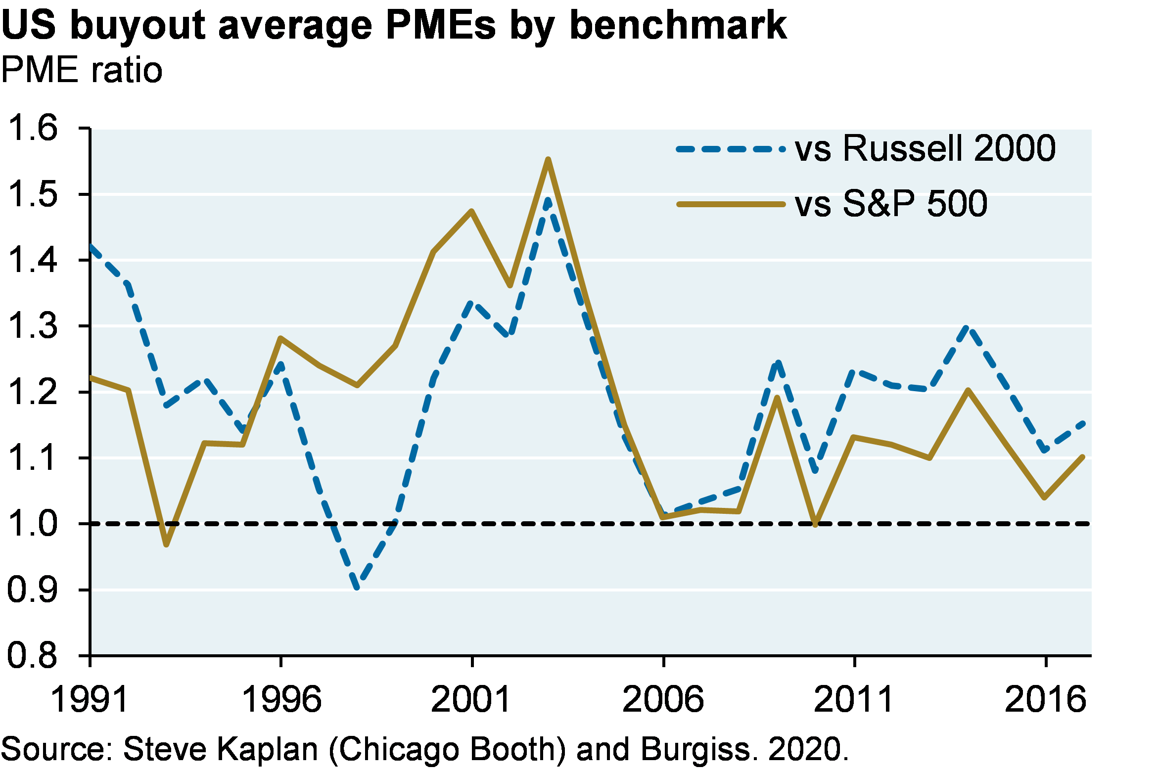
    Buyout funds: what is the “right” buyout performance benchmark?

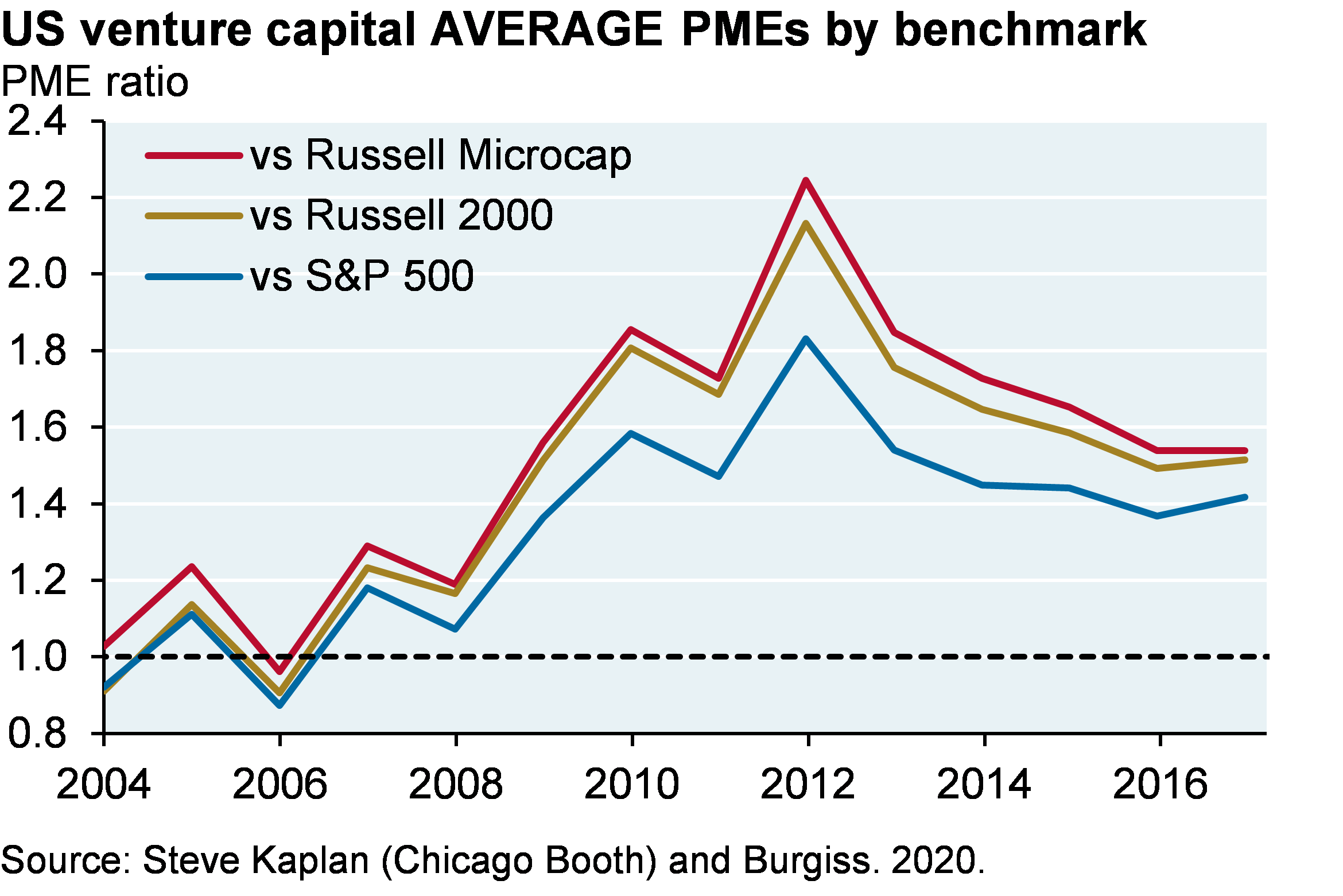
    Some analysts are reluctant to use the S&P 500 as a benchmark for buyout managers that invest in smaller companies.  While US buyout deal sizes have been rising, the average buyout is still much smaller than a typical large cap company.  The median S&P 500 market cap is $21 billion, the average US buyout is $2.5 billion and the median Russell 2000 market cap is $1.1 billion. In any case, the chart below shows PMEs using the Russell 2000 instead. The results reflect the relative performance of the S&P 500 vs the Russell 2000 over time. 

    Line chart which shows average US buyout PMEs versus both the Russell 2000 and the S&P 500 by vintage year. PME compares private equity commitments and distributions to investments in public equity markets in the same time period. The result is an MOIC of private equity performance vs the public equity benchmark. The chart illustrates the relative performance differences between the S&P 500 and Russell 2000 over time. Since the S&P 500 has outperformed the Russell 2000 since 2006, buyout PMEs vs the Russell 2000 are higher than buyout PMEs vs S&P 500 over the same time period.

    Buyout manager dispersion

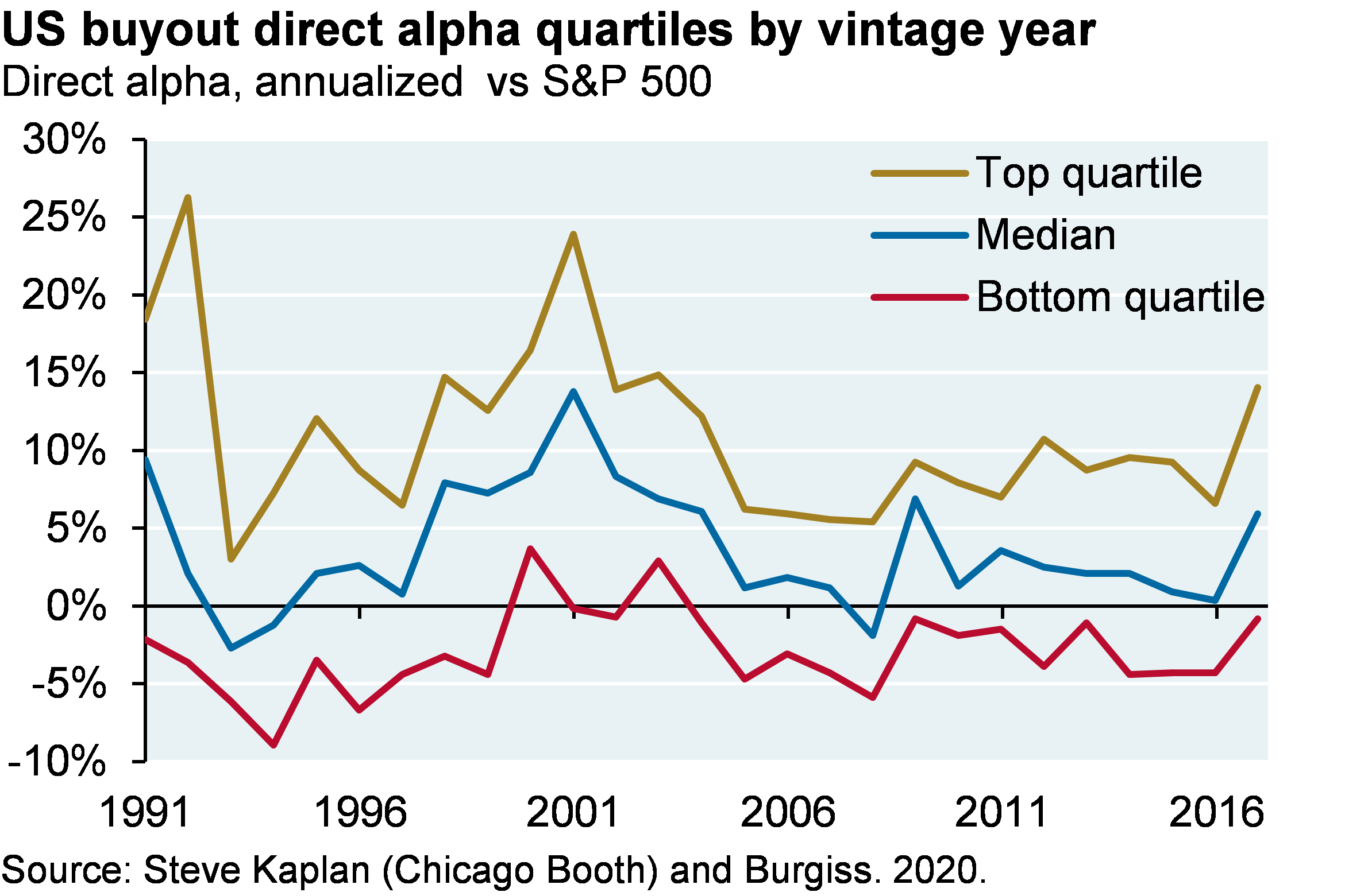
    Average/median managers have consistently outperformed, but what happens if you pick a below-average buyout manager?  Since 2010, the gap between top and bottom quartile managers has narrowed compared to prior decades, and the degree of underperformance for bottom quartile managers is pretty modest. 

    Line chart which shows US buyout direct alpha vs the S&P 500 by vintage year. The chart plots the median manager as well as the top and bottom quartile managers. The chart illustrates the dispersion between buyout managers. The top line indicates top quartile managers have the greatest direct alpha, followed by the median immediately below, with bottom quartile at the lowest direct alpha. Since 2010, the gap between top and bottom quartile managers is narrowing, and the underperformance of bottom quartile managers has been modest (-5%).

    Drivers of buyout performance

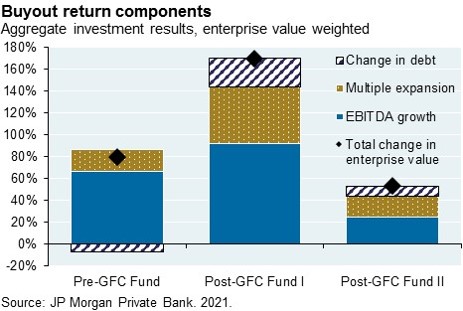
    While cash flow data sourced from limited partners is a reliable way to measure performance of private equity funds, it does not allow a closer look under the hood to see what drives that performance.  We asked one of the larger buyout managers we know for company-specific data for three consecutive buyout funds they managed.  We decomposed the change in enterprise value into three sources: cash flow (EBITDA) growth, changes in valuation multiples and change in debt levels.  In each case, operating cash flow improvements at the company accounted for more than half of the total change in enterprise value, and for more than the impact of multiple expansion.  This is not meant to be indicative of the industry as a whole, but it does illustrate that operating improvements can play a primary role in generation of returns.

    The stacked bar chart shows the change in enterprise value for a pre-GFC buyout fund and 2 post-PFC buyout funds. The change in enterprise value is decomposed into 3 sources: cash flow (EBITDA) growth, changes in valuation multiples and change in debt levels.

    Venture capital performance

    As with buyout managers, VC manager MOIC and IRR also tracked each other until 2012 after which a combination of subscription lines and faster distributions led to rising IRRs despite falling MOICs.   There’s a larger gap between average and median managers than in buyout, indicating that there are a few VC managers with much higher returns and/or larger funds that pull up the average relative to the median.

    Line chart shows the average and median multiples of invested capital (MOIC) by vintage year for 2006 to 2017 venture capital funds. The average MOIC is consistently about 0.5 higher than the median MOIC across vintage years. Average and median MOIC rose from 2004 to 2012 vintage years, but have since fallen to mid-2000s vintage year levels (2.0x average, 1.5x median)
    Line chart shows the average and median internal rate of return (IRR) by vintage year for 2006 to 2017 venture capital funds. The average IRR was consistently about 5% higher than the median IRR until 2014, when the average IRR started to rise at a faster pace than the median. Nevertheless, average and median IRRs have increased with each vintage year.


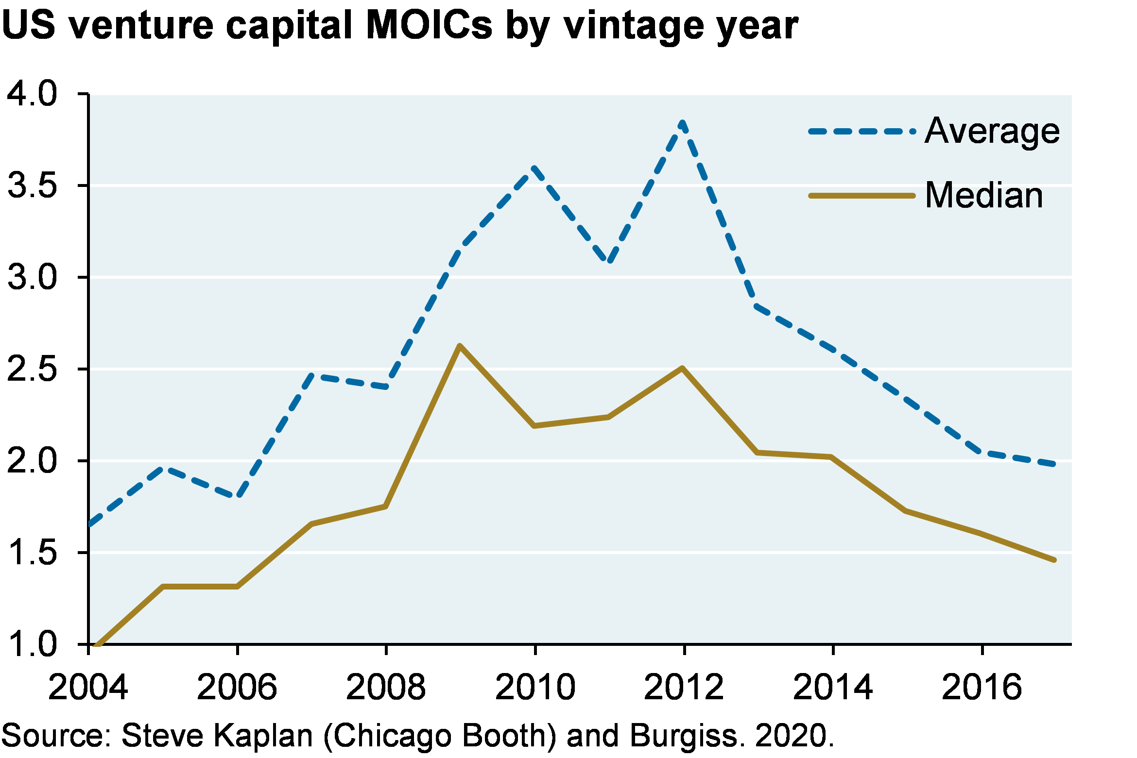
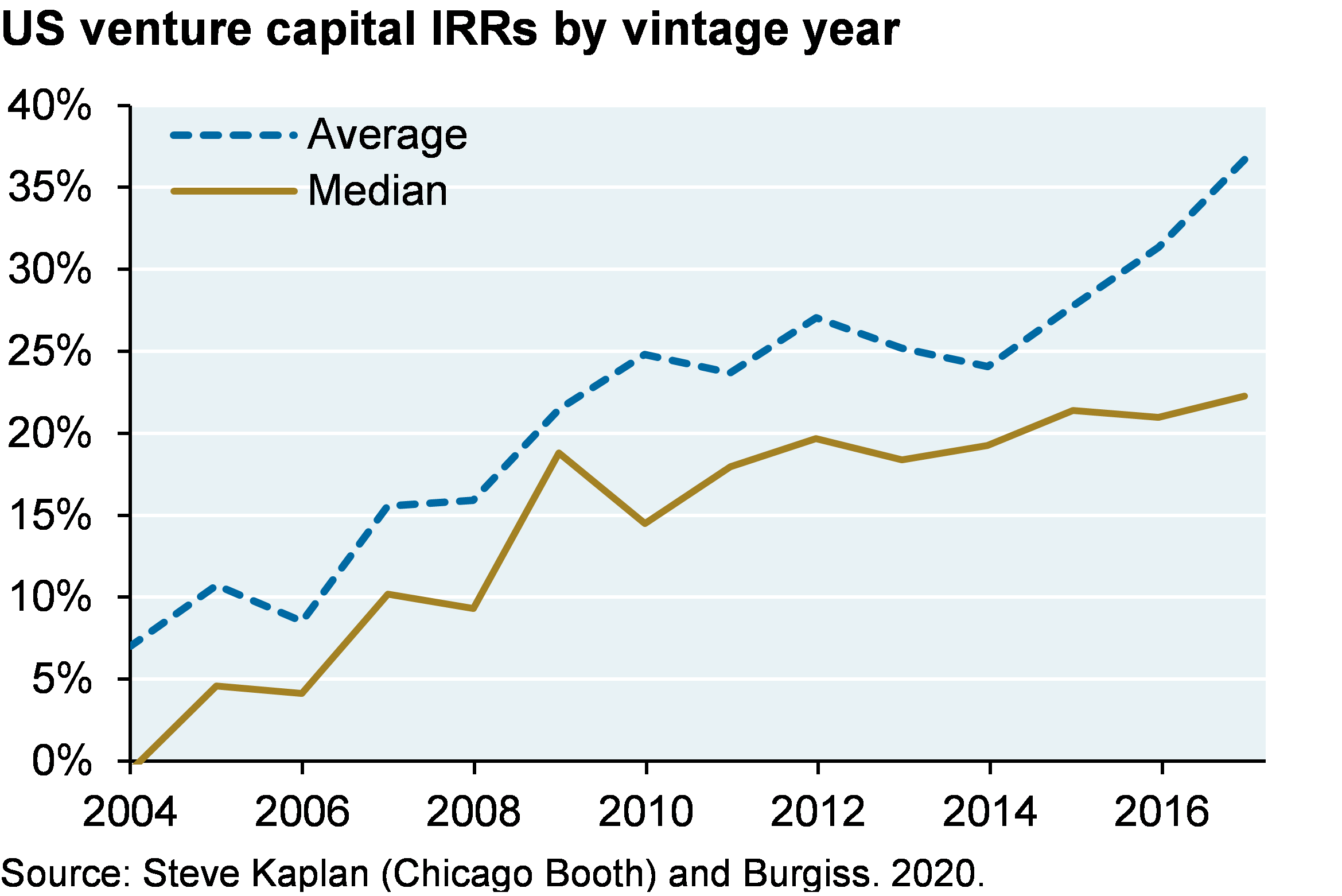
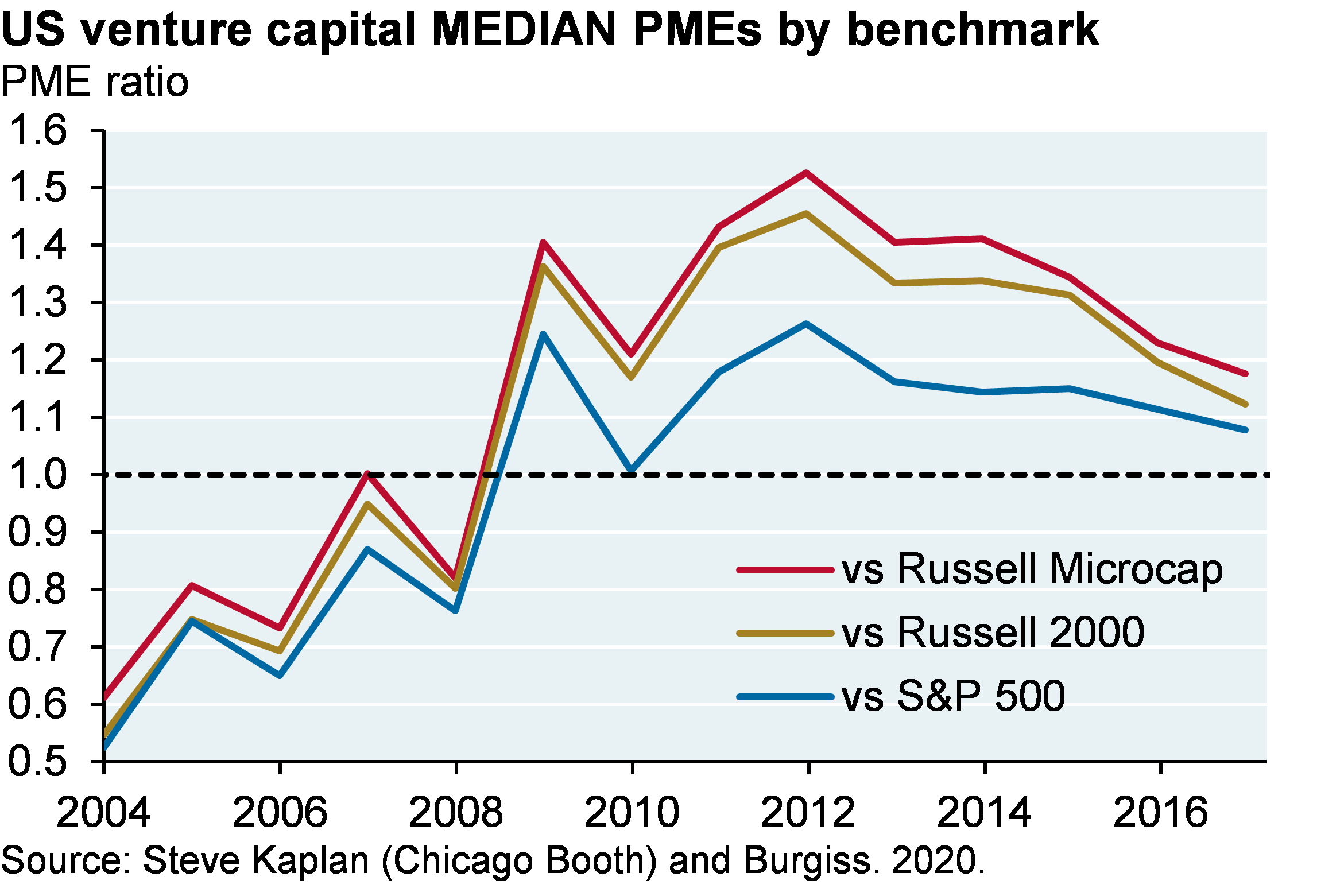
    VC managers have consistently outperformed public equity markets when looking at the “average” manager. But to reiterate, the gap between average and median results are substantial and indicate outsized returns posted by a small number of VC managers. For vintage years 2004 to 2008, the median VC manager actually underperformed the S&P 500 pretty substantially.

    Line chart shows the average and median public market equivalent ratio (PME) vs the S&P 500 by vintage year for 2006 to 2017 venture capital funds. The average PME is consistently higher than the median PME. Both the average and median PMEs increased with each vintage year until 2012 when they began to plateau around an average of 1.4x and a median of 1.1x.
    Line chart shows the average and median direct alpha vs the S&P 500 by vintage year for 2006 to 2017 venture capital funds. Average direct alpha is consistently higher than the median. Direct alpha implies that the average and median venture capital fund underperformed the market from 2004 to 2008, then began to consistently outperform.  Since 2015, the average VC manager’s direct alpha has risen to about 17% and the median manager plateaued at about 4%


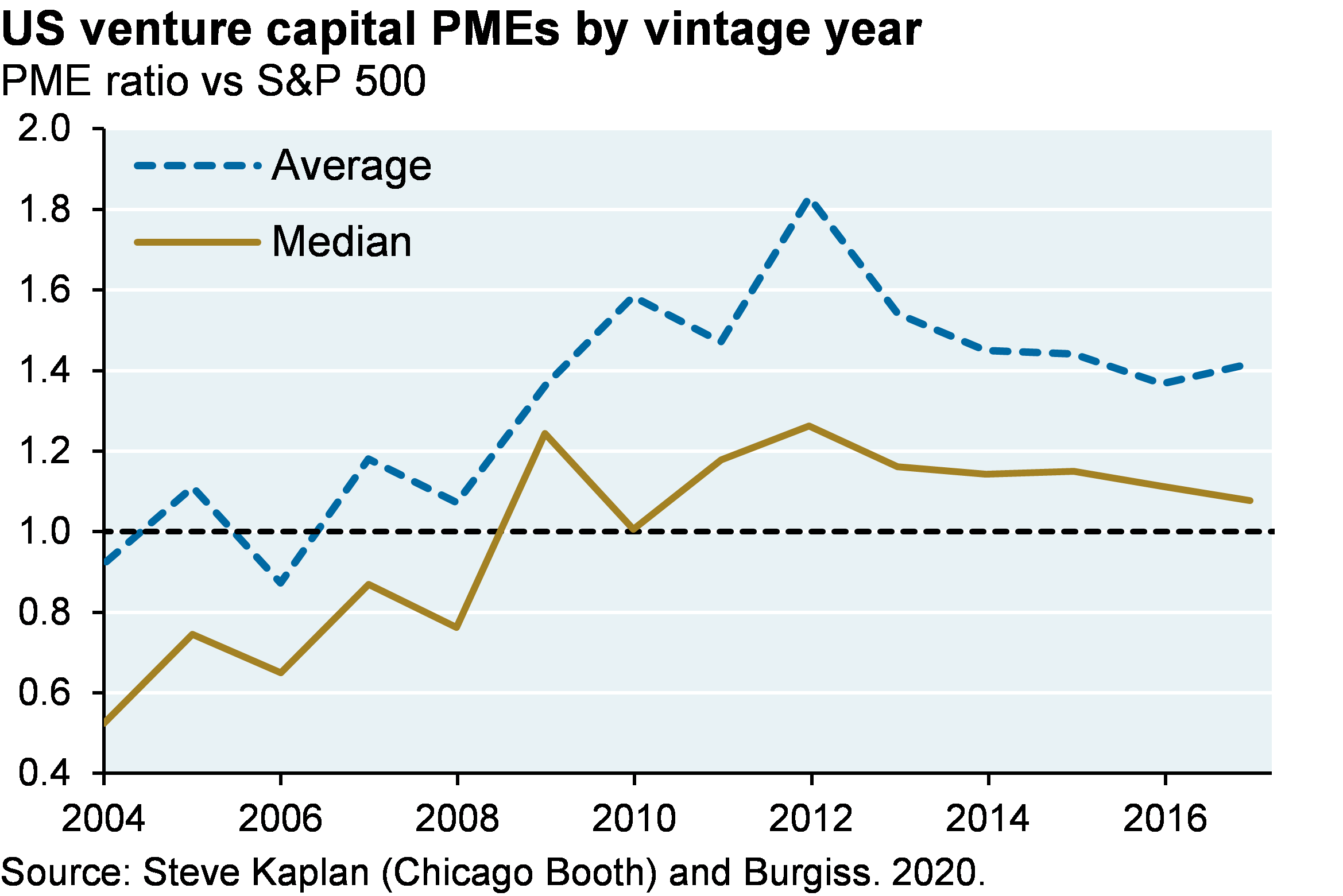
    Venture capital: performance benchmarks and manager dispersion

    One could make an even stronger argument that the S&P 500 is not the right benchmark for venture capital given much smaller deal sizes.  The first two charts show average and median PME ratios for VC using different benchmark options.  Since the S&P 500 outperformed the Russell 2000 Index, the Russell 2000 Growth Index, the Russell Microcap Index and most other US equity benchmarks since 2010, using a different benchmark than the S&P 500 would simply make venture outperformance look larger since that date.

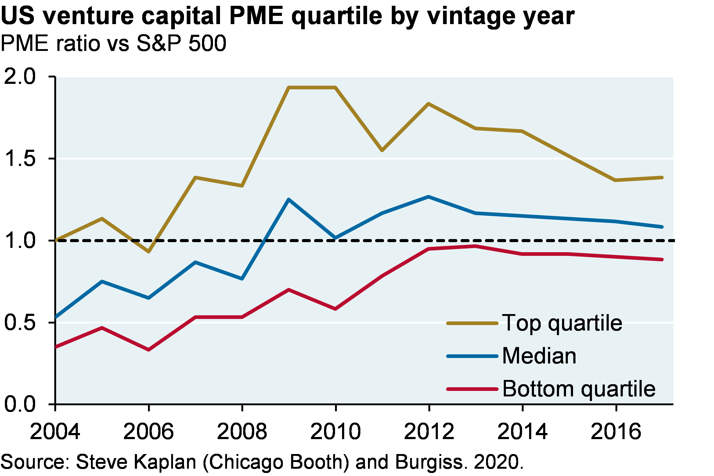
    As for manager performance dispersion, VC trends are similar to buyout.  Since 2010 the gap between top and bottom quartile VC managers has narrowed and bottom quartile VC manager underperformance vs public equity is very modest.  To be frank, I was expecting much worse from bottom quartile VC managers.

    Line chart which shows US venture capital average PMEs, showing the PME vs the Russell Microcap, the Russell 2000, and the S&P 500. A PME above 1 indicates that the venture capital performance outperformed the benchmark. Since 2004, the PME ratios for all benchmarks steadily increased from around 1 to around 2.2 in 2012. Since then the PME ratios have declined to around 1.6. Over time, the PME vs Russell Microcap has been slightly higher than the PME vs Russell 2000. There has been a wider gap between the PME vs Russell 2000 and the PME vs S&P 500. In 2012, the PME vs S&P 500 was 1.8 compared to 2.2 vs the Russsell 2000. In the most recent point, the PME vs the Russell 2000 was around 1.5 compared to 1.4 vs the S&P 500.
    Line chart shows US venture capital median PMEs, showing the PME vs the Russell Microcap, the Russell 2000, and the S&P 500. A PME above 1 indicates that the venture capital performance outperformed the benchmark. Since 2004, the PME ratios for all benchmarks steadily increased from around 0.6 to around 1.5 in 2012. Since then the PME ratios have declined to around 1.1-1.2. Over time, the PME vs Russell Microcap has been slightly higher than the PME vs Russell 2000. There has been a wider gap between the PME vs Russell 2000 and the PME vs S&P 500. In 2012, the PME vs S&P 500 was 1.25 compared to 1.45 vs the Russsell 2000. However, the gap has recently narrowed, with both the PME vs Russell 2000 and the PME vs S&P 500 at around 1.1

    Line chart which shows US venture capital PME (vs S&P 500) quartile by vintage year. The bottom quartile venture capital PME ratio has steadily increased from 0.4 in 2004 to slightly below 1 at the latest point. The median PME ratio has steadily increased from 0.5 to around 1.25 in 2012, but has since declined slightly to its latest value at just above 1. The top quartile venture capital PME ratio increased from 1 in 2004 to almost 2 in 2008-2010, but has since declined to around 1.4 at its latest point.

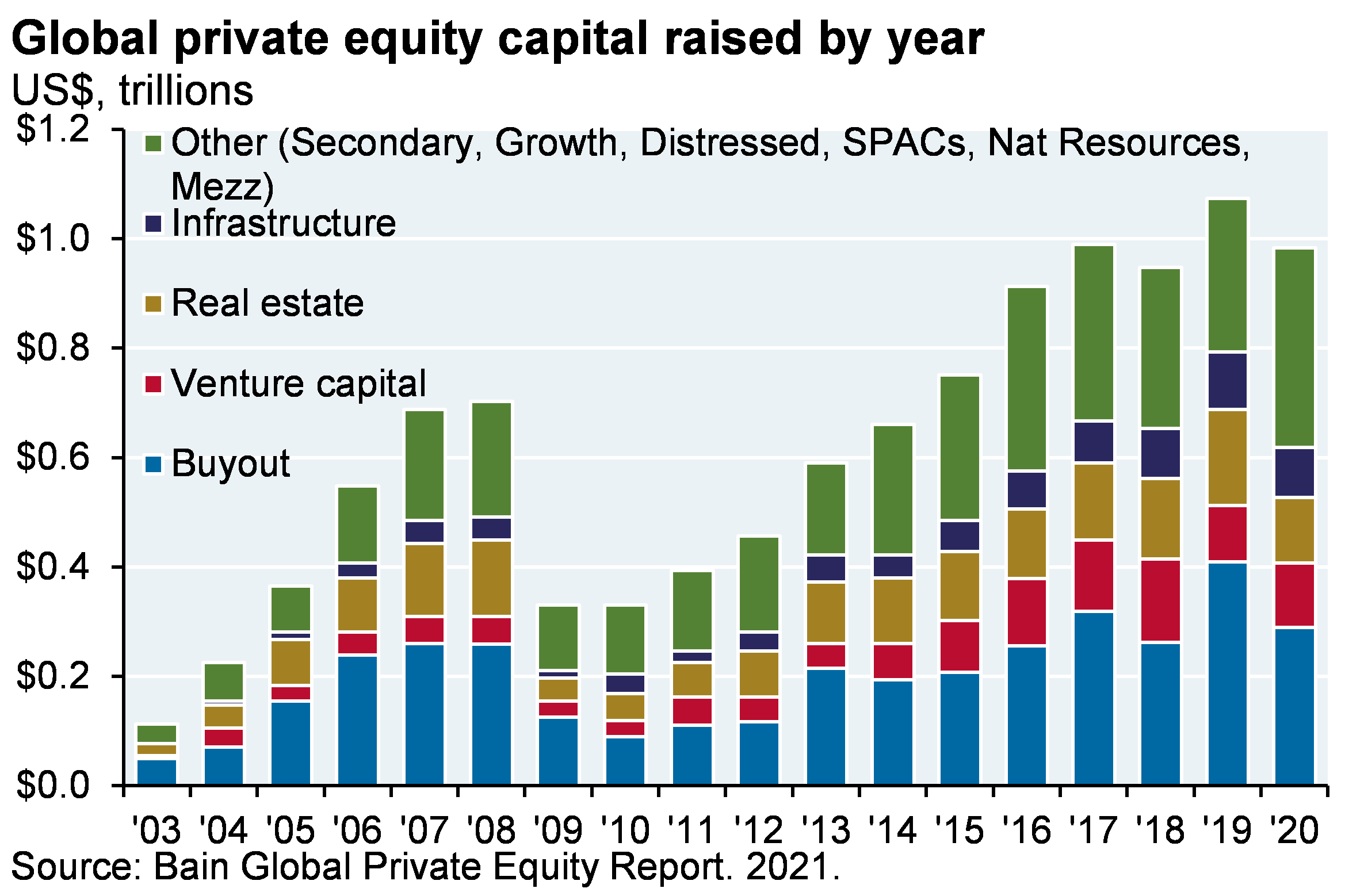
    Fundraising and the pace of investment

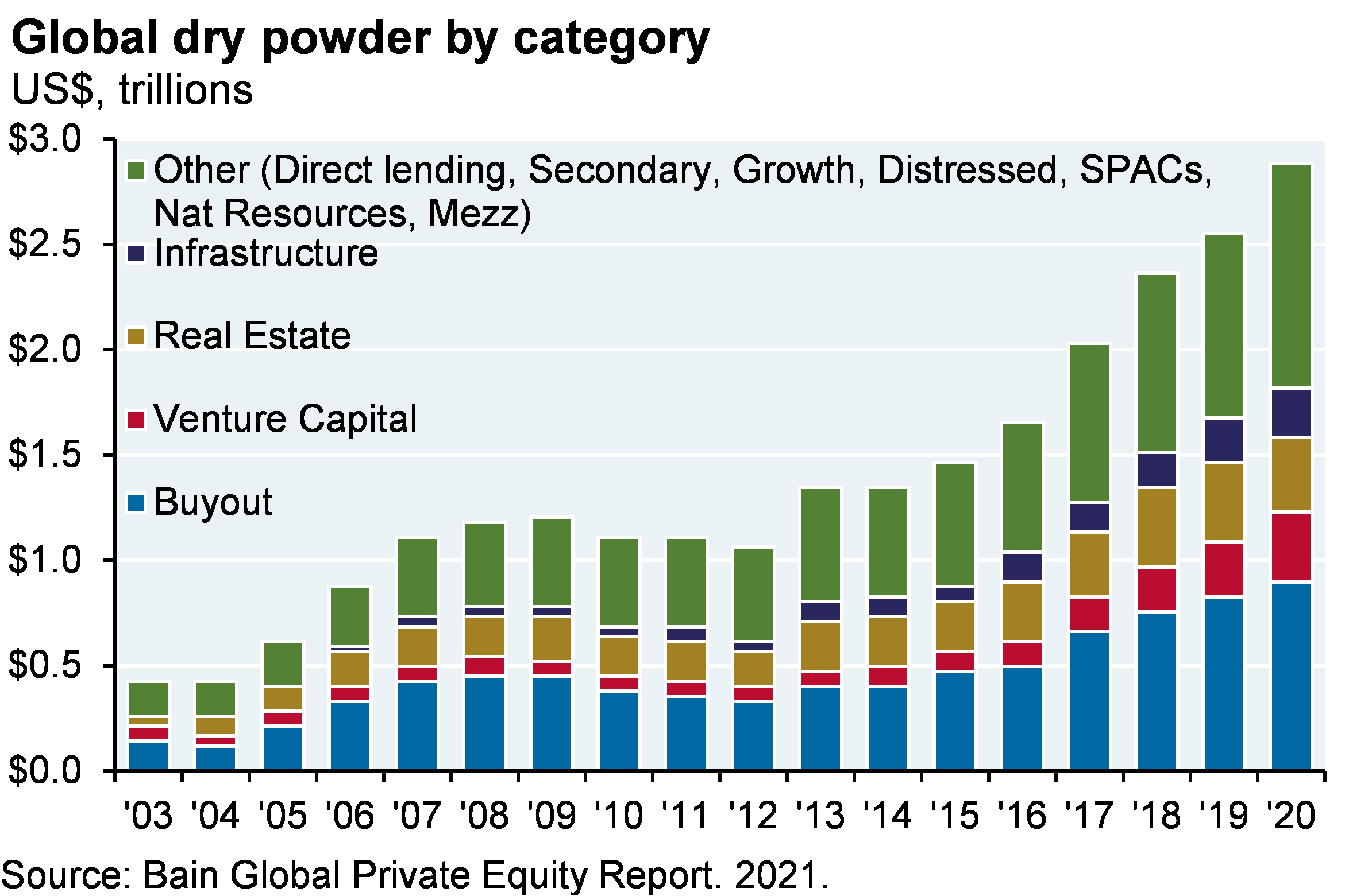
    • Since the pace of new investment has trailed fundraising, global “dry powder” has exploded since our last analysis, rising from $2 trillion to ~$3 trillion. However, this figure includes all private equity categories and not just buyout and venture capital. For the latter two categories, dry powder is closer to $1 trillion
    • Increased use of subscription lines also overstates the “real” amount of undrawn and committed capital. The latest estimates indicate $500 billion in subscription lines outstanding, which is a meaningful portion of the increase in global dry powder since 2012
    Bar chart which shows global private equity capital raised by year, shown as the breakdown between buyout, venture capital, real estate, infrastructure and Other (including secondary, growth, distressed, SPCs, Natural Resources, Mezzanine). Total private equity capital raised increased from around $0.1 trillion in 2003 to $0.7 trillion in 2008, then declined to $0.3 trillion in 2009. Since then, private equity capital has increased to its latest value of around $1 trillion in 2020. From 2003-2009, Buyout made up nearly half of private equity capital raised, with a quarter made up of “Other”. However, in recent years, “Other” makes up about half to a third of private equity capital raised, with “Buyout’ representing around a third and the remaining third split fairly evenly across real estate, venture capital and infrastructure.
    Bar chart which shows global dry powder by year, shown as the breakdown between buyout, venture capital, real estate, infrastructure and Other (including secondary, growth, distressed, SPCs, Natural Resources, Mezzanine). Total dry powder increased from around $0.5 trillion in 2003 to $0.7 trillion in 2008, then declined to $1 trillion in 2009. After a flat period through 2012, dry powder then began to increase steadily from around $1 trillion to its 2020 value of almost $3 trillion. In general, a third of dry powder has been in Buyout funds, a third in “Other” and the remaining third divided among Real Estate, Infrastructure and Venture Capital, with real estate representing slightly more than the Infrastructure and Venture Capital funds.


    The full private equity paper contains our complete analysis, including the following:

    • Growing size of average buyout and venture capital transactions
    • Return dispersion of buyout vs venture, real estate and private credit
    • Detailed decomposition of buyout fund drivers of enterprise value
    • Secondary private equity funds and the rise in GP-led transactions
    • How are gains on venture-backed companies split between VC investors and post-IPO investors?
    • Return and downside risk benefits from co-investments
    • The pace of capital calls vs distributions
    • Fundraising vs market capitalization for buyout and venture capital
    • Discussion of private equity fees and incentives
    • The latest academic private equity research (performance persistence, investor timing and post-IPO holding periods)
    • Return dispersion on buyout and venture transactions within commingled funds
    • Sources of private equity performance data
    • Appendix on methodology for IRR, Direct Alpha, cash flow timing and subscription lines
    DOWNLOAD
     
    09dd212506024158


    Listen to Podcast

    Food Fight: 2021 Private Equity Update

    28-06-2021

    Every two years, we take a close look at the performance of the private equity industry given its rising share of institutional and individual portfolios. Our findings this year: the private equity industry is still outperforming public equity, but this outperformance narrowed as all markets benefit from non-stop monetary and fiscal stimulus, and as private equity acquisition multiples rise. We examine manager dispersion, benchmarks, co-investing, GP-led secondary funds, the torrid pace of industry fundraising and manager fees in this year’s piece.

    J.P. Morgan Asset Management

    • Investment stewardship
    • About us
    • Contact us
    • Privacy policy
    • Cookie policy
    • Binding corporate rules
    • Sitemap
    Decorative
    J.P. Morgan

    • J.P. Morgan
    • JPMorgan Chase
    • Chase

    READ IMPORTANT LEGAL INFORMATION. CLICK HERE >

    The value of investments may go down as well as up and investors may not get back the full amount invested.

    Copyright 2023 JPMorgan Chase & Co. All rights reserved.