
If you’ve ever desired a vacation on a ventilator in the ICU, then not getting vaccinated is probably for you.
- Craig McCoy
former paramedic and president of Mercy Springfield Communities Hospital, Springfield Missouri
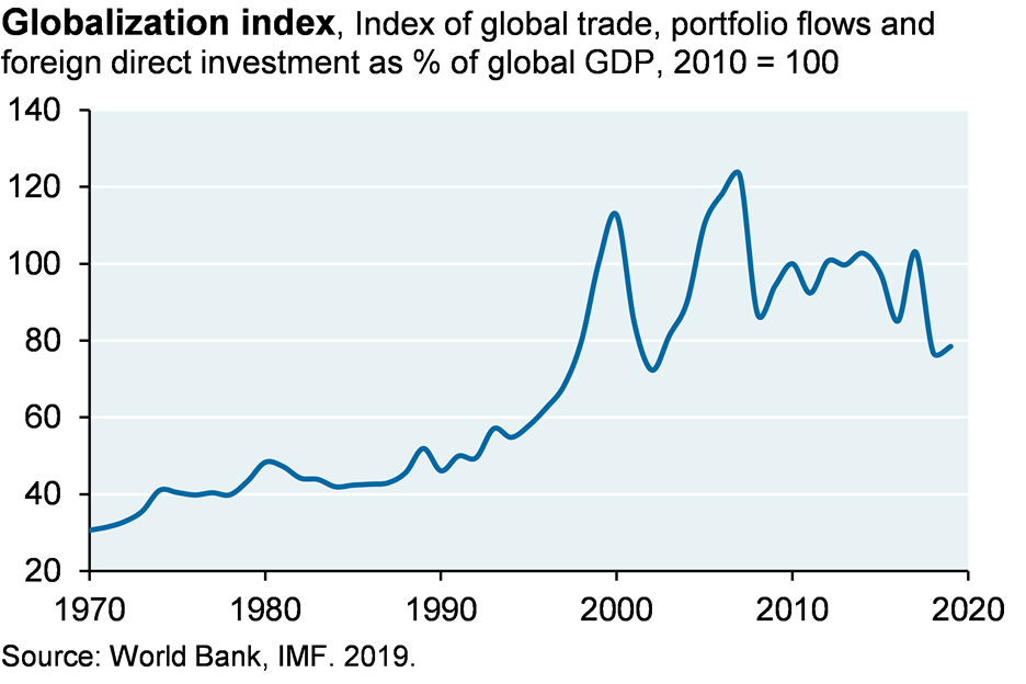
I led an internal discussion recently on the Delta variant for our asset management business. The details can be found in Section 1 on our virus portal here. Main messages: while the Delta variant has caused a small number of breakthrough hospitalizations and deaths for vaccinated people, the main risks overwhelmingly affect unvaccinated and immunocompromised people with no or insufficient antibody responses. From an investor’s perspective, developed world equities should be able to withstand the Delta variant; a chart we added on economic throw-weight (trade, FDI and portfolio flows), vaccination and mortality by country explains why.
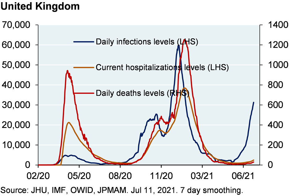
One important chart to watch is the first one from the UK: so far, a large spike in Delta infections has not led to a surge in overall hospitalization or mortality. However, this masks what’s happening to unvaccinated people over 50 in the UK: 14% of such Delta infections ended up in the hospital and almost 4% died1, figures which are 4x higher than for vaccinated people over 50. The good news: in the UK, 96% of people over 50 are vaccinated, reducing the size of its at-risk unvaccinated population. However, in the US age 50+ vaccinations are ~75% nationwide (lower in many rural counties), resulting in larger populations of at-risk people; and in hotspot states (AR, FL, LA, MO, NV, WY), hospitalizations are rising more rapidly than in the UK.
Even so, my primary message to the group was that the US reopening train has left the station and that the Delta variant is unlikely to have a durable impact on US equity markets. Federal and local governments are unlikely to reimpose mobility restrictions to protect a cohort that is mostly unprotected by its own volition. The policy borrows from Genesis 4:9: “you are not thy brother’s keeper if he chooses to expose himself to COVID”, irrespective of whatever his reasoning may be. A February NYT article2 described how younger generations are bearing unacceptable sacrifices to protect older ones. I doubt the NYT would have published this while Trump was President, for fear of being seen as aligning itself with his Administration’s views. But with a new administration in DC, I suppose it’s safer to make one’s intergenerational prosperity preferences clearer.
Charts: 96% vaccination rate of people over 50 explains the gap between UK infections and deaths; in the US, the reopening train has left the station irrespective of Delta variant outbreaks
The Fed as firefighter and arsonist at the same time
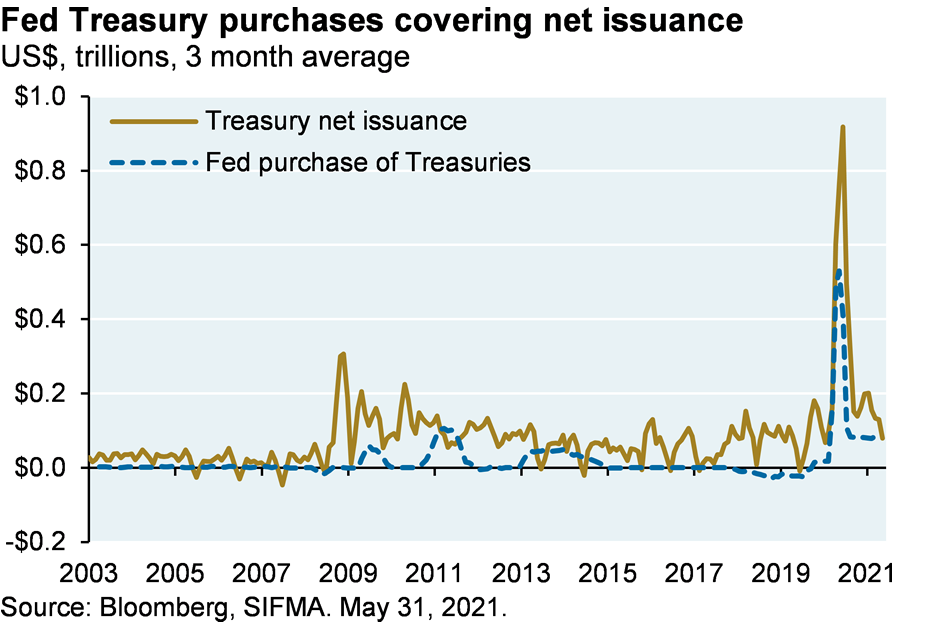
I read something recently which referred to the Fed as both firefighter and arsonist. That’s a good description: resuscitating private sector demand while simultaneously destroying decades of underwriting and investment discipline in the process. The firefighting resources the Fed is using: the easiest monetary policy in US history other than during wartime; and a symbiotic relationship with the US Treasury which now entails the Fed buying the entire stock of net Treasury issuance. You have to see it to believe it.
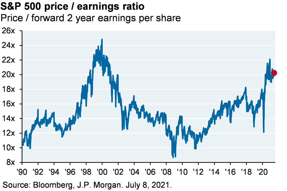
During the March 2009, 2012 and 2020 selloffs, the right question to ask was “what could go right”. When markets reach all-time highs and are close to the highest valuations on record (as they are now), the right discipline is to focus on risks as well. The US and global economy are set for a powerful recovery as pent-up corporate and household demand is unleashed. In the US, for example, household debt service ratios are close to the lowest levels in 40 years, suggesting a sustainable expansion in consumption. Even so, markets are pricing a lot of that in. As the world resets closer to trend growth in 2022, I envision modestly higher inflation in which industrials, energy, financials and other reflation plays outperform; and a market in which earnings growth drives equity returns, rather than rising valuations.
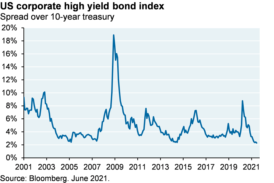
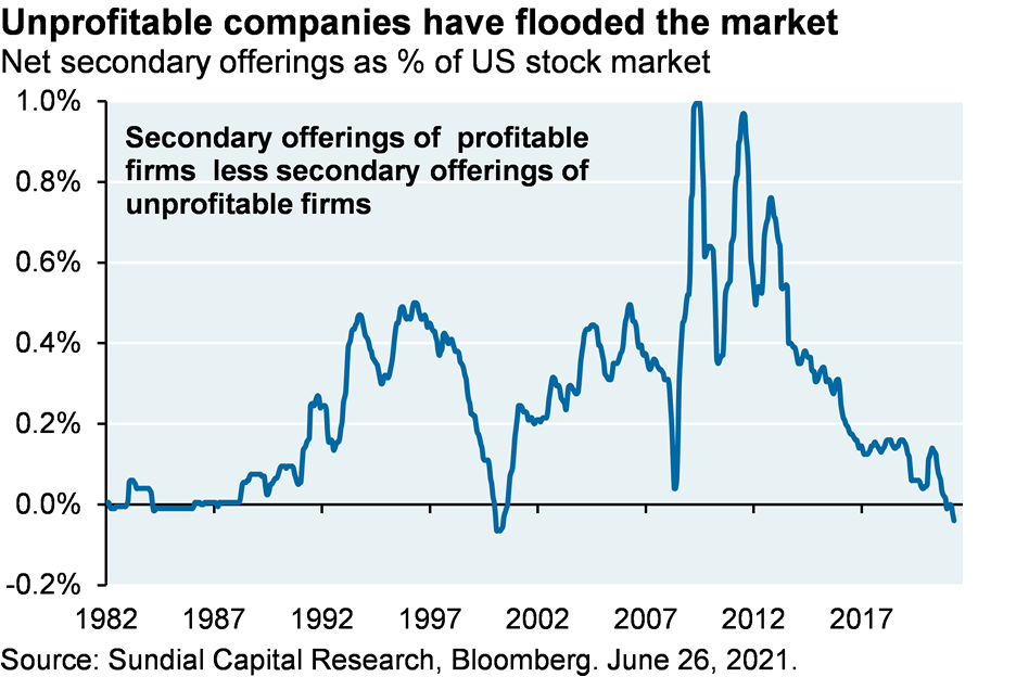
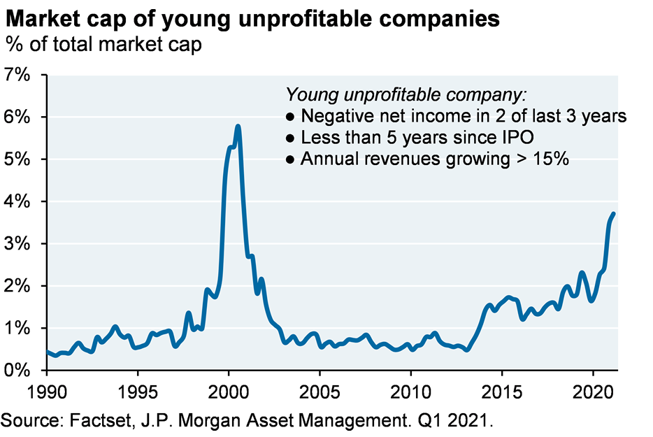
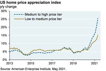
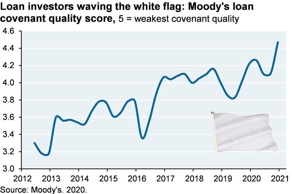
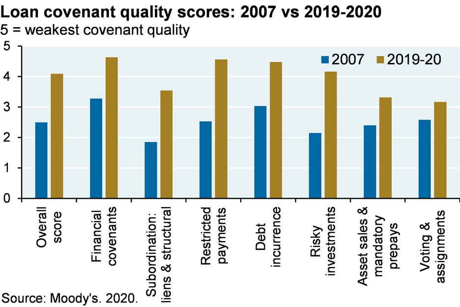
In any case, here are some ashes that can be laid in part at the doorstep of the Fed and its policies: a collapse in the spread on high yield bonds, a locust-like scourge of secondary equity offerings from unprofitable companies, a rise in the market cap share of unprofitable companies, a surge in home prices and perhaps most concerning, a collapse in loan underwriting standards. Even when compared to the free-wheeling credit environment of 2007, lenders have discarded any discipline they used to have regarding covenants, restricted payments clauses, protections against layering and subordination, mandatory payments from asset sales, etc. This kind of thing is never a problem until you hit the bumpier part of the business cycle.
US-China economic divorce picks up steam, but is that what’s negatively affecting Chinese tech stocks?
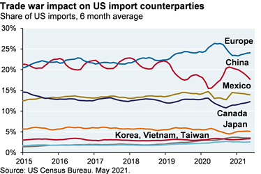
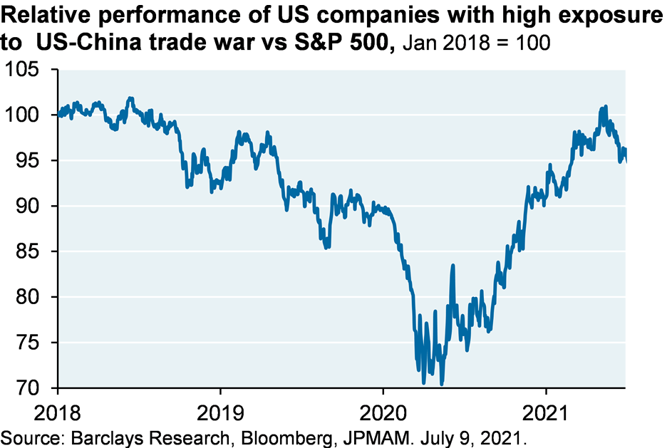
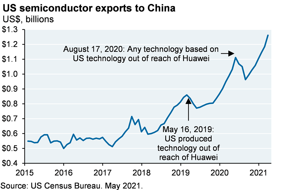
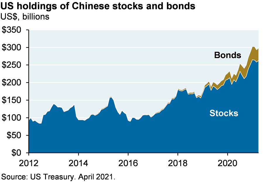
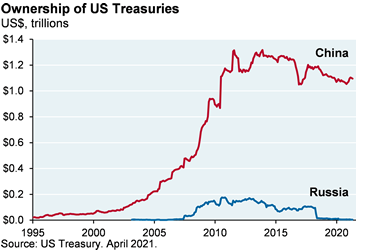
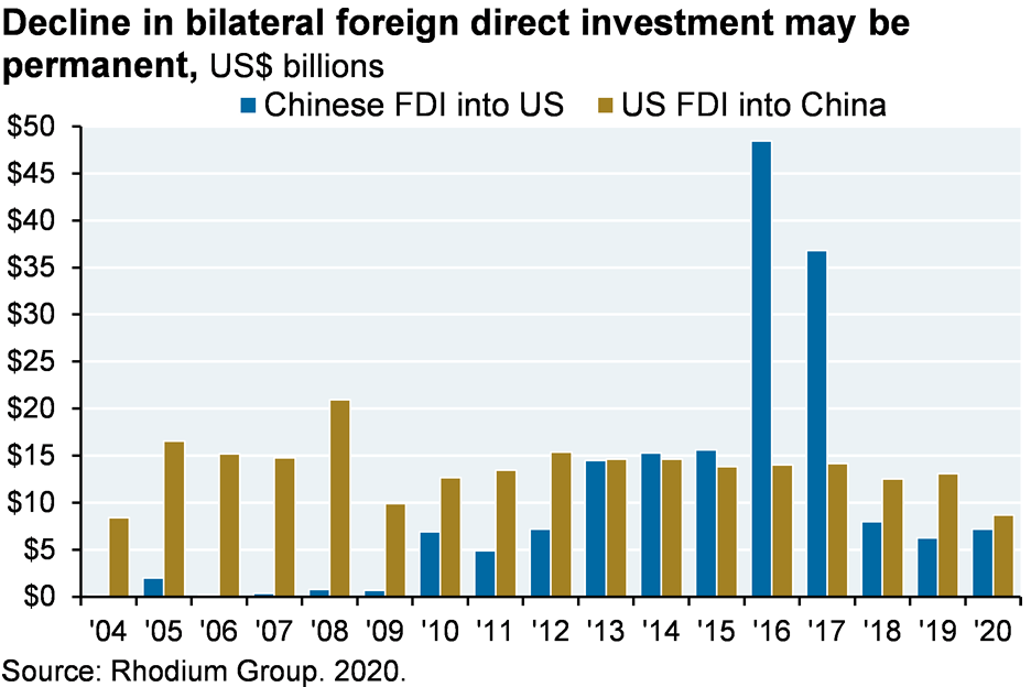
The 25% decline in Didi’s stock has refocused investors on the US-China economic divorce. However, it’s important to understand that there’s still plenty of normalcy in the US-China economic relationship. China’s share of US imports is only modestly below 2018 levels, US stocks exposed to the trade war are doing fine vs the market, US semiconductor exports to China are still rising despite Huawei, US investors continue to accumulate more Chinese stocks and bonds, and unlike Russia, China has not engaged in economic warfare via its US Treasury holdings. Only bilateral FDI flows appear to be suffering from changes in national security policy.
That said, the Biden administration has unleashed an alphabet soup of China-targeted policies:
Executive Orders restricting China’s access to US sensitive data via consumer apps and restricting US investment in Chinese companies affiliated with its military; Holding Foreign Companies Accountable Act (de-listing of Chinese companies non-compliant with SEC data requirements); CHIPS Act and 5G Emergency Appropriations ($ for US semiconductor companies); Endless Frontier Act ($ for STEM R&D); Strategic Competition Act (CFIUS oversight of mergers and gifts by Chinese entities to US institutions); Homeland Security and Governmental Affairs Committee Provisions (“Buy America” requirements for iron and steel in US infrastructure projects); Meeting the China Challenge Act (sanctions for cyberattacks, IP theft and economic espionage); Uyghur Forced Labor Prevention Act (sanctions on US and Chinese companies knowingly using forced labor or conducting surveillance)
China’s possible partnership with the Taliban in Afghanistan won’t play well in DC either. Even so, many US initiatives are meant to boost US competitiveness and only a couple target Chinese companies in the MSCI China index, and usually impact smaller ones. In fact, the largest risks facing Chinese tech stocks and ADRs come from China rather than the US. Chinese regulators have implemented guidelines aimed at curbing monopolistic practices, limiting lax underwriting activities, policing data privacy, censoring content, addressing worker mistreatment and reforming entire industries like fintech and education. While the timing of enforcement actions on Didi suggest that there’s a message to US politicians in there as well, domestic policy concerns were the driving factor behind China’s decision to order mobile stores to remove Didi’s ride-hailing app.
On top of all that, China just proposed new rules to require companies with more than 1 million users seeking to list in foreign countries to undergo a cybersecurity review due to the risk that data and personal information could be “affected, controlled, and maliciously exploited by foreign governments”. This review will look into possible national security risks as well.
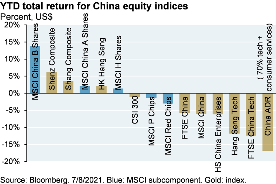
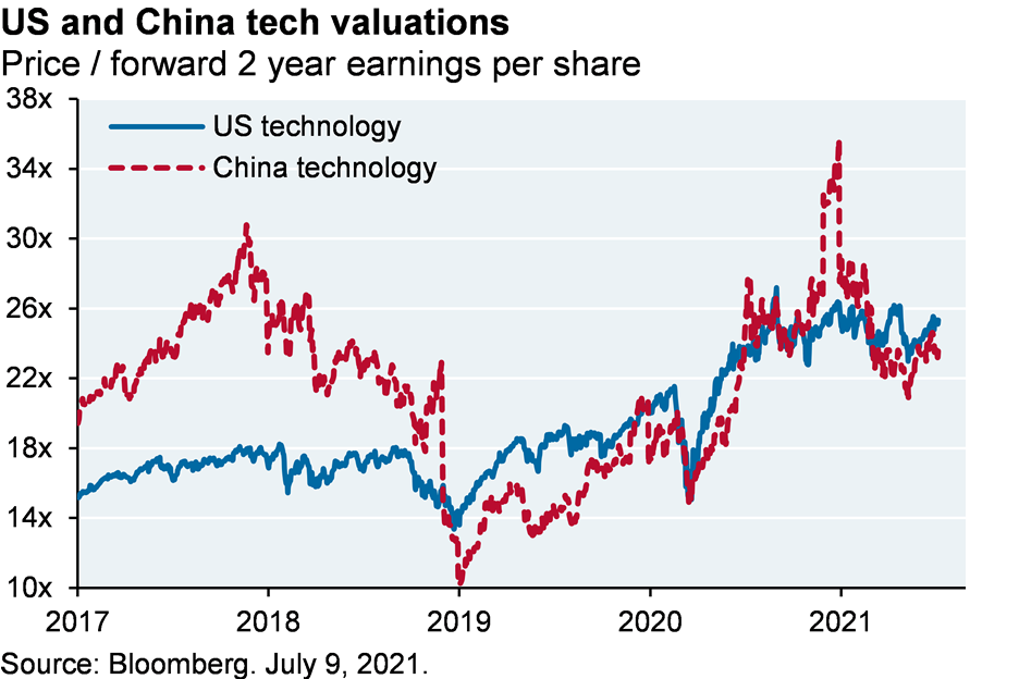
Whether new risks facing Chinese tech stocks are due to the US-China policy war or to Chinese domestic policy actions, large Chinese tech stocks now face hurdles that suggest the need for lower valuations than their US counterparts (they now trade at roughly the same level, as illustrated below).
I don’t think Biden’s China agenda has the capacity to derail China’s economy from whatever trajectory it’s on. That said, a decline in globalization and a rise in US national security enforcement argue for slightly higher inflation in the years ahead, which we discuss next.
The Pig and the Snake: a unified theory of the US, China, wages, jobs, inflation, opioid use, the WTO and investment portfolios for 2022 and beyond
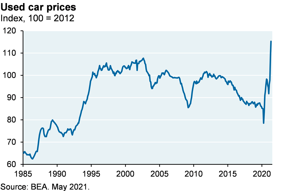
The US economy is booming: capital spending and hiring tailwinds should last a few more months at least. There are some wacky inflation readings on the high side, but most professional economic forecasters and market-based inflation expectations are looking past them (the spike in used car prices is one example).
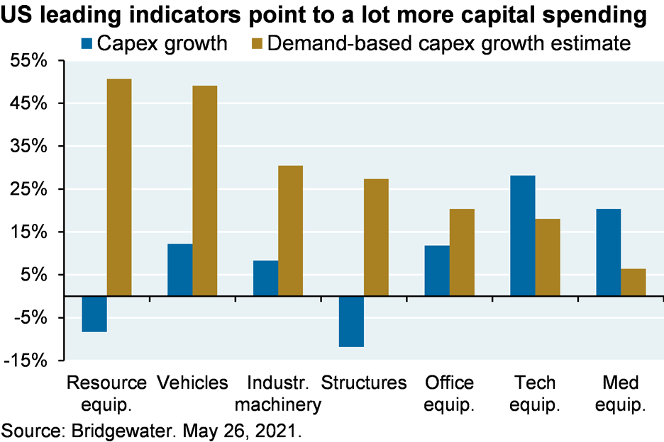
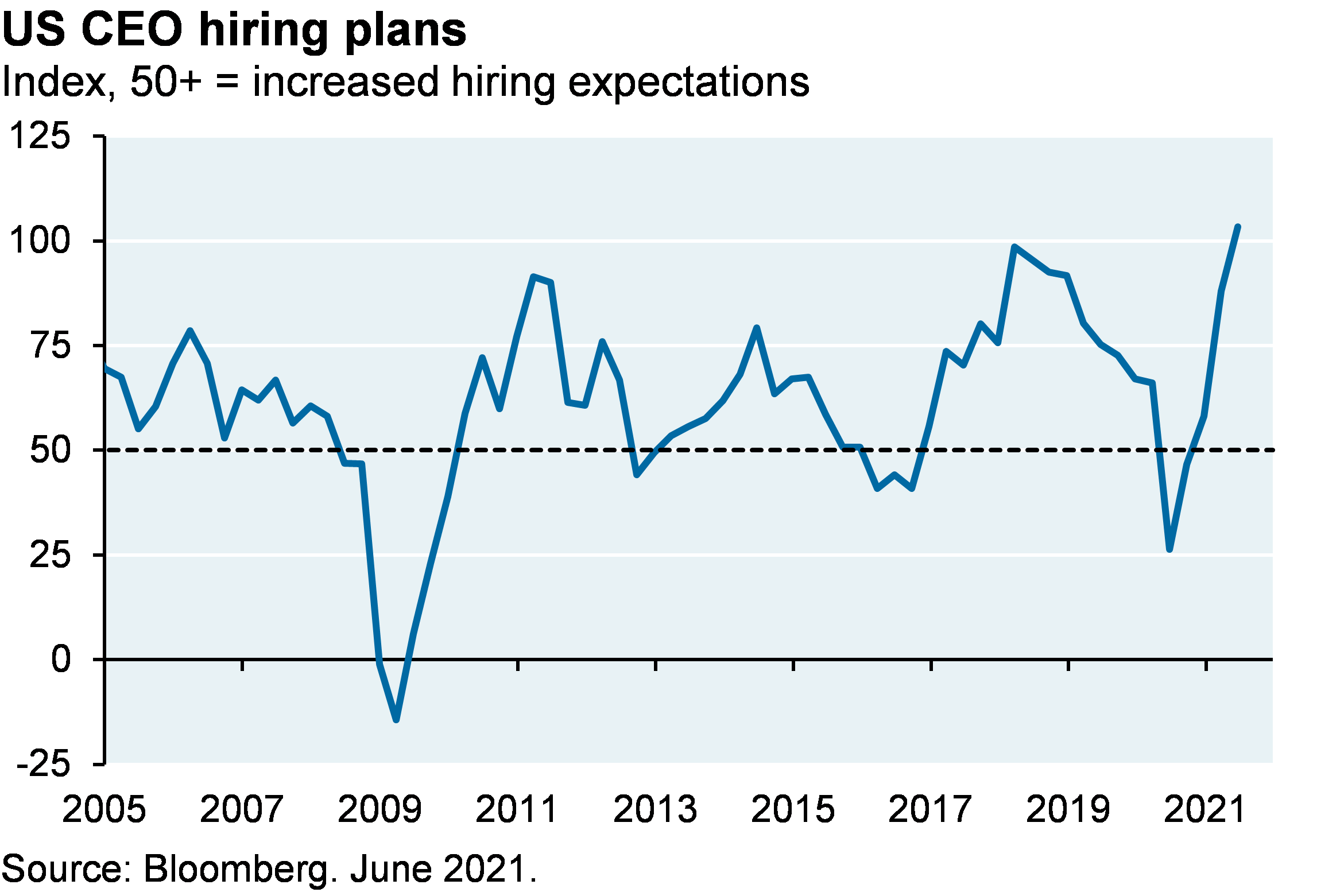
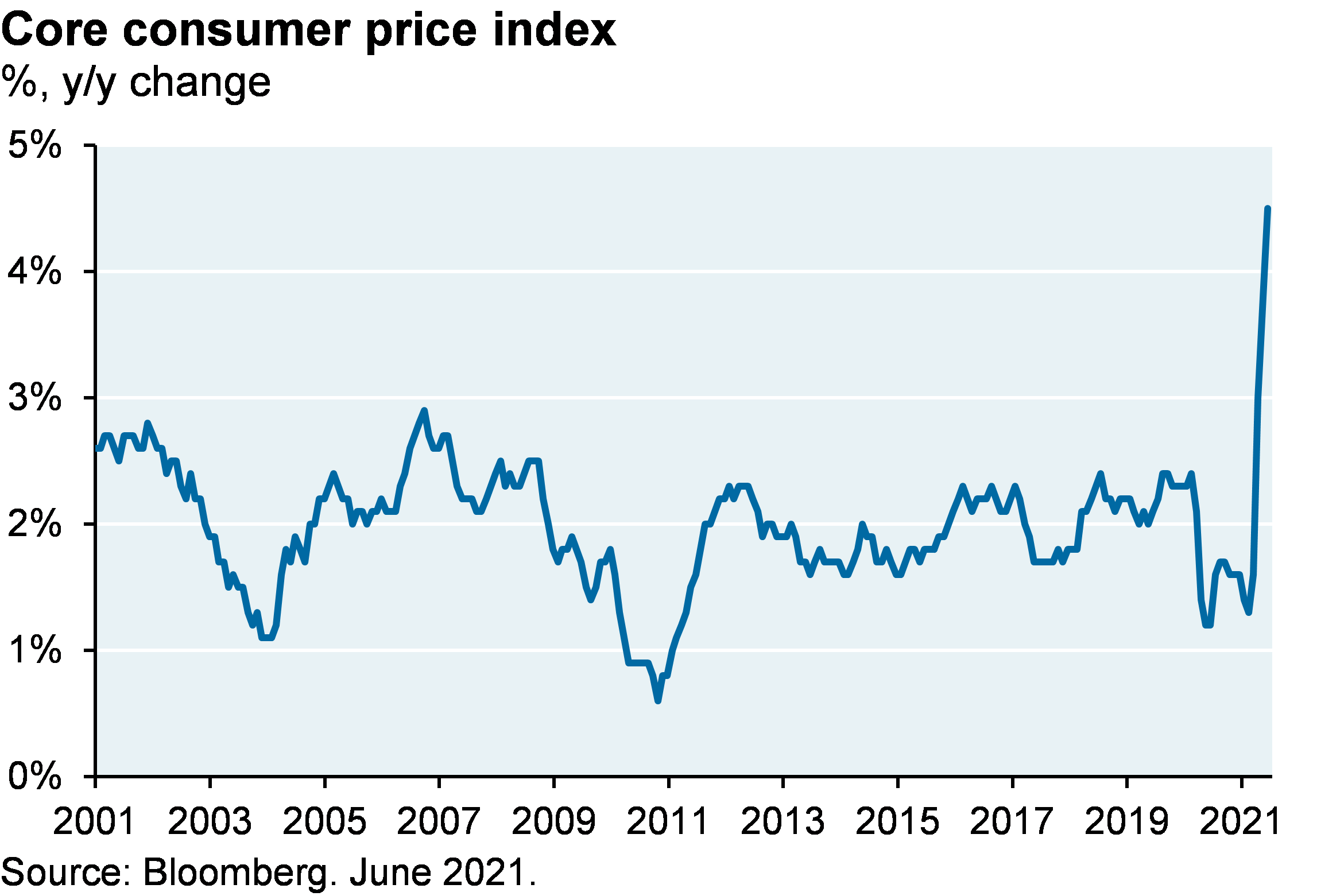
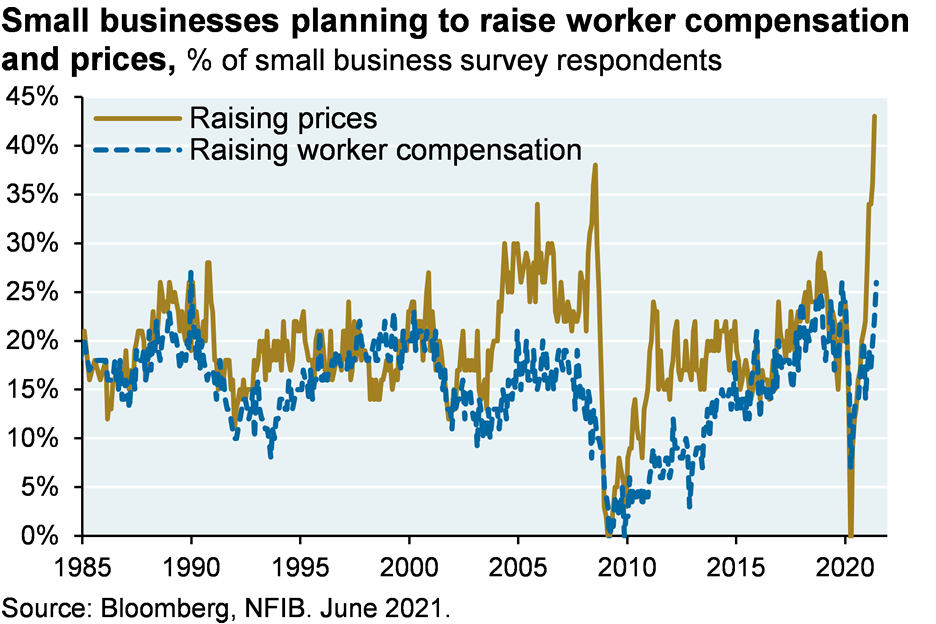
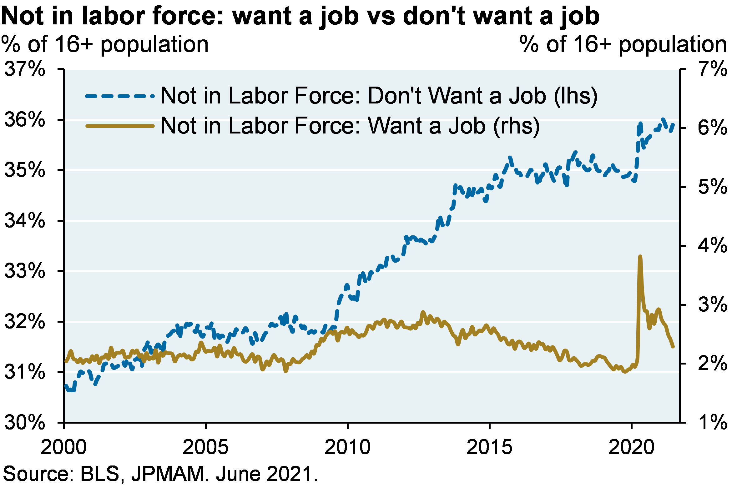
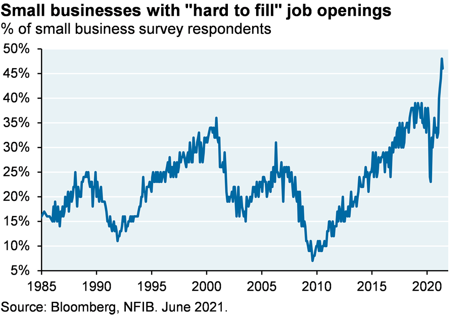
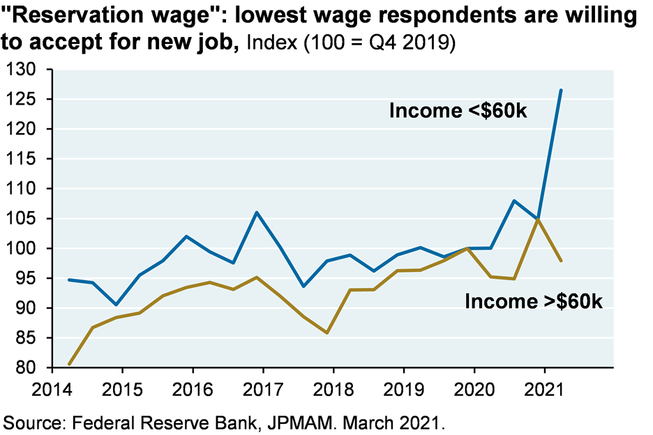
On goods, services and commodity prices, I think benign inflation expectations for 2022 are right. In a few months, the pig will move through the snake and these price measures should be within the Fed’s comfort zone. However, I’m less convinced about wage inflation. There’s a lot riding on the assumption that expiration of COVID unemployment benefits this fall will loosen tight labor markets. Perhaps it will. But the exhibits below show a lot of momentum beyond COVID unemployment payments: price hike intentions outstripping wage hikes, wages rising faster than employment, the highest number of “hard to fill” job openings and wage increases on record, more people who don’t want a job vs people who do, and a high “reservation wage” reflecting the cost of luring employed and unemployed persons to new jobs.
To be clear, rising wages are a positive development for the US economy but there are levels at which the Fed’s zero rate policy becomes inconsistent with them. To bring the whole US-China-wage-inflation discussion full circle consider the following, illustrated below:
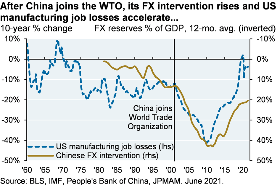
- In 2001, the West allowed China into the World Trade Organization…
- After which China immediately launched a massive and unprecedented intervention in its currency markets to prevent appreciation and boost its manufacturing and export shares….
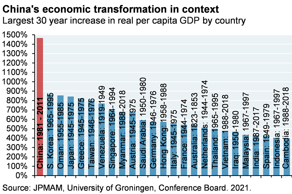
- Which allowed China to mount the greatest economic boom in post-war history…
- Flooding the US with cheap goods (the US import price index from China is at the same level as in 2004)…
- But which contributed significantly to an acceleration of US manufacturing job losses…
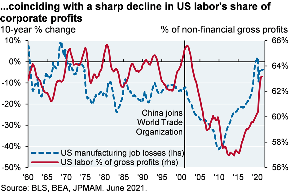
- And a collapse in the US of the share of gross profits accruing to labor vs capital…
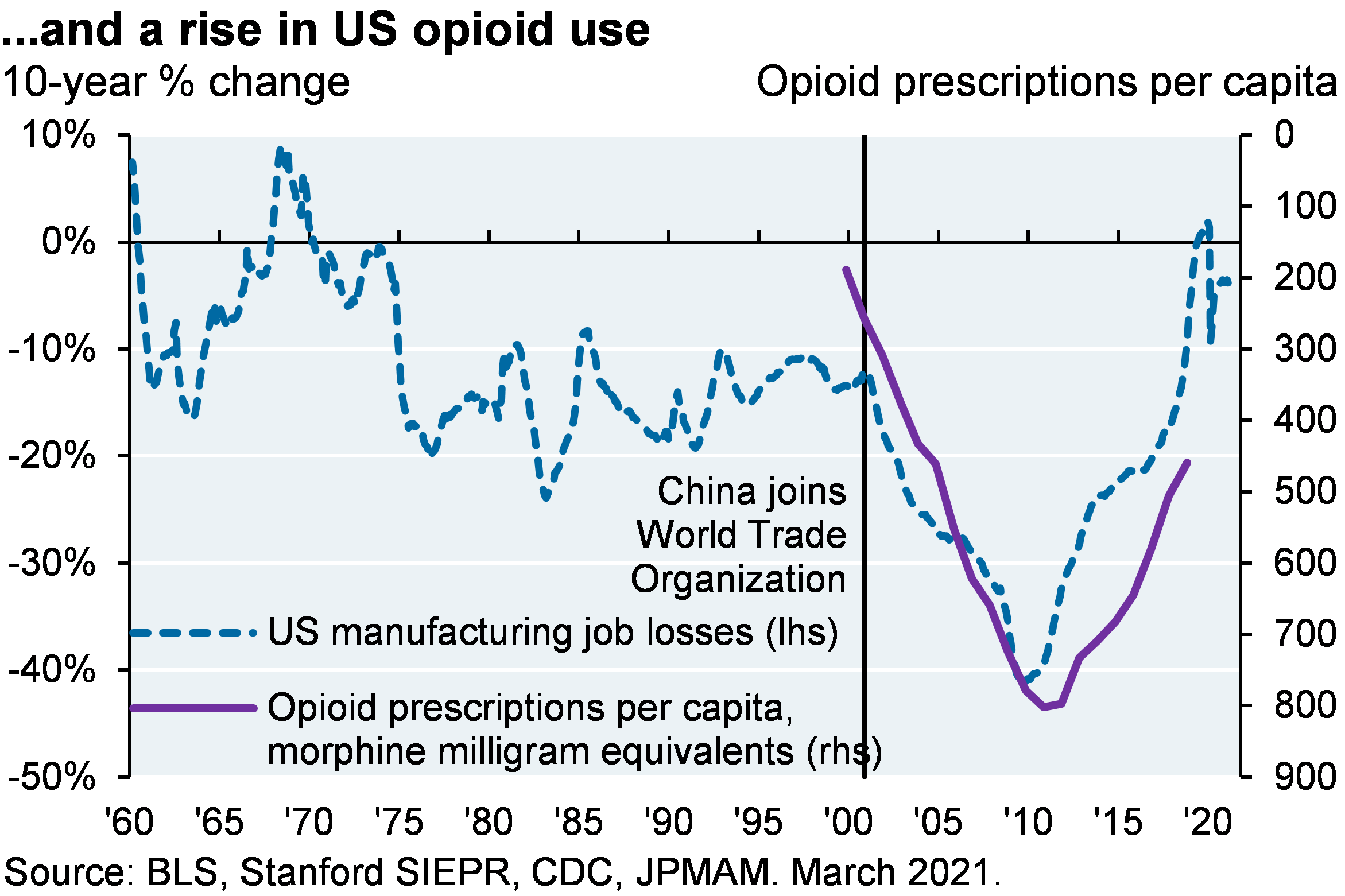
- Whose aftershocks include the opioid epidemic, rising polarization and growing wealth inequality
With wages now rising, the US labor share of profits is finally getting closer to its post-war average, something the Fed will be VERY reluctant to interfere with. As a result, if wage pressures remain my guess is that the Fed will not do much at first, creating more reasons to favor reflation strategies in portfolios in 2022 and beyond.
[1] "The Delta variant in the UK: how is it going?", David Mackie, J.P. Morgan Economic Research, July 6, 2021. See Table 3 for all the Delta impact data by vaccination status and age.
[2] https://www.nytimes.com/2021/02/14/world/europe/youth-mental-health-covid.html
09em211207174727
COVID and Thy Brother’s Keeper
COVID and the Delta variant; the Fed as firefighter and arsonist; US-China economic divorce picks up steam; and the pig-snake inflation timetable (how long until we know if there’s a permanent wage/price rise)
AUTOMATED RECORDING: This podcast has been prepared exclusively for institutional wholesale professional clients and qualified investors only, as defined by local laws and regulations. Please read other information which can be found on the link at the end of the podcast episode.
MR. MICHAEL CEMBALEST: Good afternoon and welcome to the July "Eye on the Market" podcast. We start this week with a discussion about the delta variant with some comments on the Fed; in wake of what's going on with DD; we talk about the U.S./China economic divorce. And then we conclude with a unified theory of a whole bunch of things: the U.S., China, wages, jobs, the World Trade Organization and investment – and implications for investment portfolios in 2022 and beyond.
So let's start with the delta variant. I think at this point the information that's out there is doing a good job of summarizing the facts and research on the ground. There are a small percentage of breakthrough hospitalizations and deaths for people that are vaccinated taking place in the Western world. But the main risks are overwhelming affecting unvaccinated and immunocompromised people that either have no or insufficient antibody responses.
From an investor's perspective I think the developed world equity market should be able to withstand this delta variant, and we added a chart on our virus web portal to explain why it looks at vaccination, mortality by country, along with its economic throw weight. And what you can see is that the places that have the highest levels of mortality and low vaccination tend to have very low global economic throwaway in terms of trade, FDI portfolios and stuff like that.
And in some ways the most important chart to watch is the one from the U.K. where there is a massive spike in delta infections that has not led to a surge in overall hospitalization and mortality.
This masks what's going on underneath, which is that the unvaccinated people over 50 in the U.K. are suffering substantially – 14 percent of the delta infections ended up in the hospital and almost four percent of them died. But it doesn't show up in the overall numbers because in the U.K. 96 percent of all people over 50 are vaccinated. So the cohort of at-risk, unvaccinated people over 50 is pretty small. In the U.S. that figure that was 96 percent over 50 vaccinations in the U.K.; in the U.S. that number is 75 percent; lower in a lot of places. And in the emerging world obviously the percentages are much lower than that.
Even so, my primary message to the group was that the train has left the station in the U.S. and a lot of other Western countries and the delta variant is going to have a large impact on certain individuals but not on markets themselves. Most federal and local governments in the West are unlikely to reimpose mobility restrictions, particularly since we're dealing with a cohort that's exposed that are mostly unprotected by their own volition.
And the policy seems to be – this is not my point of view – but the policy seems to be you are not "thy brother's keeper" if he chooses to expose himself, irrespective of whatever his reasoning might be. I thought it was interesting that even the New York Times, which I was surprised to see, published a piece on how younger generations are bearing unacceptable sacrifices to protect older ones. I really doubt The Times would have published this while Trump was president for fear of being seen as aligning themselves with Trump, but with the new administration in DC it's now safer to make your intergenerational preferences clearer.
So the bottom line is that there is a substantial number of unvaccinated people over 50 who are at risk in the developed world, but given the shrinking size of that cohort I don't think that you're going to see governments do that much permanent about them that affects markets.
We had a reasonably optimistic stance heading into this year, mostly based on the notion that there's a lot of pent-up household and corporate demand that's going to have to be met through increased spending, increased hiring, increased investment, and all of that's playing out. But boy, a lot of that is priced in. We're now halfway through the year; the markets have done extremely well.
And when we take stock of things like massive number of secondary offerings from unprofitable companies, a collapse in high-yield bond spreads to tightest levels on record, surging home prices, and then just really bad underwriting discipline in things like the loan markets. It seems like we're getting closer to the edges here of where the Fed has wrung every bit of investment aggressiveness that they can have priced into financial markets.
And so a couple things from here: I think earnings growth is going to be the driver of markets; we've run out of room for multiple expansion. And I think the risks are more balanced from here, whereas over the last 18 months it was pretty clear that you were going to be getting a stimulus-related boost to overall markets. And so the risks appear a little bit more two-sided right now.
We also get into a discussion of DD, the 25 percent decline in the stocks since China announced its enforcement actions has refocused a lot of people on the risk of Chinese tech stocks and the U.S. economic divorce with China.
Before getting into the details on that, however, this is an example where there's a little bit too much attention being paid to a couple of stocks that have gotten hit and not enough to some of the broader context. The China share of imports into the U.S. is only a little bit below the 2018 pre-trade war levels. The U.S. stocks that are exposed to the trade war are doing fine versus the market. Semiconductor exports to China are still rising, despite the situation with Huawei. U.S. investors continue to accumulate Chinese stocks and bonds. And there's no sign that China, like Russia did, is engaged in any kind of economic warfare via its treasury holdings.
So there's a bunch of stuff that's more normal than abnormal as it relates to the U.S.-China relationship. The clearest thing that you could say is suffering is when you look at the bilateral foreign direct investment data in both directions it's slowed down pretty substantially from where it was let's say in 2016 and 2017.
That said, the Biden Administration has unleashed an alphabet soup of China-targeted policies related to U.S. data: consumer apps, U.S. investment in Chinese companies affiliated with the military requiring the delisting of Chinese companies that don't comply with SEC data requirements, throwing tons of money at U.S. semiconductor and stem companies, congressional oversight of mergers involving China and gifts by any Chinese entities to U.S. institutions. Buy America requirements for infrastructure projects, in terms of iron and steel, sanctions on China for cyberattacks, intellectual property theft, the sanctions on U.S. and Chinese companies knowingly using forced labor. It actually got to the point where some Progressives went to the Biden Administration and said, "Hey, can you please cool it on some of this stuff? Because we may lose China as a partner in climate discussions." In any case – and then on top of that China may have a possible partnership with the Taliban in Afghanistan; I can't imagine that would play well in DC either.
Even with all of that alphabet soup of anti-China policies the larger risks facing Chinese tech stocks and ADRs, which have performed pretty poorly over the last few months come from Chinese domestic policy concerns, rather than the U.S. economic conflict with China. Chinese regulators – and some of their actions have been kind of impressive when you think about the regulatory lapses that have taken place in the U.S. over the last 25 years – Chinese regulators have been very active with guidelines aimed at curbing monopolistic practices, limiting lax underwriting activities – that's what canceled the ANT [phonetic] financial IPO, policing data privacy, addressing worker mistreatment, reforming industries.
And so while the timing of the enforcement actions on DD suggests that they also wanted to sense a message to U.S. politicians, the domestic policy concerns were really the driving factor behind this decision to require mobile stores to rule that out.
And then on top of that, over the weekend China proposed new rules requiring companies with more than a million users that want to list in foreign countries to undergo a cybersecurity review to make sure that the data "won't be maliciously exploited by foreign governments," is the way they phrased it, and they'll also look at national security risks as well.
So until very recently Chinese and U.S. tech stocks traded at roughly the same multiple of around 25 times forward earnings. These new risks that are mostly coming from China, rather than from the U.S., suggests that there should be a wider gap between them.
The last section in this week's piece is titled "The Pig and the Snake," and has to do with a unified theory we have of the U.S., China, wages, jobs, inflation, the World Trade Organization, and implications for investment portfolios.
So the U.S., as we mentioned, is booming; capital spending and hiring indicators should give us some tail winds that last a few month. There is some whacky inflation readings that you've probably read about: used car prices, strawberries, motor vehicle insurance. But most professional economic forecasters and the market-based inflation expectations are looking past them.
And I think that's probably right. I think goods and services and commodity-priced inflation in 2022 will come back down. And the pig will move through the snake, so to speak, and the inflation indicators should be within the Fed's comfort zone.
The thing that's much more concerning is wage inflation. There's a lot riding on the assumption that the expiration of COVID and unemployment benefits this fall will loosen labor markets. And they probably will, to some extent. But when you look at the momentum in labor markets there's a lot going on other than the COVID unemployment payment situation. Price hike intentions are outstripping wage hikes; wages are rising faster than employment itself. You've got the highest number of hard-to-fill job openings and wage increases on record. You have a lot more people who don't want a job versus people that do.
And then there's thing called the Reservation Wage, that reflects the cost of luring employed and unemployed people to new jobs. And that's been going up. And so there's a lot brewing in here that suggests that we're heading into a period of substantially-rising wages at a pace that's faster than what we've seen in a long time.
Now to be clear, rising wages are a good thing, a positive development for the U.S. The challenge is there's a level of wage inflation that's inconsistent with the Fed's zero rate policy. And here's where this whole U.S.-China discussion comes full circle. And so you'll probably want to look at the charts that correspond to this discussion, but let me just walk you through how I see it.
So in 2001 the West finally relented and allowed China into the World Trade Organization. On a dime China immediately launched the most aggressive and unprecedented intervention in its currency markets that anybody's ever seen. The goal was to prevent appreciation of currency in order to boost its manufacturing and export shares. And, boy, did it work. China experienced the greatest economic boom in postwar history, absolutely outstripping the number two country, which is Korea, by a mile in terms of its fastest 30 years of growth.
Unfortunately that Chinese economic boom was not a rising tide lifts all; there were some zero sum games issues in there. Their currency intervention and other policies contributed substantially to a collapse in U.S. manufacturing jobs. They were declining at a slow pace during the '60s all the way through the end of the '90s, but then the U.S. manufacturing jobs completely collapsed after China joined the World Trade Organization.
And then you also had a collapse in the U.S. in labor's share of profits, right? These profits either go to labor or capital and there was a collapse in labor share of profits. And then from that we've got all sorts of aftershocks related to opioids, polarization and growing wealth inequality.
So now wages are finally rising again and labor's share of profits is finally getting closer after a 15- to 20-year lull, to where it was for most of the postwar era. The Fed's going to be really reluctant to interfere with that. And as a result, as the wage pressures build I don't think the Fed's going to do much of anything upfront, and that creates, from an investor's perspective, even more reasons to favor reflation strategies in portfolios in 2022 and beyond. So when you get a chance you can talk to your advisors about that those reflation strategies are. But that's how I see it.
So when you look at what's going on in the labor markets now you can connect, in my view, what the Fed is up to everything, dating back to the decision to allow China into the World Trade Organization in 2001, and what the costs and benefits of that decision was to the United States.
So anyway, thank you very much for listening and we will talk to you next time.
AUTOMATED RECODING: Michael Cembalest's "Eye on the Market" offers a unique perspective on the economy, current events, markets and investment portfolios and is a production of JPMorgan Asset and Wealth Management. Michael Cembalest is the chairman of Market and Investment Strategy for JPMorgan Asset Management and is one of our most renowned and provocative speakers.
For more information please subscribe to the "Eye on the Market" by contacting your JPMorgan representative. If you'd like to hear more please explore episodes on iTunes or on our website.
This podcast is intended for informational purposes only and is a communication on behalf of JPMorgan Institutional Investments, Inc. Views may not be suitable for all investors and are not intended as personal investment advice or as solicitation or recommendation. Outlooks and past performance are never guarantees of future results. This is not investment research. Please read other important information which can be found at www.JPMorgan.com/disclaimer-EOTM.
[END RECORDING]