2023-08-02
The Rasputin Effect: Global resilience to higher rates
Scientists investigating the history of the Tsar's family examine photographs of Grigori Rasputin, Moscow, 1990
The Rasputin Effect: Explaining global economic and equity market resilience in the face of the fastest central bank hiking cycle on record; China reopening flops due to housing overhang
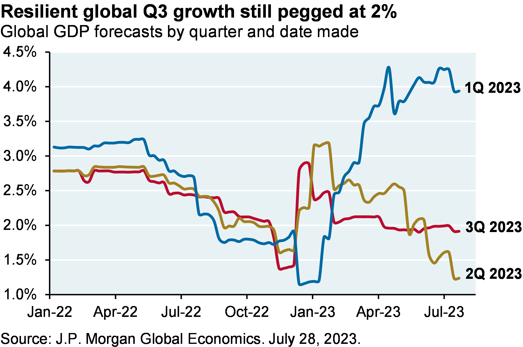
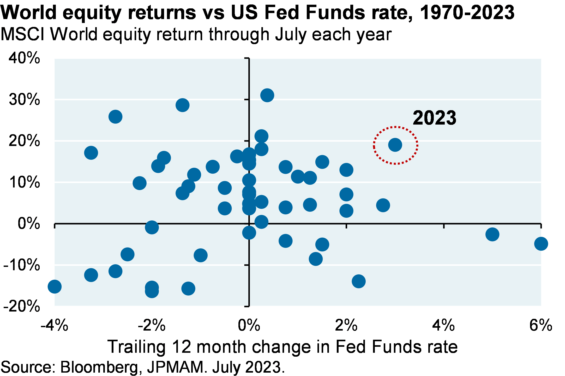
Legend has it that Rasputin was poisoned, shot twice, beaten and then drowned before finally succumbing to Russian nobles trying to end his sway over the Czar. I’m reminded of this (probably false) account when looking at global resilience. Despite 400-500 basis points of rapid policy tightening in the US and Europe (since 2021 ~95% of the world’s central banks have raised rates, even more than during the 1970’s inflation shock), and despite a very tepid Chinese recovery, global Q3 GDP growth is still projected to be ~2% and the MSCI World Equity Index is up 18% this year.
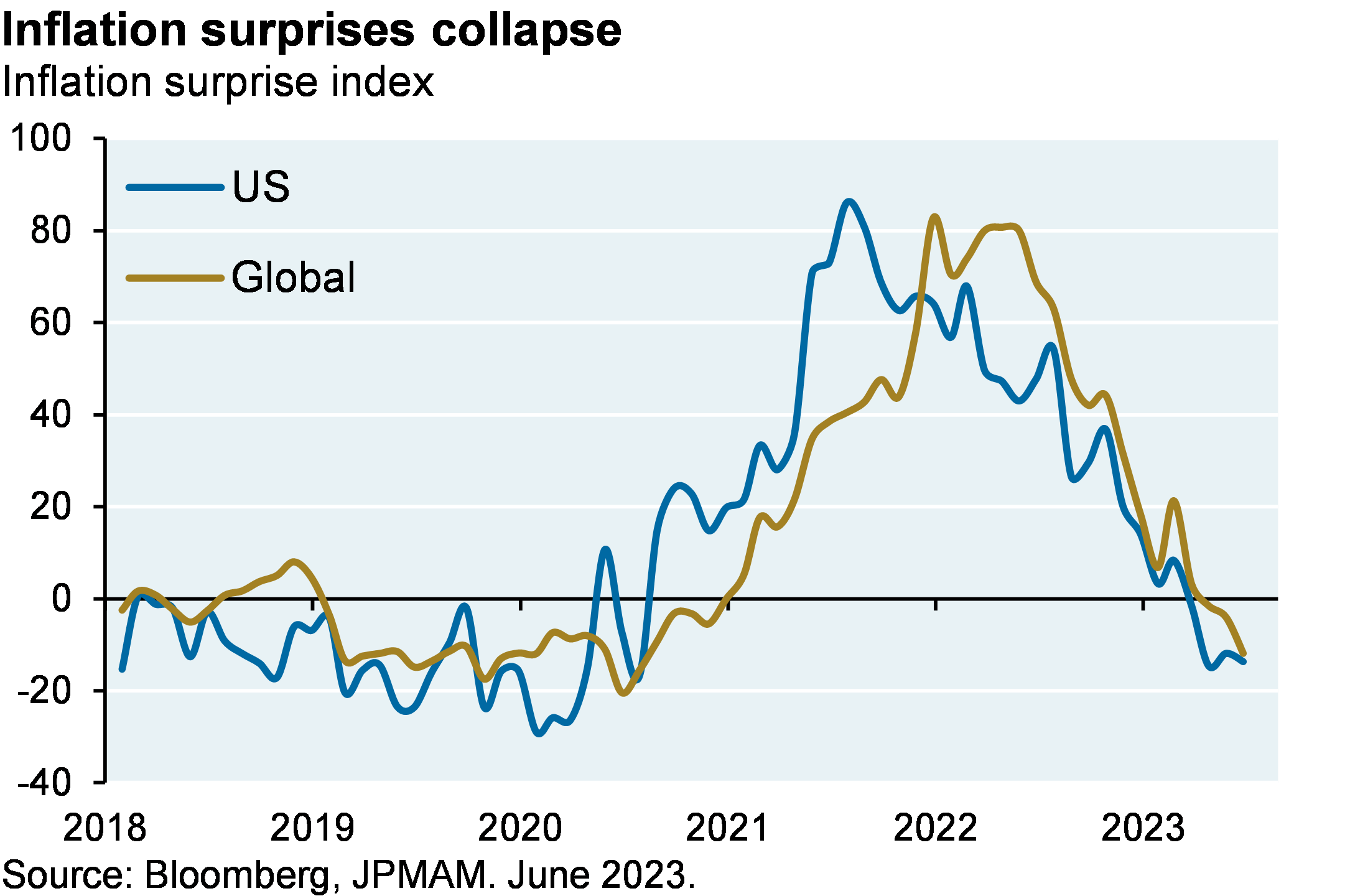
How can we explain this? The obvious place to start: the decline in inflation surprises and in related measures (core, trimmed, sticky and median measures of consumer price inflation; NY Fed underlying inflation gauge; “truflation”; the Global Supply Chain Pressure Index, the jobs-workers gap, etc). But there are 6 other factors worth reviewing as well, which is the subject of this month’s note.
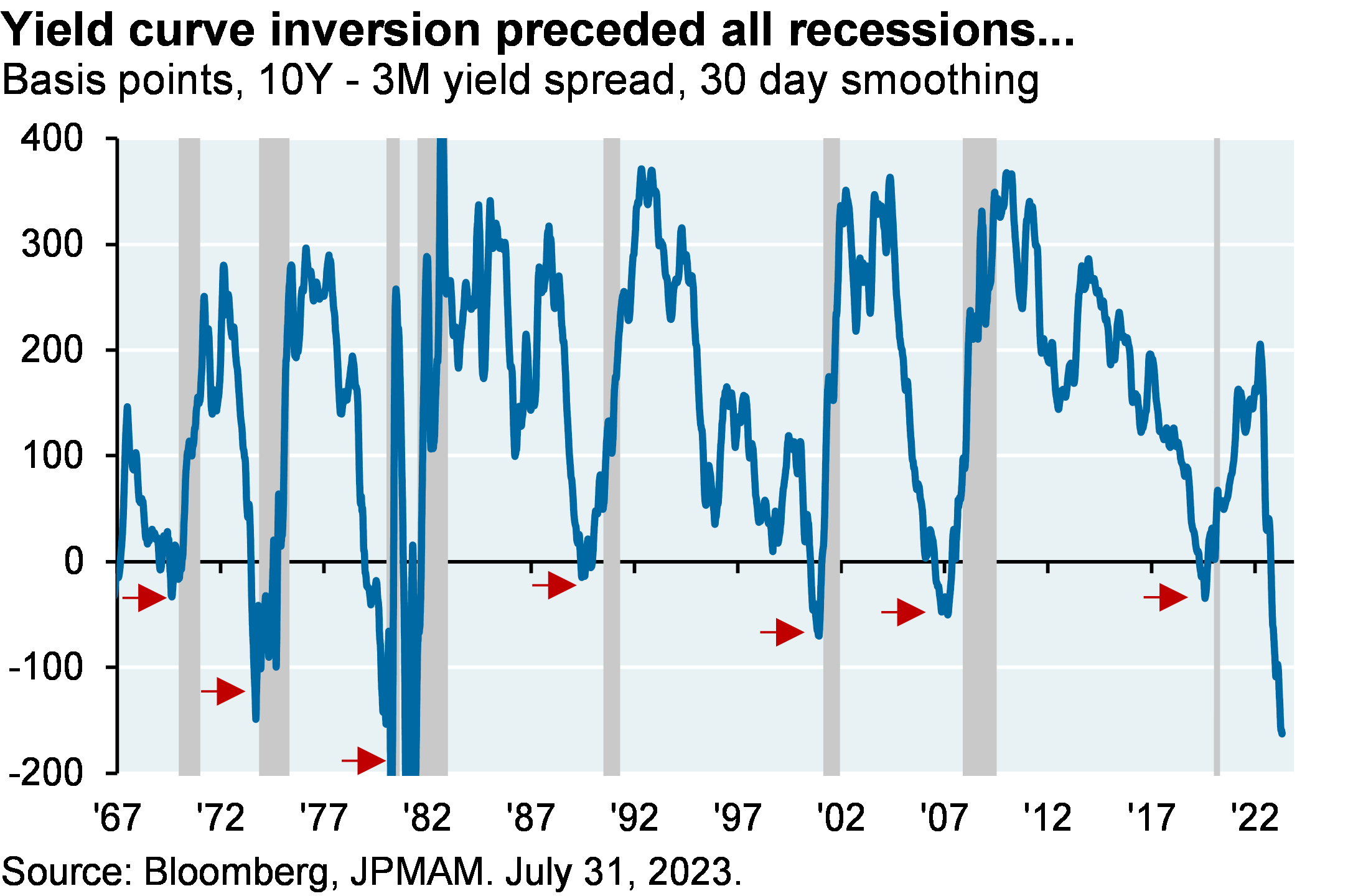
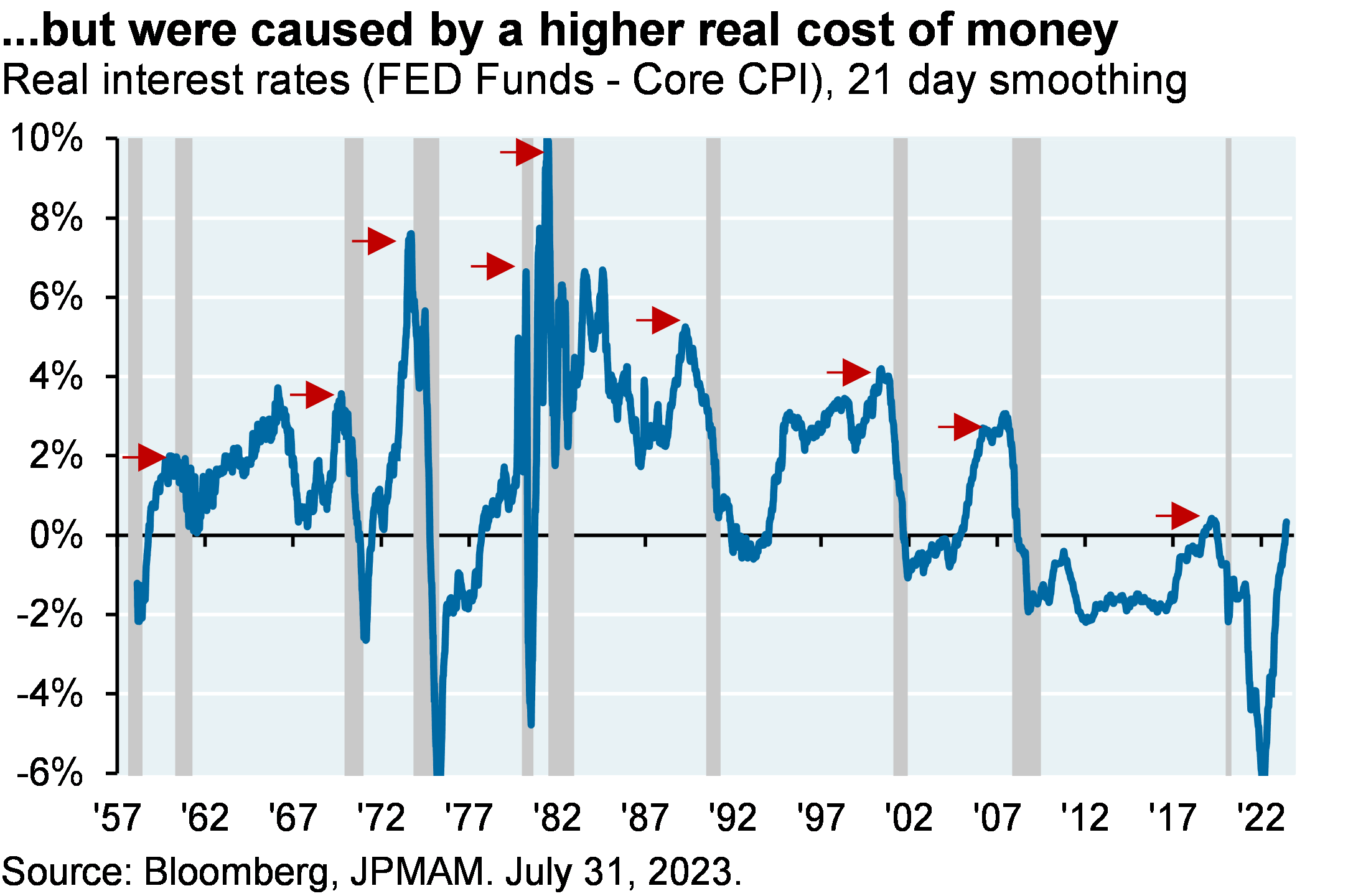
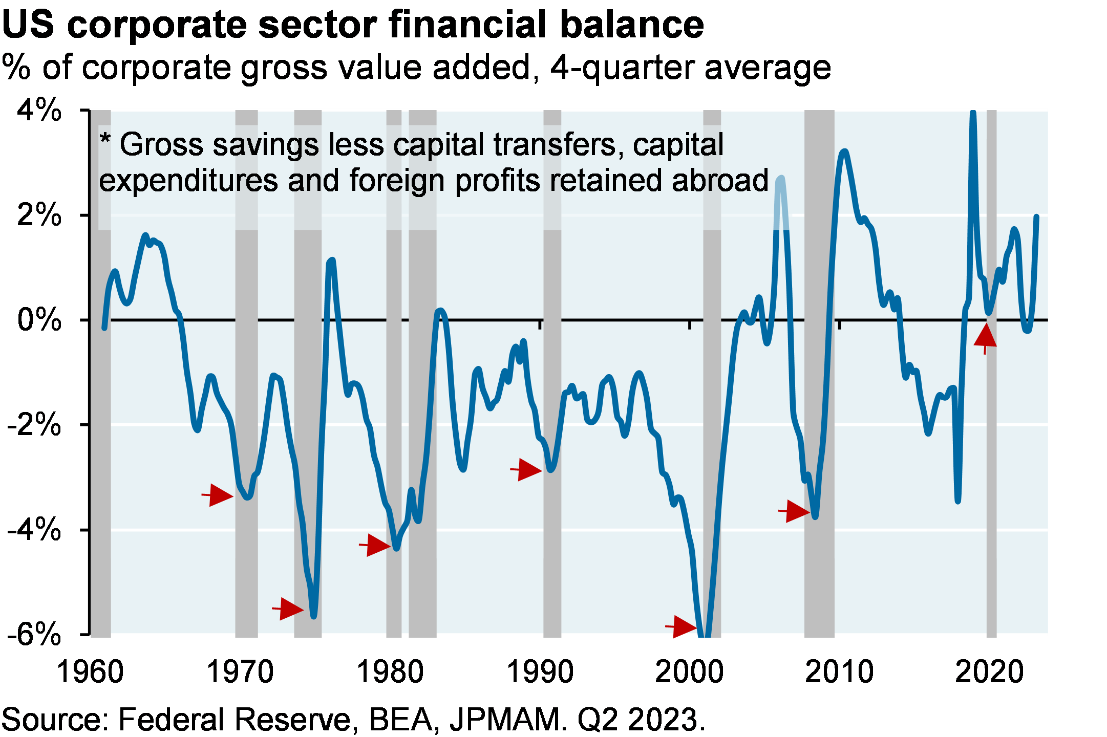
[1] The “inverted yield curve -> recession” argument is premature. Yes, inverted yield curves tend to precede recessions as shown on the left. But why was it such a consistent signal? Before prior recessions (other than COVID), yield curve inversion reflected policy rates that were restrictive in real terms (i.e., relative to inflation). This time, policy tightening in the US is barely restrictive at all, as shown on the right. And while a simple read of the yield curve points to recession, the health of the US corporate sector does not: the corporate sector financial balance is still in surplus, a condition which has never preceded a recession (see chart below).
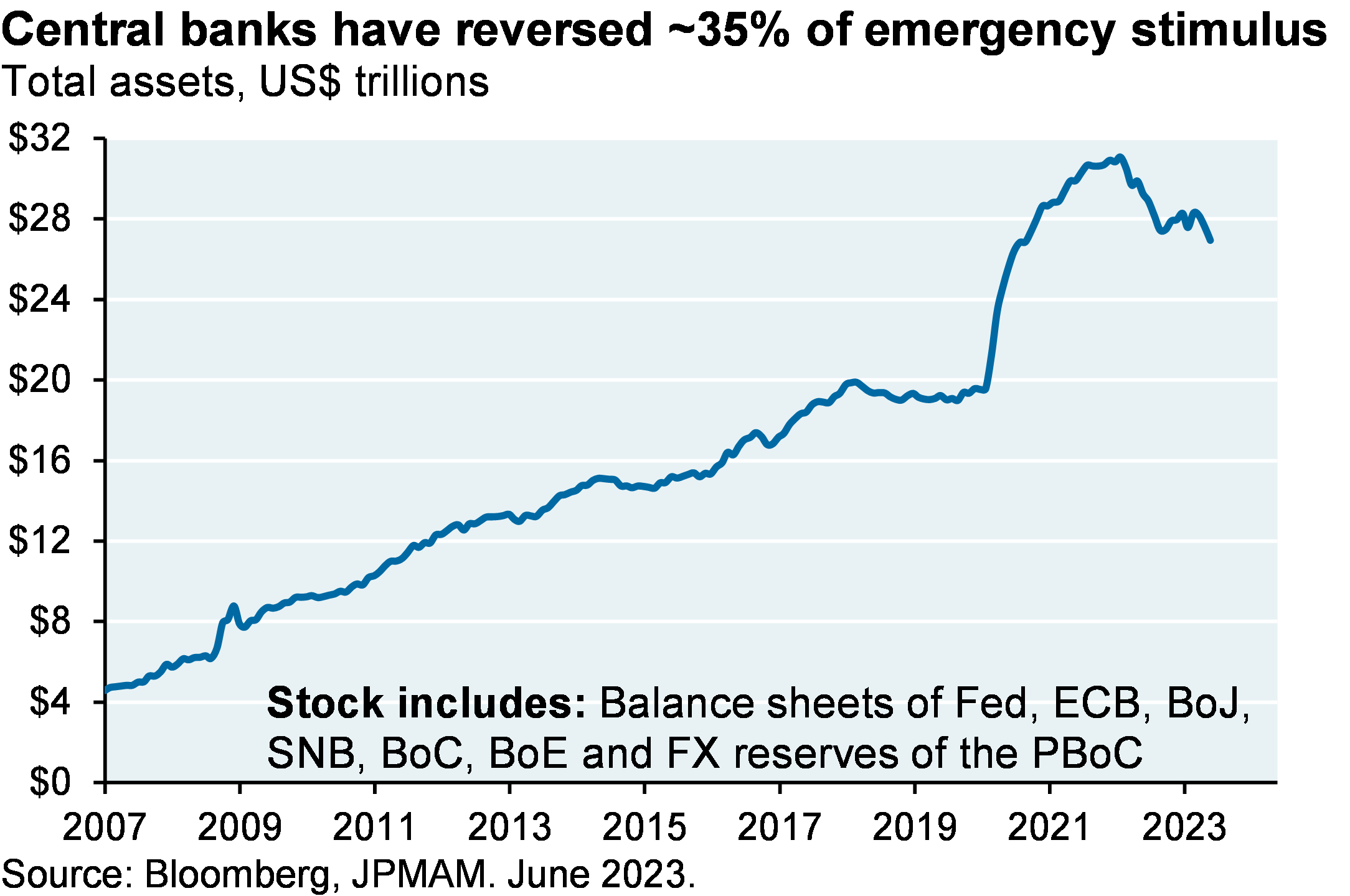
[2] Central banks have only removed around one third of the $11 trillion in global liquidity they created in 2020/2021. In other words when considering points #1 and #2, there’s still plenty of liquidity in the system and the cost of money is not prohibitive.
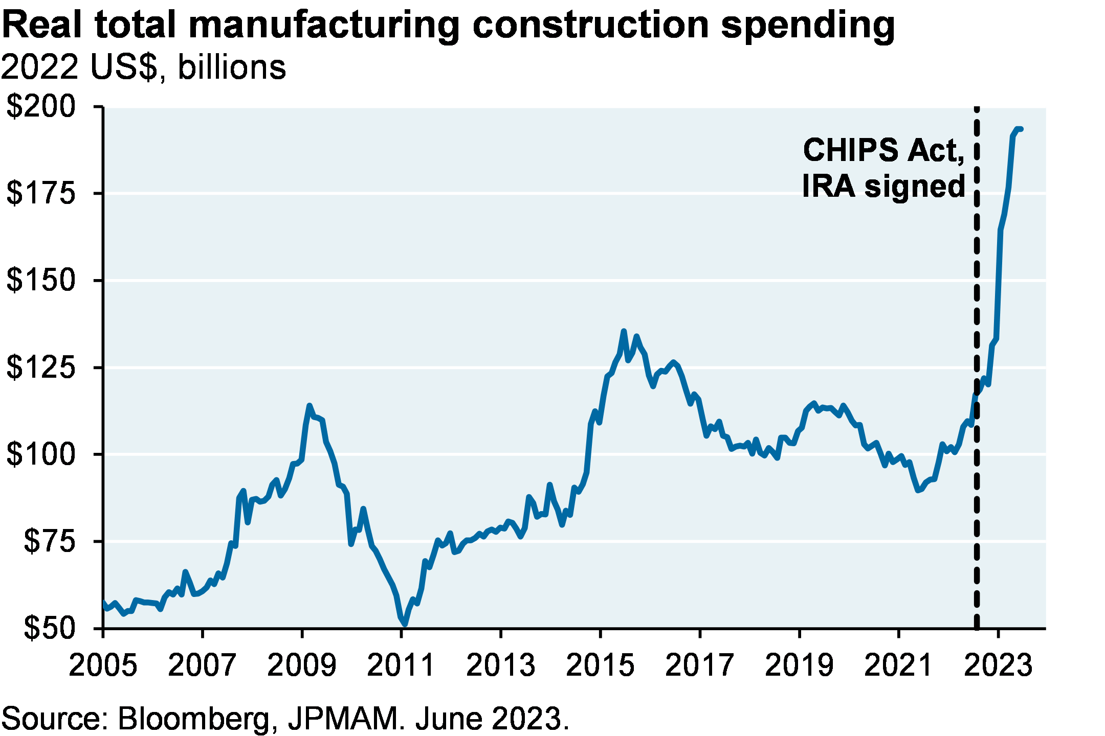
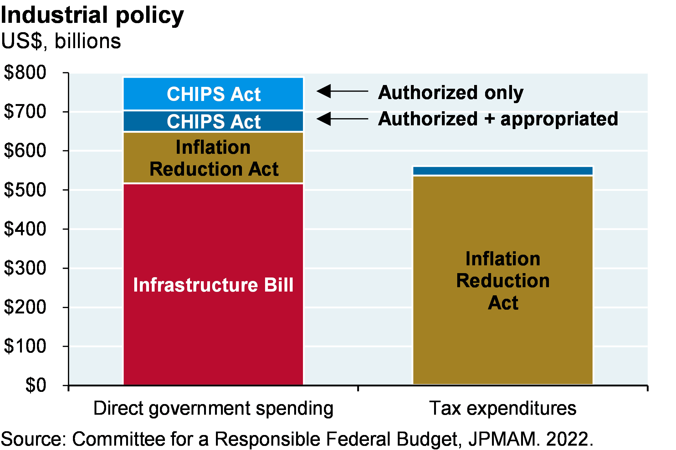
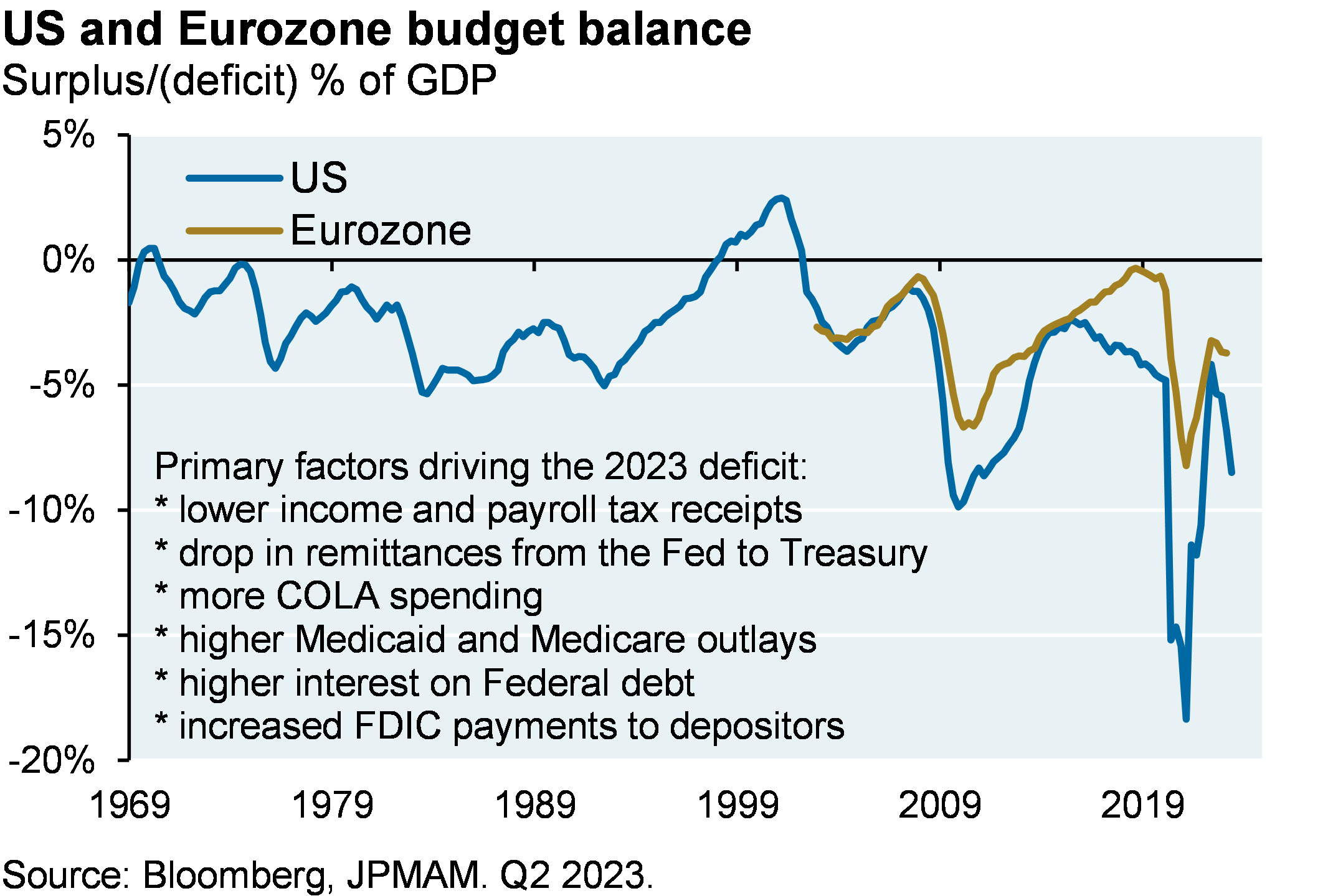
[3] Biden’s industrial and fiscal policies offset part of the drag from higher policy rates. The charts below show the construction bounce in the manufacturing sector, and the direct government spending and tax incentives associated with semiconductor, infrastructure and energy bills. And don’t look now, but US fiscal policy has become very loose again: the latest fiscal deficit is not far off the peak deficit during the financial crisis of 2009. A recent note from our economist colleagues goes into the details1.
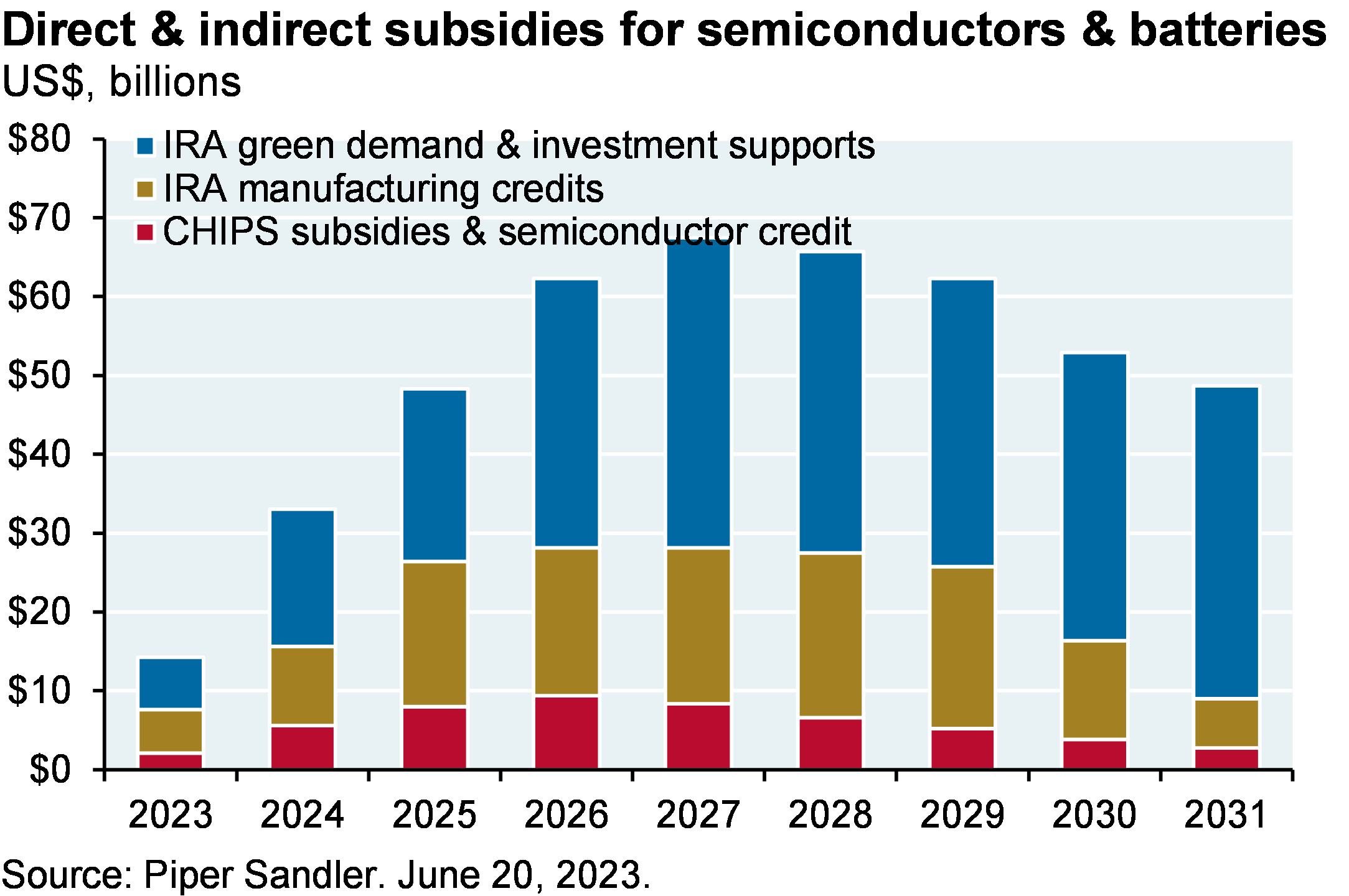
Bidenomics, opioids and the Third Man. I’ve got questions on the long-term inflationary impact of Bidenomics. Two examples: the ultimate cost of US semiconductor production compared to Taiwan, and the cost of energy systems with large amounts of renewable power that also require substantial backup thermal power and/or energy storage. Also, the notion that hiring IRS agents will raise enough money to finance the energy bill and reduce the deficit is to me totally implausible. But there’s one thing to be optimistic about: the potential for industrial policy to partially revitalize US manufacturing communities that were left in the dust by China’s entry into the World Trade Organization. I’ve written before on the connection between post-WTO Chinese FX intervention, US manufacturing job losses and US opioid addiction rates (see Eye on the Market 7/13/2021). The “battery belt” that will stretch from Michigan to Georgia through Ohio, Kentucky and Tennessee will be welcome news in many communities.
I never do media appearances but I did accept an invitation in July to speak on a video podcast called The Compound which is moderated by money manager Josh Brown. The reason I accepted: it’s a long form 90-minute show that allows for in-depth discussion and debate that does not occur in any other media I’ve seen. Anyway, they end the show by asking for a book and movie recommendation. I mentioned “Empire of Pain” by Patrick Keefe on the family behind the opioid crisis, and the 1949 film The Third Man. The connection: the ferris wheel scene in which Orson Welles describes to Joseph Cotton how he rationalizes his tainted penicillin scheme.
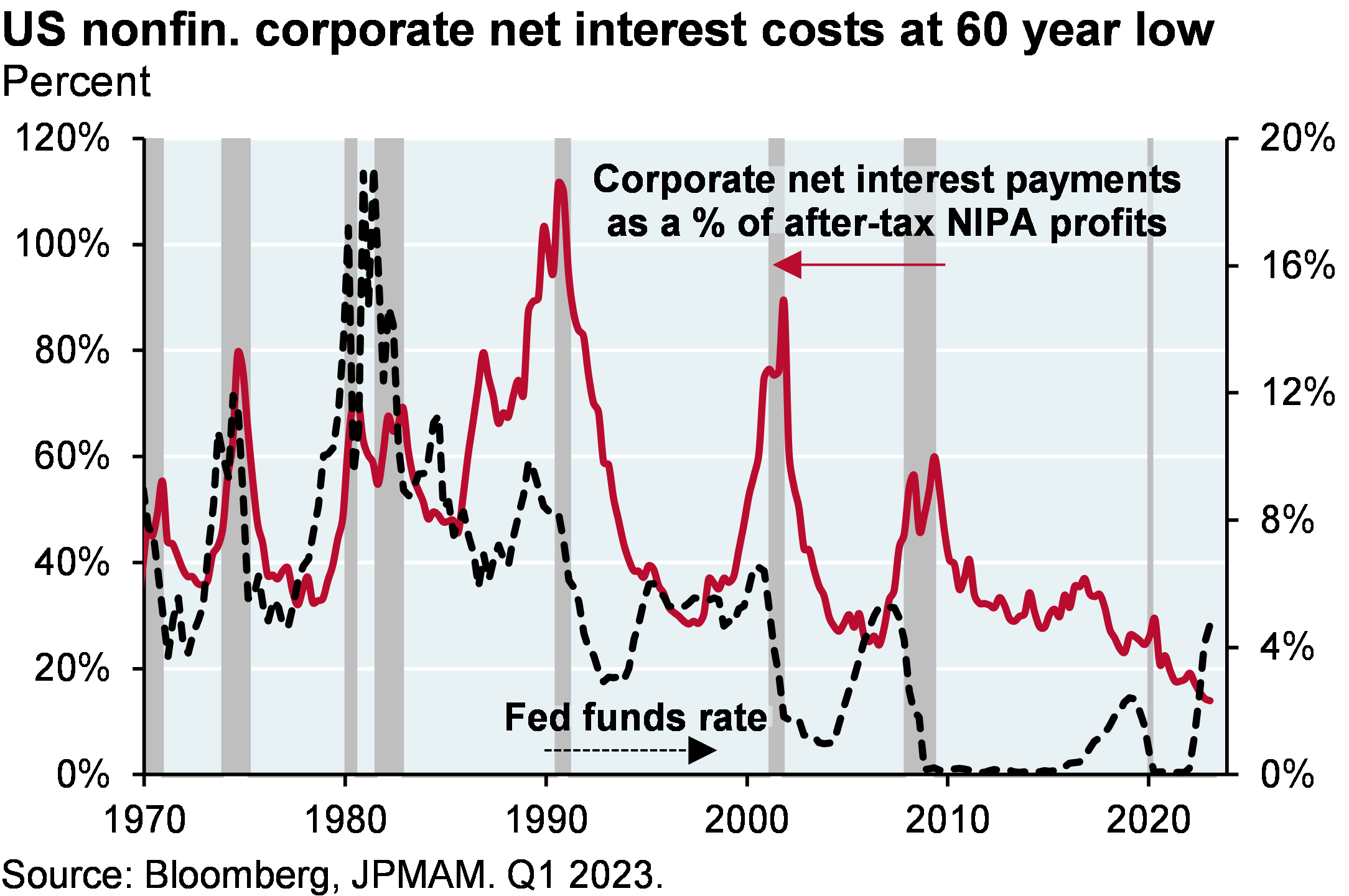
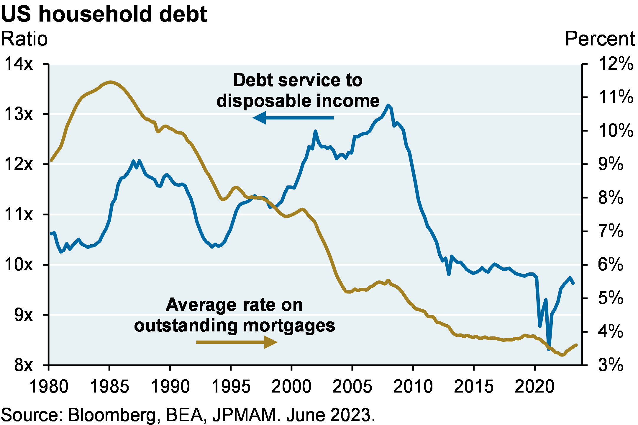
[4] Rising interest rates will take time to flow through to profit margins and household balance sheets. In contrast to some US banks that made extremely poor decisions to extend asset duration at the lows in rates2, many US and European companies extended liability duration and enjoy the lowest levels of interest expense to cash flow in decades. As shown below, for the first time on record, corporate interest expense is falling as the Fed is hiking rates. US household debt service costs are also low. One reason: the average coupon on outstanding residential mortgages is ~3.5%, immunizing many homeowners from the spike in mortgage rates to ~7%. Credit card and auto delinquencies are rising, but from low levels and are now back at 2010-2020 averages.
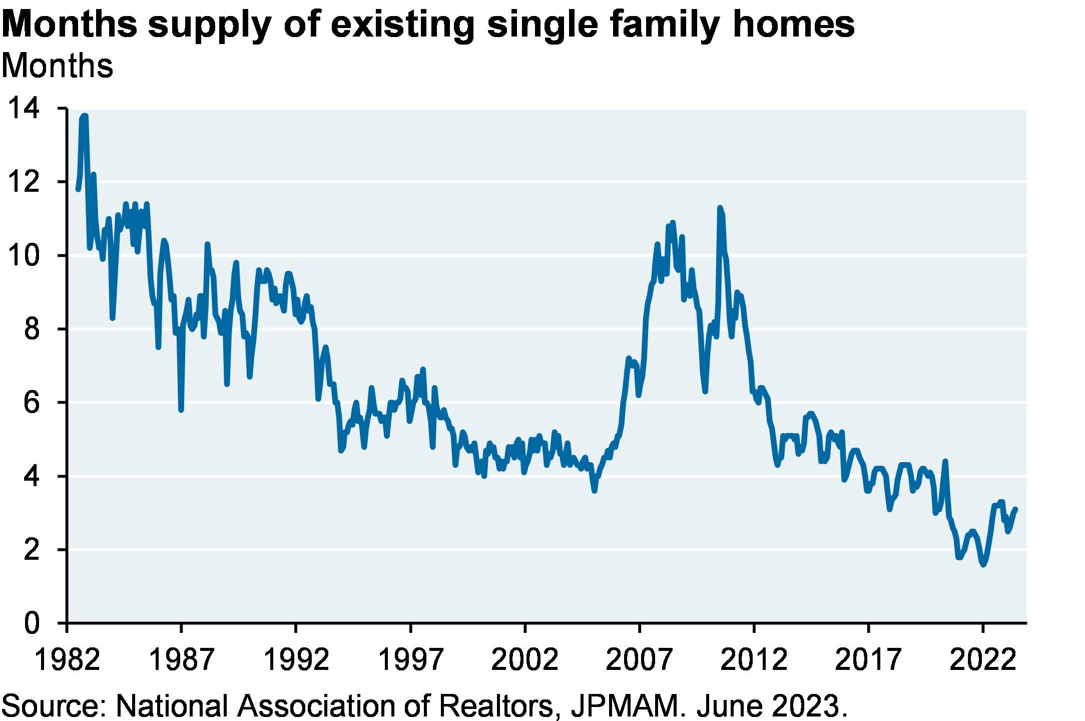
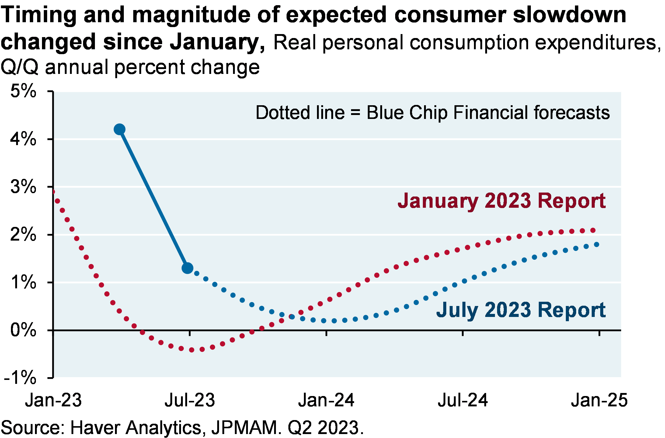
While higher interest rates hit US housing pretty hard, the lowest housing inventory in decades3 offsets what might have been an even sharper decline in home prices, permits and starts. Also: tight US labor markets have sustained personal income and spending. While goods spending is weakening, services spending and auto spending are holding up. Note how the timing and magnitude of the expected consumer slowdown has changed since January. Tech layoffs have declined by 50%-75% from peak levels according to Challenger data; the AI frenzy came just in time for some.
Note that the US government is not nearly as immune from rising interest rates as households or companies. Net interest payments to GDP have already risen from a post-war low of 1.2% in 2015 to 1.9%, and are heading to 3.2% by 2029 which would match the post-1960 high last seen in 1991. See our American Gothic piece from January for more on the long-term unsustainability of US Federal debt, entitlement spending and interest.
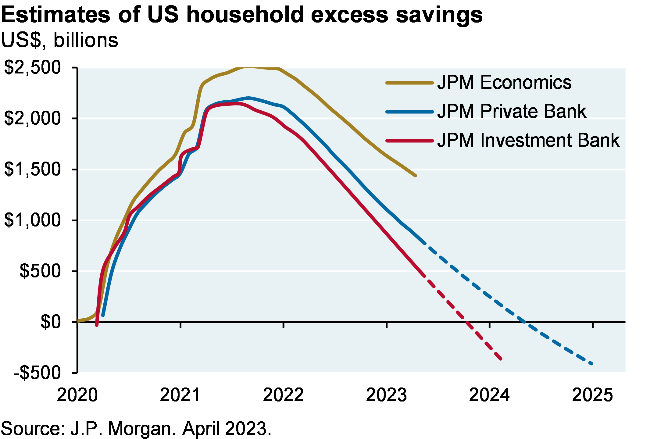
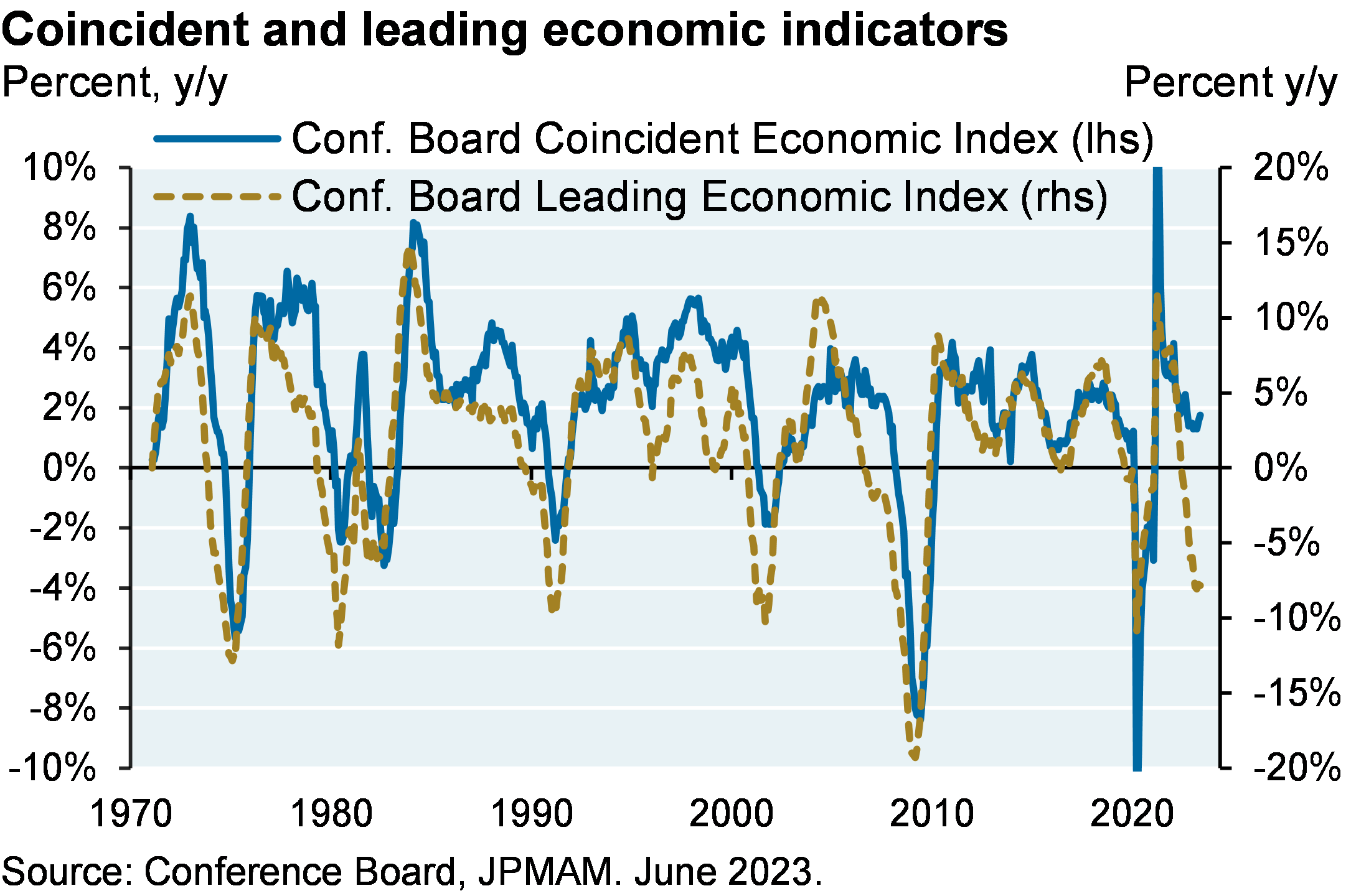
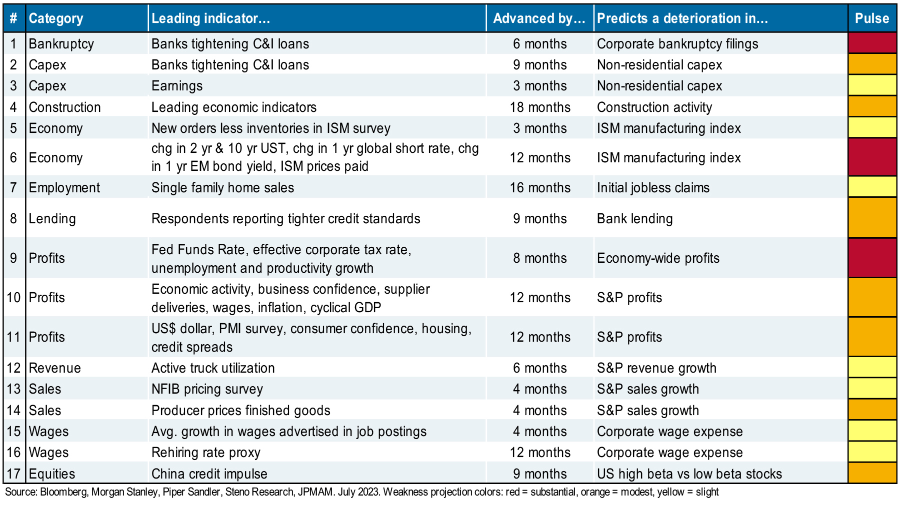
[5] Just wait, economic weakness is coming later this year or in early 2024. Monetary policy tightening works with a lag and is occurring after a period of unprecedented stimulus. Excess US household savings are projected to run out sometime in 2024, and while current economic indicators are robust, there’s weakness in Conference Board leading indicators.
We also monitor the longer-dated indicators shown in the table. The overall pulse does not point to a significant contraction, just to modestly weaker US conditions in 6-9 months. Furthermore, new orders less inventories (#5) has improved three months in a row. We watch this metric closely given its leading signal on the PMI index, a useful predictor of economic growth and stock market returns over the long run.
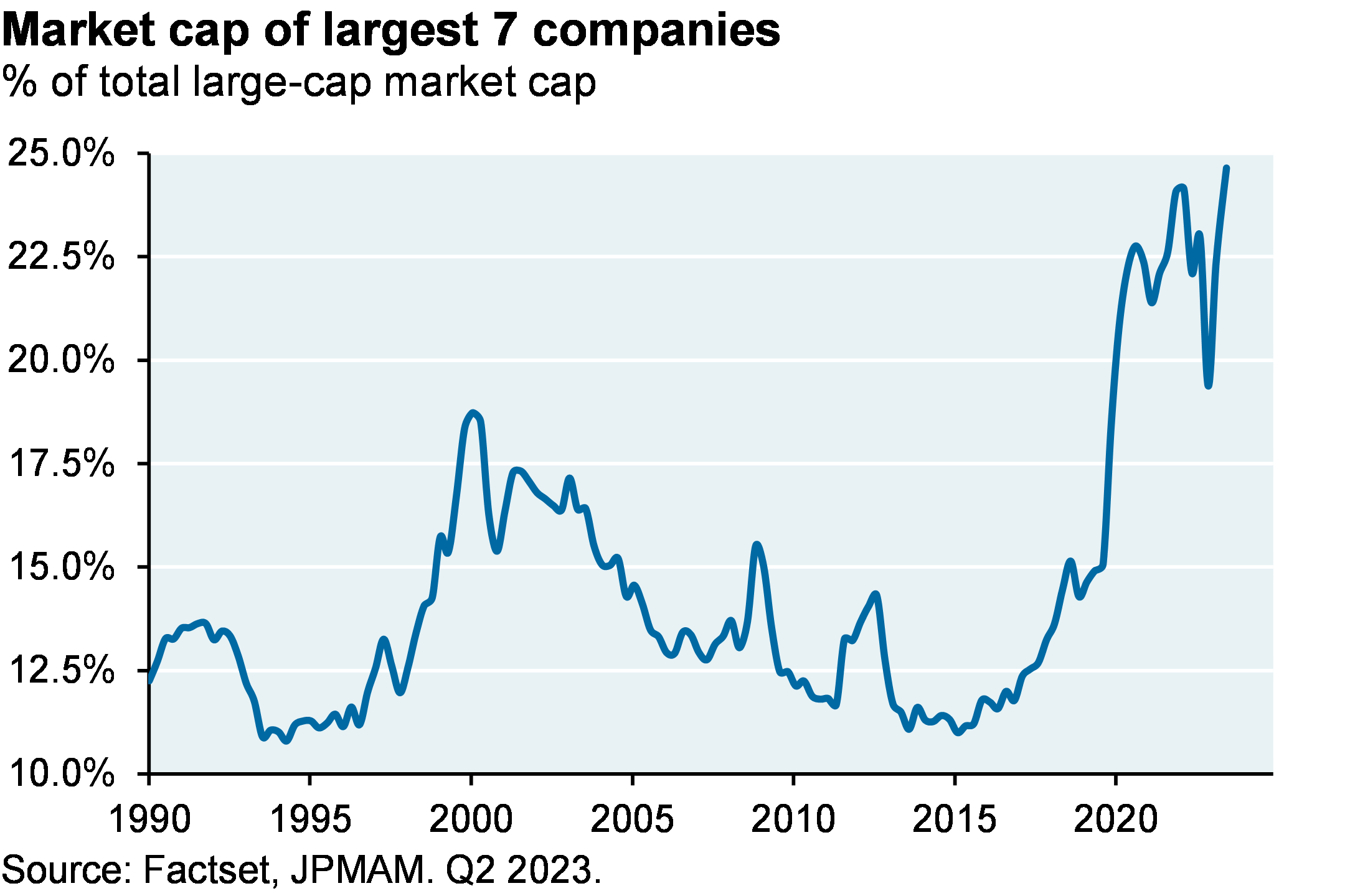
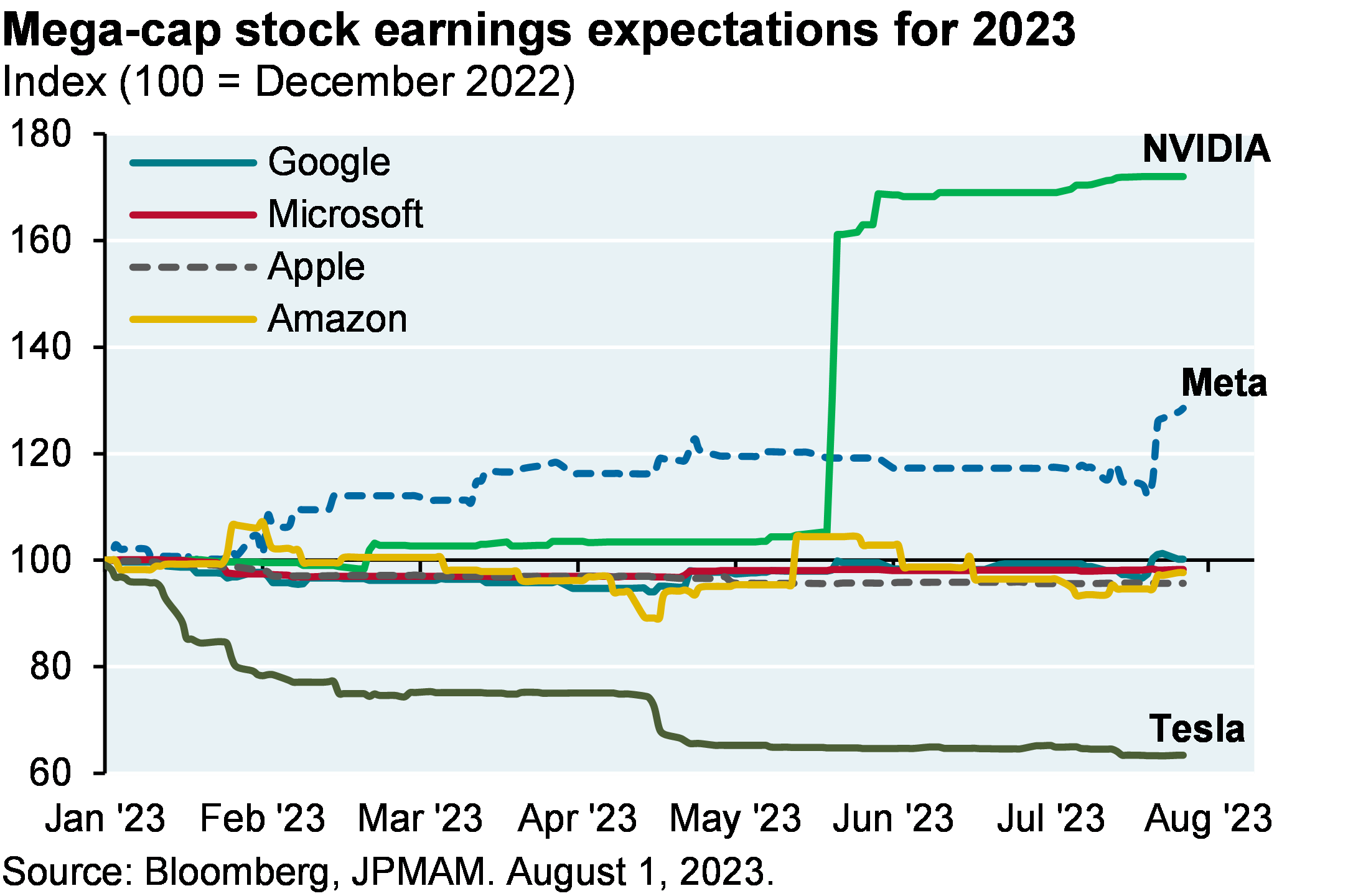
[6] YTD US equity returns have been substantially boosted by rising valuations of a few mega-cap stocks, most of which have not seen their earnings projections grow at all this year. We covered this issue in June, and J.P. Morgan’s Global Markets Strategy team wrote on the topic as well4.
The bottom line: risk appetite is back, courtesy of immaculate disinflation and plenty of liquidity
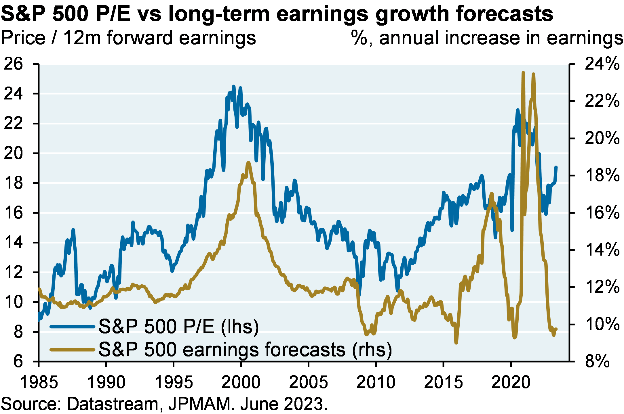
The equity rally can be justified on the grounds that the Fed’s “immaculate disinflation” was not expected by many investors, some of whom added risk this year after conservative positioning in 2022. But: rising valuations account for 90%+ of the gain in the S&P 500 this year, with earnings growth accounting for the rest. Multiple expansion has occurred despite the lack of a rebound in long term earnings growth expectations. As shown on the left, this is unusual. In other words, there’s a lot of good news priced in at current levels and little room for any negative developments in the Russia-Ukraine war and global energy/food prices next winter.
More signs of investor optimism:
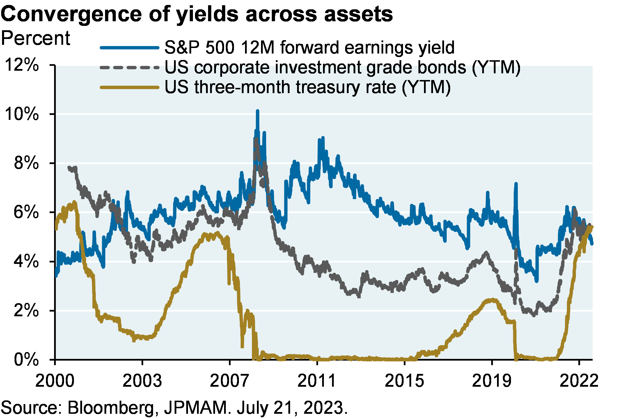
The equity rally is also taking place when fixed income is competitive with equities from a yield perspective for the first time since 2002, as shown on the right. For risk-averse investors, some fixed income opportunities offer compelling risk-reward compared to equity counterparts6.
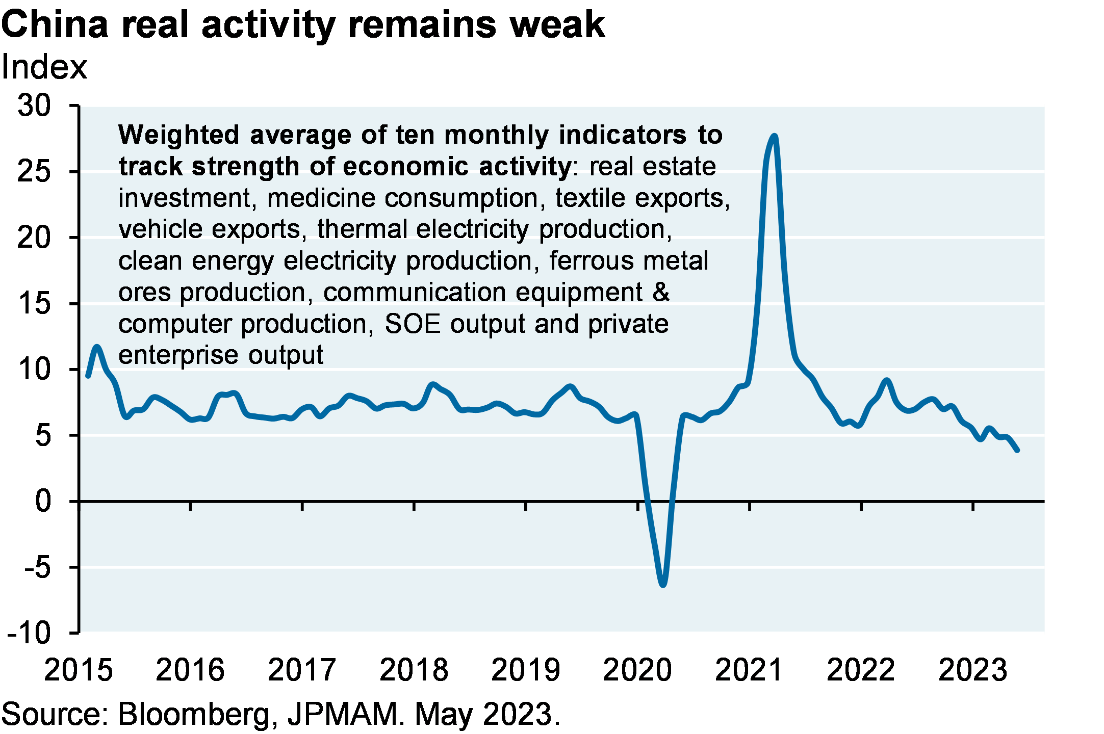
After the Flop, waiting for the Turn: China’s reopening fizzles due to real estate overhang
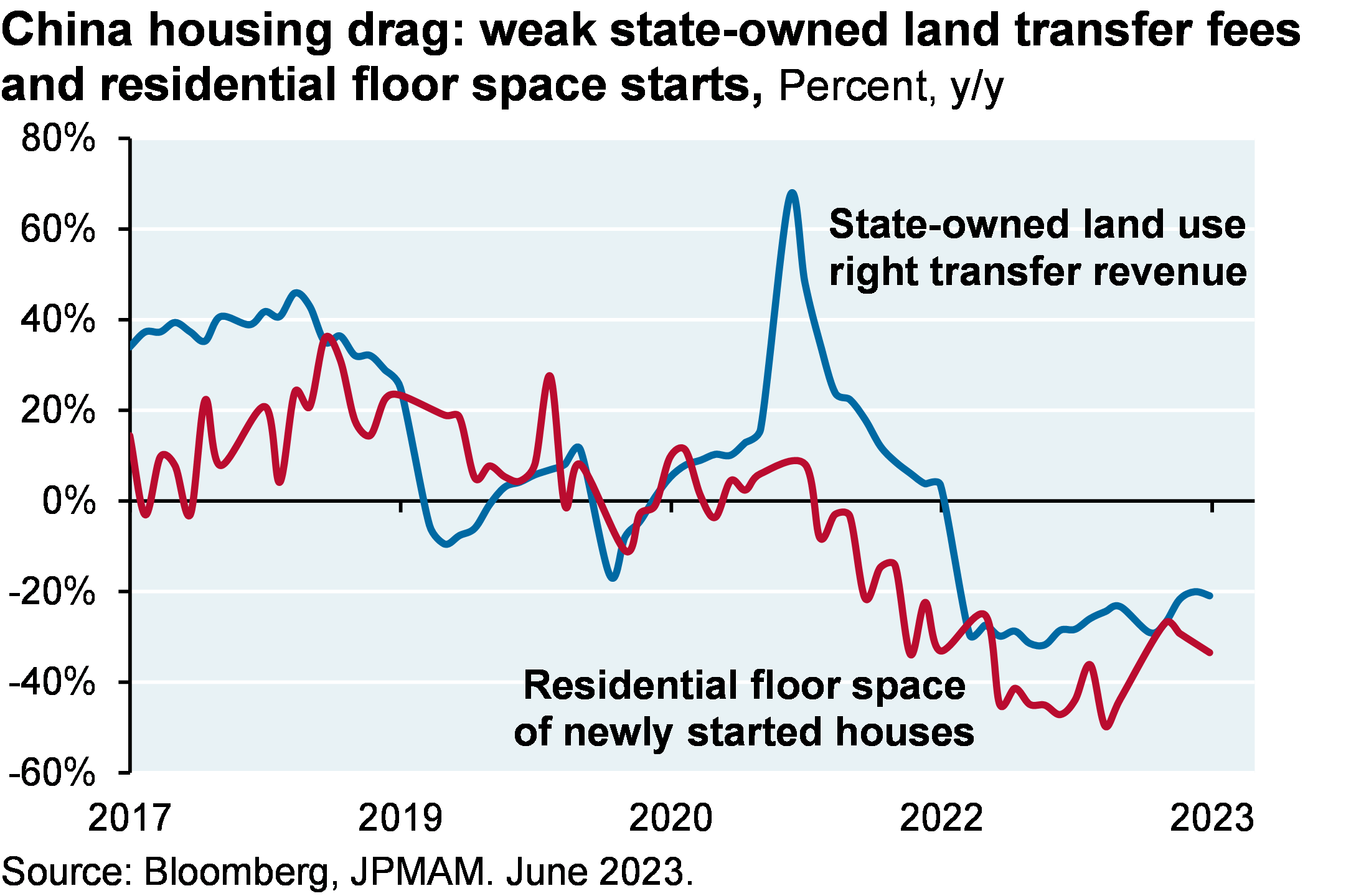
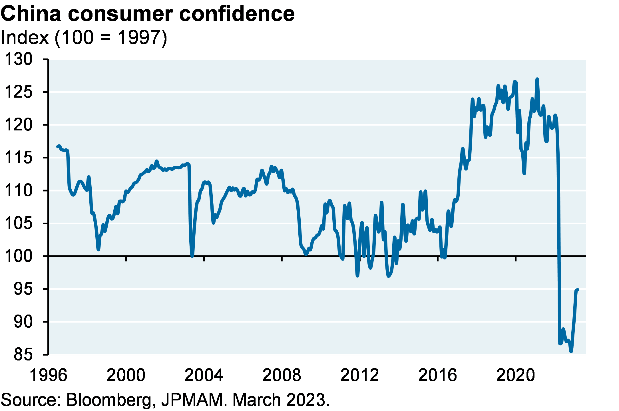
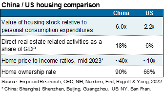
After Strange World, Lightyear, Amsterdam and Babylon flopped in 2022, China’s grand reopening did the same in 2023. The latest problem with China’s economy stems more from misallocated investment in residential real estate than from excess industrial capacity. China’s home ownership rate is ~90% (a figure unheard of in the US even during the most feverish attempts by the FHFA to unsustainably inflate it), and 20% of Chinese households own more than one home. Vacant properties amount to 2+ years of sales, and consumer confidence remains low despite low mortgage rates designed to boost leverage and homebuying.
As discussed in our April piece on the dollar as the world’s reserve currency, China relies on large amounts of trapped domestic savings to finance itself. Rather than a balance of payments or banking crisis, the housing situation in China has resulted in a period of slower growth and an equity market that trades at 10-12x earnings, a steep discount to the developed world. The Chinese Politburo appears to have announced intentions to provide more stimulus, but the timing and amounts are unclear.
1 “The Curious Case of the 2023 Fiscal Expansion”, JP Morgan North America Economic Research, M. Feroli, July 26 2023
2 What happened to the US banking crisis? The perception of a blanket FDIC guarantee of uninsured deposits after SIVB and new Fed borrowing facilities has led to a sharp slowdown in bank deposit outflows, despite the ongoing gap between money market rates at ~5.0%, 1-year CDs at 1.8%-2.6% and deposit rates at ~0.5%.
3 New homes are selling at roughly the same price as existing homes for the first time since the late 1960’s. Most likely reason: very low levels of existing supply.
4 “Steepest Rise in Concentration, Narrowest Leadership, ML Application of Crowding to Predict Market Returns”, J.P. Morgan Global Market Strategy, July 21, 2023, Dubravko Lakos-Bujas and Marko Kolanovic
5 Some press reports cite put options as being cheaper than at any time since 2008, but this is a little misleading. Option premiums incorporate short term interest rates and as rates rise, premiums get cheaper. When analyzing put option premiums struck based on S&P 500 forward prices (which effectively incorporates rate changes), they’re still cheap but not quite as much as when looking at premiums based on S&P 500 spot prices.
6 “Another example: the yield on investment grade REIT debt is roughly the same as REIT cap rates (5.8%)
09ut233107143842
Watch the Podcast
FEMALE VOICE: This podcast has been prepared exclusively for institutional wholesale professional clients and qualified investors, only as defined by local laws and regulations. Please read other important information, which can be found on the link at the end of the podcast episode.
MR. MICHAEL CEMBALEST: Good afternoon and welcome to the August Eye on the Market audio/video podcast. I’m not really in San Francisco; that’s just a Zoom background. But I have this fancy new microphone, ‘cause some of you have commented that the audio from my iPhone headphones is terrible, so I now have a professional Edward R. Murrow-style microphone. And you’ll be able to see this on video if you’re accessing it through our website rather than a Spotify or Apple podcast portal.
Anyway, welcome to the August Eye on the Market audiovisual extravaganza. So I like everybody else, I’m somewhat surprised that despite 400 to 500 basis points of tightening in the US and Europe and a very weak Chinese recovery, the equity markets are up globally about 18% this year, and Q3 GDP looks like it’s globally going to hang in and still poised for around 2%.
So the reason I’m calling this the Rasputin recovery is if you remember the legend around Rasputin, which is almost certainly false, but he was I think beaten, poisoned, shot twice, and then finally drowned before he dies, it’s a proxy for how I see the global economy right now. No matter what the central banks were throwing at it, it continues to exhibit some resilience, and the same goes for the equity markets as well.
How can we explain this? Well, the obvious catalyst is the decline in inflation surprises. So we’ve got a chart in here that shows for the US and globally, what those inflation surprises looked like just in the beginning of this year and they have collapsed, and whether you’re looking at core inflation, trimmed inflation, sticky price inflation, median inflation, and then a bunch of other measures related to supply chains and the jobs/workers gap. The inflation outlook has cooled more or less the way the Fed thought it should. It just took them another year or so before it started to happen.
And that’s the obvious big catalyst, but I wanted to walk through six other important catalysts so that everybody understands where we are, why the markets are doing this well, and where we go from here. I think the biggest surprise to some people has been a chart that we have showing that on seven prior occasions, every time the yield curve inverted, you had a recession. And it was almost automatic, and there were very few, if any, false signals on where you had an inverted yield curve and you didn’t get a recession.
So we have a chart in here with these little red arrows showing that if you look at the yield curve inversion from three months to ten years, it was a really consistent signal. And as you can see, the yield curve is mega-inverted right now. But I don’t think this is such a great signal this time around, and I’ve been explaining to clients this year when I’ve been meeting them, that the reason why that inverted yield curve was such a successful signal, if you look back, was the yield curve was inverted, but that’s ‘cause the short end of the curve was really high relative to inflation. And if you look at a chart on the real cost of money associated with those yield curve inversions, you saw a real cost of money, 2%, 4%, 8%, maybe even 10%.
This time around, the real cost of money is still barely positive. So I think it’s premature to even look at this recession indicator inversion thing because the real cost of money this time around is barely positive at all, and it’s a sign of just how far behind the Fed got relative to inflation.
The other thing too is if you’re really into that kind of yield curve inversion always predicts a recession stuff, you’ve got to look at the corporate sector financial balance, which is kind of a broad measure of the profitability of the entire corporate sector, not just public companies, net of capital spending and other kinds of transfers. And in the past, you got a recession because that corporate sector financial balance went negative. This time around, it’s still substantially positive. So if you’re into kind of recession indicator tracking, the corporate sector financial balance would offset the yield curve inversion signal, even if you believed it, which I don’t.
The second thing is yes, the central banks are starting to take back some of the stimulus. But if you look broadly across the Fed and Europe and Japan, and the Swiss National Bank, Canada, Bank of England, and then the relevant comparable entity within China, only around 35% of the emergency stimulus from a monetary perspective has been withdrawn, so there’s still a lot of money sloshing around, and the real cost of money is not prohibitively high. Those are the first two takeaways in terms of why things are doing so well, despite 5% higher Fed funds rates than we started the year with.
The third factor is fiscal stimulus, and we have a chart here showing the spike, a really big spike in construction spending, not related to commercial real estate, but related to manufacturing. And that started to happen shortly after the semiconductor bill and the energy bill and the infrastructure bills were passed. There’s a lot of money getting spent here. And more broadly, this is the amazing part, the fiscal deficit in the United States is almost as large as it was at its peak level in 2009 when you had the global recession.
So yeah, there’s a lot of monetary tightening taking place, but there’s a lot of fiscal easing offsetting that. Our partners in the Investment Bank, they have a great economics team. And Mike Feroli and his team wrote a piece on analyzing what’s driving the US deficit. It’s a lot of little bits and pieces, but lower income and payroll tax receipts, drop in remittances from the Federal Reserve to the Treasury, more cost-of-living adjustments, higher Medicaid and Medicare outlays, higher interest on the federal debt, and then, of course, don’t forget about the last one, which is increased FDIC payments to depositors after the bank failures that occurred earlier this year. But the bottom line is there’s a lot of fiscal stimulus taking place.
The fourth factor that has helped contribute to this Rasputin market and Rasputin economy is, it’s going to take a while for higher interest rates to feed into the corporate sector and the household sector. And so there’s a chart in here, and I’ll be honest with you, I can’t tell you exactly why this is happening, ‘cause it’s remarkable. But it shows, we have a chart that shows that every time since the early ‘70s when the Fed funds rate went up, in other words, when policy rates went up, corporate interest payments, as a percentage of their profits went up too.
This time, not only is that net interest payment ratio not rising, it’s still falling. And there’s a number of things that could be contributing to this. Notably, companies that have a lot of short-term excess cash are reinvesting and earning higher rates. And those same companies, one can infer extended duration massively at the lows in rates.
But how ironic is it that the corporate sector understood the assignment when rates were, when ten-year rates were at 1.5, the corporate sector extended duration, whereas some of the banks, who you would assume were experts in asset liability management, some of the banks, as you now know, extended their asset duration at the lows in rates while the corporate sector got it right and extended their liability duration. I think it’s kind of ironic. But you can see in this chart that the corporate sector is not really getting hit right now from higher interest rates. Most certainly that has something to do with having, they were having extended duration when rates were much lower.
Same for the household sector. Look at the rate on outstanding mortgages. That rate has come down steadily and is now around, let’s say around 3.5%. So in contrast to Europe, most homeowners in the United States have fixed-rate, long-duration fixed-rate mortgages. And while mortgages look prohibitively expensive for new home buyers, existing homeowners have locked in really low rates, which is one of the reasons why the debt-service-to-income ratio of the US household sector has gone up a little bit with higher rates, but is still close to the lowest levels that it’s been at since 1980. So not just the corporate sector has been resilient to higher rates, but also households.
And housing’s gotten hit pretty hard in terms of starts and permits and mortgage applications and the normal stuff that you’d look at. But housing would’ve looked much worse, if not for the fact that we have very tight inventory levels in terms of single-family homes. We have a chart in here showing that we’re still close to the levels of the last 40 years or so in terms of the supply of existing single-family homes.
So that tight supply, now there’s all sorts of problems related to that in terms of productivity and employment and labor mobility, but this time around it’s made the housing markets more resilient than it might have been to rising interest rates.
So if we step back and look at the US consumer, in January of this year, the consensus forecasts were a consumer-led recession by the summer. All of the factors I’ve just walked through have helped prevent that from happening so far. And now when you look at those same forecasts, the decline has pushed out a little bit, but notably doesn’t go negative on any kind of year-on-year or quarter-on-quarter basis. So the forecast of the consumer slowdown has changed in terms of both timing and magnitude.
And the other thing, and this gets discussed a lot and I think it should, households are still burning off massive amounts of excess savings that they got during COVID via both fiscal stimulus means and monetary stimulus means. Here are three different forecasts from three different parts of J.P. Morgan we have in this chart, and they’re all pointing to the same thing, which is some time in 2024, that runs out. But that still gives you at least a few months of cushion where households will have the ability to spend in excess of their earned income.
Now even with all of that, just wait, right. The leading indicators are still projecting weakness this fall, Q4, Q1. We have a chart in here showing you can split leading indicators into coincident indicators, meaning the stuff that’s happening now. And leading indicators, which is the stuff that’s expected to happen in a few months. And the coincident indicators all look fine, whereas the leading indicators still look pretty weak.
And so we take a closer look than just at these aggregate baskets. And we track 20 or so long-dated leading indicators that give us a sense for what might be happening anywhere from three months to six months, nine months, 12 months. They don’t look terrible. We have a color-coded table in the Eye on the Market that shows roughly what we’re expecting based on each one. And there’s a modest slowdown expected later this year, early first quarter, that I would put at something like 1% growth rather than recession. But that does have implications for how large an equity market drawdown you might expect, even if there is one. And a lot of these signals look a lot less malevolent than they did a few months ago.
Now of course, the sixth, last and the sixth factor is what’s been driving the market this year is the return of risk appetite in a big way, right. So just be aware of that. This is not an earnings-led recovery. First of all, the market cap of the largest seven companies, is at its highest level since the 1970s. It’s even now - - market leadership than during the TMT bubble during 2000. And you’ve all read about this, we’ve written about it before, the crowding and growth factor investing has reached the 97 percentile, eclipsed only in the year 2000. There was a very good piece that the Investment Bank, J.P. Morgan’s Investment Bank, put out last week by the US Equity Strategy team that gets into detail on this. I cited in the Eye on the Market the name of that piece in case you want to look at it.
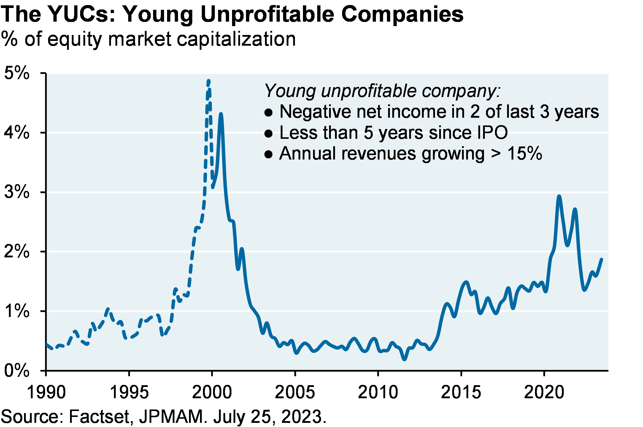
And for those of you that are fans of the Eye on the Market, just be aware the YUCs are back. So we track the percentage of overall market cap made up of the YUCs, which are the young, unprofitable companies. One of the signals that I wrote about a lot, that I was very worried about where markets were valued in 2021 and early 2022, is how high this was. It corrected in 2022 in the fall, but now is going up again. And so just be aware, rising YUC shares of the overall market is, there’s a reason we call it YUC. I’d rather not be seeing this in terms of how stable this rally is.
And then I think the most important chart in some ways in the piece we have is one that looks at the rise in the valuation multiple on the P/E ratio for the S&P compared to long-term earnings growth forecasts. Now sometimes long-term earnings growth forecasts take a while to change. Corporate guidance and the analyst community have to kind of get on board and reflect what they’re seeing.
But undoubtedly, the chart we’ve got here shows the valuation multiple has gone up almost four points, maybe three-and-a-half points, without any movement higher in long-term earnings growth forecasts. That’s unusual; that doesn’t happen a lot. And there’s no escaping the fact that there’s a lot of good news priced into the markets right now and not a lot of room for negative developments should they come from Russia-Ukraine war, global energy and food prices, or anything else.
So I think there’s a reasonable foundation for the rally that’s taken place this year because inflation has outperformed almost everybody’s forecasts in terms of how quickly it would fall. Wage inflation is declining a little bit more slowly. And a lot of people were underinvested at the end of 2022. They added risk; I get it. But I think it’s important to understand exactly where we are at this point in a kind of earning-less appreciation cycle that’s taking place in a handful of stocks.
So just a couple more things. First, I think this is the best time for risk-averse investors in 20 years. So why do I say that? We have a chart at the end of the piece that looks at the earnings yield on the S&P, which is basically earnings divided by price. And we compare that to the short-term returns on corporate bonds and Treasuries, and they’ve all converged to somewhere around 5 to 5.5%. The last time you earned more money on Treasuries than you did on equities was in early 2000. So it’s been over 20 years since a risk-averse investor could look at the fixed-income markets and consider them roughly comparable in earnable yield terms compared to equities, and that’s where we are right now.
So one last thing I wanted to mention, and I hope I’m not running out of time, but I normally, I don’t do any press, I don’t have a lot of time for that. And our compliance people generally get very nervous when I’m put in front of press people, which I can understand. But I agreed to do this video podcast of a money manager called Josh Brown. And he does an in-depth 90-minute video podcast a couple times a month, and I joined over the summer.
And the reason I’m mentioning it is at the end of the podcast, he asked the people that joined for that session to name a book and a movie that they liked. And I started thinking about Bidenomics, which is essentially the United States having an industrial policy for the first time really in 50, 60 years. And there’s a lot of money that’s going to be spent in terms of direct government spending or tax expenditures on infrastructure, energy, semiconductors.
I have questions about the long-term inflationary consequences here. How much will it eventually cost to produce semiconductors in Arizona versus Taiwan? What’s going to be the cost of energy once you have both the cost of storage and backup thermal power added onto the cost of a high renewable system, things we explore in the energy paper.
So I’ve got some questions about the inflationary consequences of this, but one thing I am optimistic on is the ability for Bidenomics to reverse some of the damage that was done to manufacturing communities in the United States after China joined the World Trade Organization. I showed some research a couple of years ago. Then after China joined the WTO and then started engaging in currency intervention, US manufacturing employment and wages plummeted, and opioid use started rising specifically in the counties that had the most intense competitive economic pressures with China.
And so I’m hopeful that the battery belt that will stretch from Georgia up to Michigan and some of the other monies that get spent here alleviate some of the pain and suffering in those communities. And on the podcast, I mentioned the book Empire of Pain, about the history of the opioid crisis and the family behind it. And I mentioned the movie The Third Man with Orson Welles, ‘cause there’s a scene where he’s explaining his justification for his tainted penicillin scheme, and I thought that that was a nice way to wrap the whole message up together. Anyway, thank you for listening/watching. I hope this all worked, and we’ll see you sometime in September. Thank you.
FEMALE VOICE: Michael Cembalest’s Eye on the Market offers a unique perspective on the economy, current events, markets, and investment portfolios, and is a production of J.P. Morgan Asset and Wealth Management. Michael Cembalest is the Chairman of Market and Investment Strategy for J.P. Morgan Asset Management and is one of our most renowned and provocative speakers. For more information, please subscribe to the Eye on the Market by contacting your J.P. Morgan representative. If you’d like to hear more, please explore episodes on iTunes or on our website.
This podcast is intended for informational purposes only and is a communication on behalf of J.P. Morgan Institutional Investments Incorporated. Views may not be suitable for all investors and are not intended as personal investment advice or a solicitation or recommendation. Outlooks and past performance are never guarantees of future results. This is not investment research. Please read other important information, which can be found at www.JPMorgan.com/disclaimer-EOTM.
IMPORTANT INFORMATION
This report uses rigorous security protocols for selected data sourced from Chase credit and debit card transactions to ensure all information is kept confidential and secure. All selected data is highly aggregated and all unique identifiable information, including names, account numbers, addresses, dates of birth, and Social Security Numbers, is removed from the data before the report’s author receives it. The data in this report is not representative of Chase’s overall credit and debit cardholder population.
The views, opinions and estimates expressed herein constitute Michael Cembalest’s judgment based on current market conditions and are subject to change without notice. Information herein may differ from those expressed by other areas of J.P. Morgan. This information in no way constitutes J.P. Morgan Research and should not be treated as such.
The views contained herein are not to be taken as advice or a recommendation to buy or sell any investment in any jurisdiction, nor is it a commitment from J.P. Morgan or any of its subsidiaries to participate in any of the transactions mentioned herein. Any forecasts, figures, opinions or investment techniques and strategies set out are for information purposes only, based on certain assumptions and current market conditions and are subject to change without prior notice. All information presented herein is considered to be accurate at the time of production. This material does not contain sufficient information to support an investment decision and it should not be relied upon by you in evaluating the merits of investing in any securities or products. In addition, users should make an independent assessment of the legal, regulatory, tax, credit and accounting implications and determine, together with their own professional advisers, if any investment mentioned herein is believed to be suitable to their personal goals. Investors should ensure that they obtain all available relevant information before making any investment. It should be noted that investment involves risks, the value of investments and the income from them may fluctuate in accordance with market conditions and taxation agreements and investors may not get back the full amount invested. Both past performance and yields are not reliable indicators of current and future results.
Non-affiliated entities mentioned are for informational purposes only and should not be construed as an endorsement or sponsorship of J.P. Morgan Chase & Co. or its affiliates.
For J.P. Morgan Asset Management Clients:
J.P. Morgan Asset Management is the brand for the asset management business of JPMorgan Chase & Co. and its affiliates worldwide.
To the extent permitted by applicable law, we may record telephone calls and monitor electronic communications to comply with our legal and regulatory obligations and internal policies. Personal data will be collected, stored and processed by J.P. Morgan Asset Management in accordance with our privacy policies at https://am.jpmorgan.com/global/privacy.
ACCESSIBILITY
For U.S. only: If you are a person with a disability and need additional support in viewing the material, please call us at 1-800-343-1113 for assistance.
This communication is issued by the following entities:
In the United States, by J.P. Morgan Investment Management Inc. or J.P. Morgan Alternative Asset Management, Inc., both regulated by the Securities and Exchange Commission; in Latin America, for intended recipients’ use only, by local J.P. Morgan entities, as the case may be.; in Canada, for institutional clients’ use only, by JPMorgan Asset Management (Canada) Inc., which is a registered Portfolio Manager and Exempt Market Dealer in all Canadian provinces and territories except the Yukon and is also registered as an Investment Fund Manager in British Columbia, Ontario, Quebec and Newfoundland and Labrador. In the United Kingdom, by JPMorgan Asset Management (UK) Limited, which is authorized and regulated by the Financial Conduct Authority; in other European jurisdictions, by JPMorgan Asset Management (Europe) S.à r.l. In Asia Pacific (“APAC”), by the following issuing entities and in the respective jurisdictions in which they are primarily regulated: JPMorgan Asset Management (Asia Pacific) Limited, or JPMorgan Funds (Asia) Limited, or JPMorgan Asset Management Real Assets (Asia) Limited, each of which is regulated by the Securities and Futures Commission of Hong Kong; JPMorgan Asset Management (Singapore) Limited (Co. Reg. No. 197601586K), which this advertisement or publication has not been reviewed by the Monetary Authority of Singapore; JPMorgan Asset Management (Taiwan) Limited; JPMorgan Asset Management (Japan) Limited, which is a member of the Investment Trusts Association, Japan, the Japan Investment Advisers Association, Type II Financial Instruments Firms Association and the Japan Securities Dealers Association and is regulated by the Financial Services Agency (registration number “Kanto Local Finance Bureau (Financial Instruments Firm) No. 330”); in Australia, to wholesale clients only as defined in section 761A and 761G of the Corporations Act 2001 (Commonwealth), by JPMorgan Asset Management (Australia) Limited (ABN 55143832080) (AFSL 376919). For all other markets in APAC, to intended recipients only.
For J.P. Morgan Private Bank Clients:
ACCESSIBILITY
J.P. Morgan is committed to making our products and services accessible to meet the financial services needs of all our clients. Please direct any accessibility issues to the Private Bank Client Service Center at 1-866-265-1727.
LEGAL ENTITY, BRAND & REGULATORY INFORMATION
In the United States, bank deposit accounts and related services, such as checking, savings and bank lending, are offered by JPMorgan Chase Bank, N.A. Member FDIC.
JPMorgan Chase Bank, N.A. and its affiliates (collectively “JPMCB”) offer investment products, which may include bank-managed investment accounts and custody, as part of its trust and fiduciary services. Other investment products and services, such as brokerage and advisory accounts, are offered through J.P. Morgan Securities LLC (“JPMS”), a member of FINRA and SIPC. Annuities are made available through Chase Insurance Agency, Inc. (CIA), a licensed insurance agency, doing business as Chase Insurance Agency Services, Inc. in Florida. JPMCB, JPMS and CIA are affiliated companies under the common control of JPM. Products not available in all states.
In Germany, this material is issued by J.P. Morgan SE, with its registered office at Taunustor 1 (TaunusTurm), 60310 Frankfurt am Main, Germany, authorized by the Bundesanstalt für Finanzdienstleistungsaufsicht (BaFin) and jointly supervised by the BaFin, the German Central Bank (Deutsche Bundesbank) and the European Central Bank (ECB). In Luxembourg, this material is issued by J.P. Morgan SE – Luxembourg Branch, with registered office at European Bank and Business Centre, 6 route de Treves, L-2633, Senningerberg, Luxembourg, authorized by the Bundesanstalt für Finanzdienstleistungsaufsicht (BaFin) and jointly supervised by the BaFin, the German Central Bank (Deutsche Bundesbank) and the European Central Bank (ECB); J.P. Morgan SE – Luxembourg Branch is also supervised by the Commission de Surveillance du Secteur Financier (CSSF); registered under R.C.S Luxembourg B255938. In the United Kingdom, this material is issued by J.P. Morgan SE – London Branch, registered office at 25 Bank Street, Canary Wharf, London E14 5JP, authorized by the Bundesanstalt für Finanzdienstleistungsaufsicht (BaFin) and jointly supervised by the BaFin, the German Central Bank (Deutsche Bundesbank) and the European Central Bank (ECB); J.P. Morgan SE – London Branch is also supervised by the Financial Conduct Authority and Prudential Regulation Authority. In Spain, this material is distributed by J.P. Morgan SE, Sucursal en España, with registered office at Paseo de la Castellana, 31, 28046 Madrid, Spain, authorized by the Bundesanstalt für Finanzdienstleistungsaufsicht (BaFin) and jointly supervised by the BaFin, the German Central Bank (Deutsche Bundesbank) and the European Central Bank (ECB); J.P. Morgan SE, Sucursal en España is also supervised by the Spanish Securities Market Commission (CNMV); registered with Bank of Spain as a branch of J.P. Morgan SE under code 1567. In Italy, this material is distributed by J.P. Morgan SE – Milan Branch, with its registered office at Via Cordusio, n.3, Milan 20123, Italy, authorized by the Bundesanstalt für Finanzdienstleistungsaufsicht (BaFin) and jointly supervised by the BaFin, the German Central Bank (Deutsche Bundesbank) and the European Central Bank (ECB); J.P. Morgan SE – Milan Branch is also supervised by Bank of Italy and the Commissione Nazionale per le Società e la Borsa (CONSOB); registered with Bank of Italy as a branch of J.P. Morgan SE under code 8076; Milan Chamber of Commerce Registered Number: REA MI 2536325. In the Netherlands, this material is distributed by J.P. Morgan SE – Amsterdam Branch, with registered office at World Trade Centre, Tower B, Strawinskylaan 1135, 1077 XX, Amsterdam, The Netherlands, authorized by the Bundesanstalt für Finanzdienstleistungsaufsicht (BaFin) and jointly supervised by the BaFin, the German Central Bank (Deutsche Bundesbank) and the European Central Bank (ECB); J.P. Morgan SE – Amsterdam Branch is also supervised by De Nederlandsche Bank (DNB) and the Autoriteit Financiële Markten (AFM) in the Netherlands. Registered with the Kamer van Koophandel as a branch of J.P. Morgan SE under registration number 72610220. In Denmark, this material is distributed by J.P. Morgan SE – Copenhagen Branch, filial af J.P. Morgan SE, Tyskland, with registered office at Kalvebod Brygge 39-41, 1560 København V, Denmark, authorized by the Bundesanstalt für Finanzdienstleistungsaufsicht (BaFin) and jointly supervised by the BaFin, the German Central Bank (Deutsche Bundesbank) and the European Central Bank (ECB); J.P. Morgan SE – Copenhagen Branch, filial af J.P. Morgan SE, Tyskland is also supervised by Finanstilsynet (Danish FSA) and is registered with Finanstilsynet as a branch of J.P. Morgan SE under code 29010. In Sweden, this material is distributed by J.P. Morgan SE – Stockholm Bankfilial, with registered office at Hamngatan 15, Stockholm, 11147, Sweden, authorized by the Bundesanstalt für Finanzdienstleistungsaufsicht (BaFin) and jointly supervised by the BaFin, the German Central Bank (Deutsche Bundesbank) and the European Central Bank (ECB); J.P. Morgan SE – Stockholm Bankfilial is also supervised by Finansinspektionen (Swedish FSA); registered with Finansinspektionen as a branch of J.P. Morgan SE. In France, this material is distributed by JPMCB, Paris branch, which is regulated by the French banking authorities Autorité de Contrôle Prudentiel et de Résolution and Autorité des Marchés Financiers. In Switzerland, this material is distributed by J.P. Morgan (Suisse) SA, with registered address at rue de la Confédération, 8, 1211, Geneva, Switzerland, which is authorised and supervised by the Swiss Financial Market Supervisory Authority (FINMA), as a bank and a securities dealer in Switzerland. Please consult the following link to obtain information regarding J.P. Morgan’s EMEA data protection policy: https://www.jpmorgan.com/privacy.
In Hong Kong, this material is distributed by JPMCB, Hong Kong branch. JPMCB, Hong Kong branch is regulated by the Hong Kong Monetary Authority and the Securities and Futures Commission of Hong Kong. In Hong Kong, we will cease to use your personal data for our marketing purposes without charge if you so request. In Singapore, this material is distributed by JPMCB, Singapore branch. JPMCB, Singapore branch is regulated by the Monetary Authority of Singapore. Dealing and advisory services and discretionary investment management services are provided to you by JPMCB, Hong Kong/Singapore branch (as notified to you). Banking and custody services are provided to you by JPMCB Singapore Branch. The contents of this document have not been reviewed by any regulatory authority in Hong Kong, Singapore or any other jurisdictions. You are advised to exercise caution in relation to this document. If you are in any doubt about any of the contents of this document, you should obtain independent professional advice. For materials which constitute product advertisement under the Securities and Futures Act and the Financial Advisers Act, this advertisement has not been reviewed by the Monetary Authority of Singapore. JPMorgan Chase Bank, N.A. is a national banking association chartered under the laws of the United States, and as a body corporate, its shareholder’s liability is limited.
With respect to countries in Latin America, the distribution of this material may be restricted in certain jurisdictions. We may offer and/or sell to you securities or other financial instruments which may not be registered under, and are not the subject of a public offering under, the securities or other financial regulatory laws of your home country. Such securities or instruments are offered and/or sold to you on a private basis only. Any communication by us to you regarding such securities or instruments, including without limitation the delivery of a prospectus, term sheet or other offering document, is not intended by us as an offer to sell or a solicitation of an offer to buy any securities or instruments in any jurisdiction in which such an offer or a solicitation is unlawful. Furthermore, such securities or instruments may be subject to certain regulatory and/or contractual restrictions on subsequent transfer by you, and you are solely responsible for ascertaining and complying with such restrictions. To the extent this content makes reference to a fund, the Fund may not be publicly offered in any Latin American country, without previous registration of such fund’s securities in compliance with the laws of the corresponding jurisdiction. Public offering of any security, including the shares of the Fund, without previous registration at Brazilian Securities and Exchange Commission— CVM is completely prohibited. Some products or services contained in the materials might not be currently provided by the Brazilian and Mexican platforms.
JPMorgan Chase Bank, N.A. (JPMCBNA) (ABN 43 074 112 011/AFS Licence No: 238367) is regulated by the Australian Securities and Investment Commission and the Australian Prudential Regulation Authority. Material provided by JPMCBNA in Australia is to “wholesale clients” only. For the purposes of this paragraph the term “wholesale client” has the meaning given in section 761G of the Corporations Act 2001 (Cth). Please inform us if you are not a Wholesale Client now or if you cease to be a Wholesale Client at any time in the future.
JPMS is a registered foreign company (overseas) (ARBN 109293610) incorporated in Delaware, U.S.A. Under Australian financial services licensing requirements, carrying on a financial services business in Australia requires a financial service provider, such as J.P. Morgan Securities LLC (JPMS), to hold an Australian Financial Services Licence (AFSL), unless an exemption applies. JPMS is exempt from the requirement to hold an AFSL under the Corporations Act 2001 (Cth) (Act) in respect of financial services it provides to you, and is regulated by the SEC, FINRA and CFTC under U.S. laws, which differ from Australian laws. Material provided by JPMS in Australia is to “wholesale clients” only. The information provided in this material is not intended to be, and must not be, distributed or passed on, directly or indirectly, to any other class of persons in Australia. For the purposes of this paragraph the term “wholesale client” has the meaning given in section 761G of the Act. Please inform us immediately if you are not a Wholesale Client now or if you cease to be a Wholesale Client at any time in the future.
This material has not been prepared specifically for Australian investors. It:
May contain references to dollar amounts which are not Australian dollars;
May contain financial information which is not prepared in accordance with Australian law or practices;
May not address risks associated with investment in foreign currency denominated investments; and
Does not address Australian tax issues.