Slide Image

Chart Image

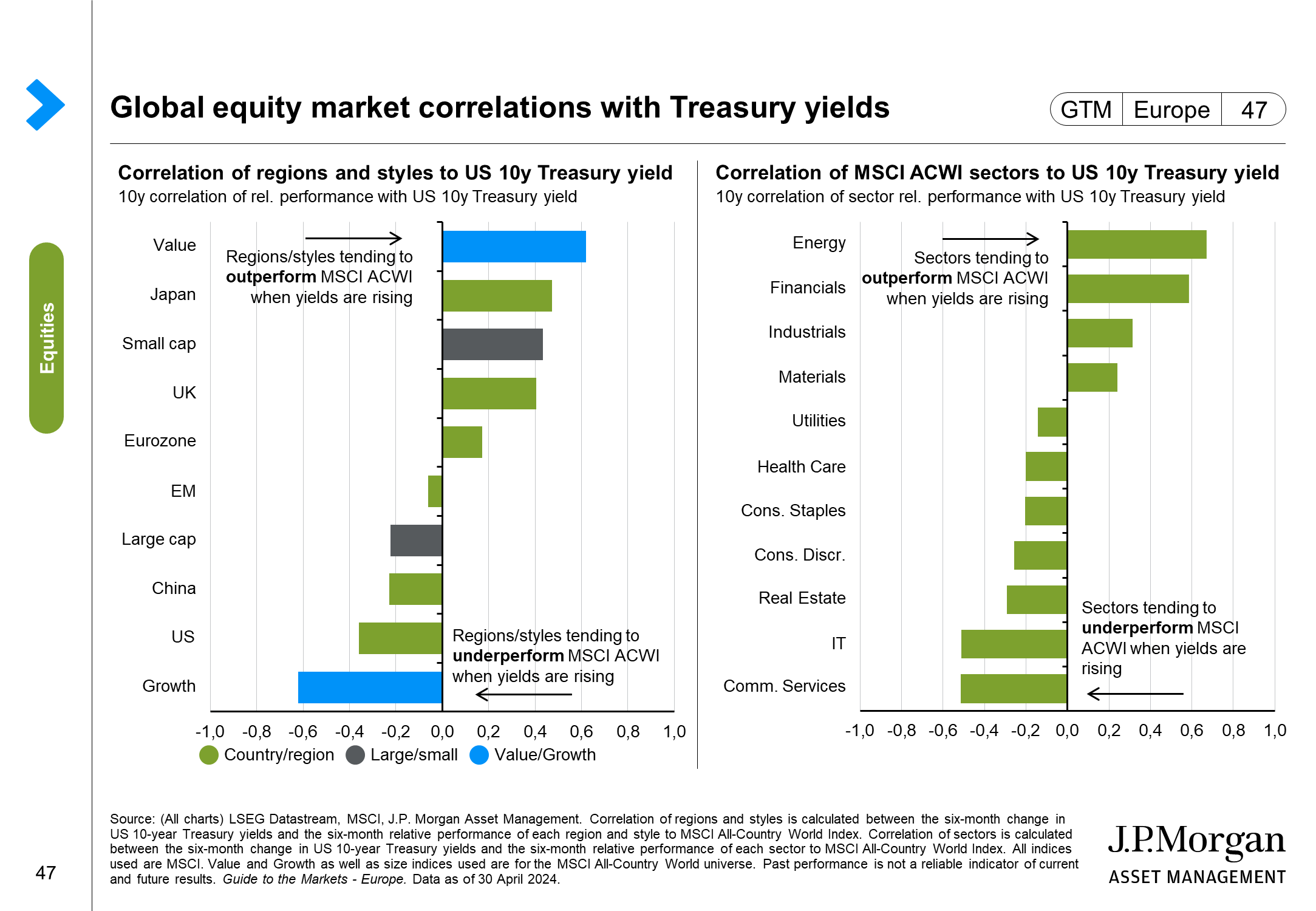
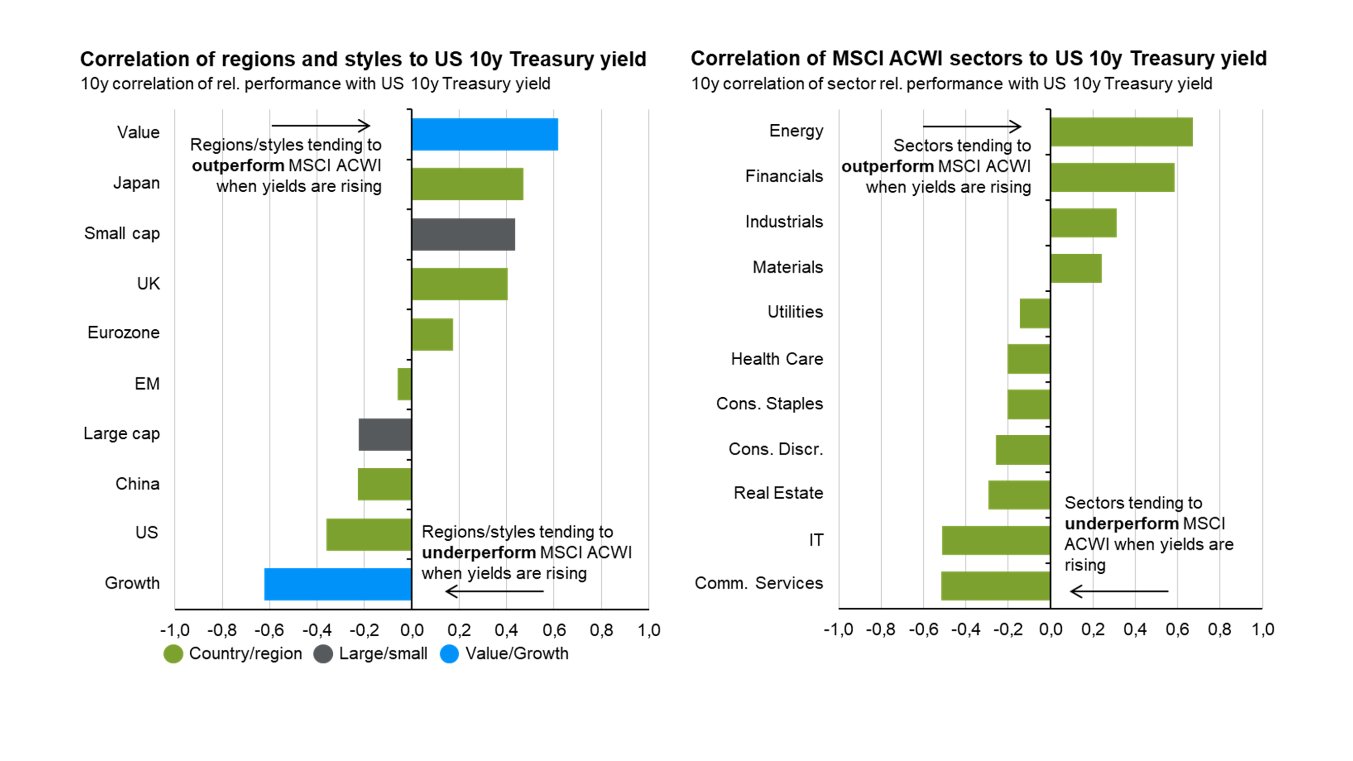
Global equity market correlations with Treasury yields
This page focuses on the performance of equities in an environment where government bond yields are rising. The left-hand chart shows how rising yields can impact performance of different regions and styles. Regions/styles at the top of the chart tend to outperform the broad MSCI ACWI index when Treasury yields are rising, and vice versa. The right-hand chart shows the same calculation but for sectors that sit below the index, rather than regions/styles.