Slide Image

Chart Image

Household debt and construction investment
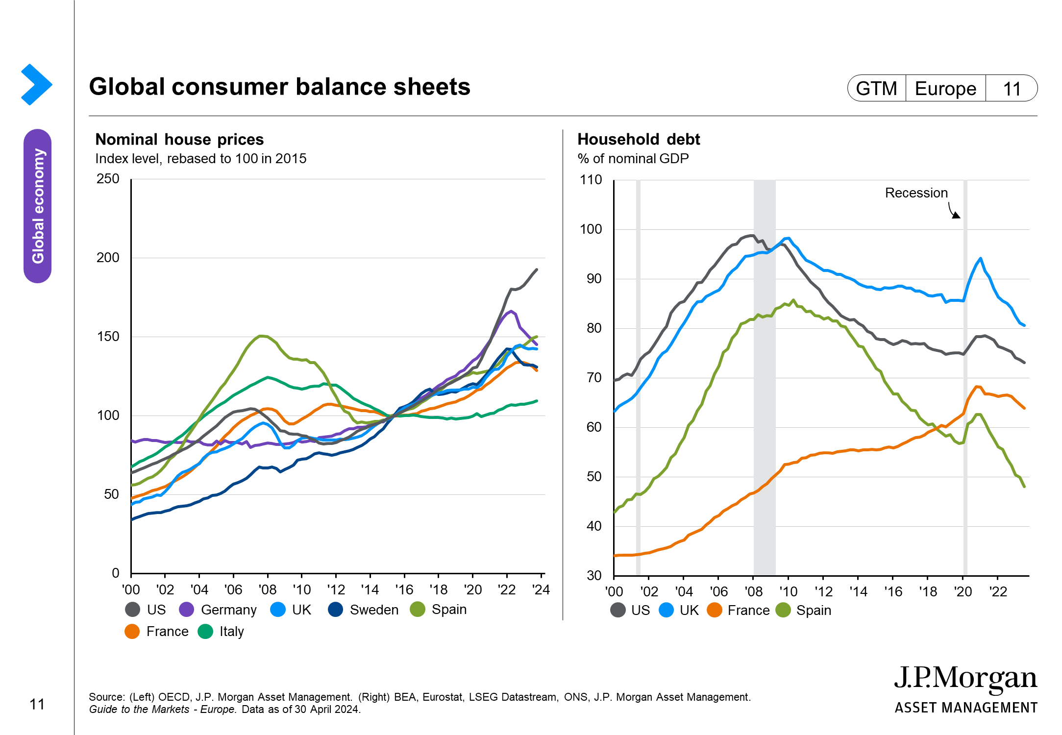
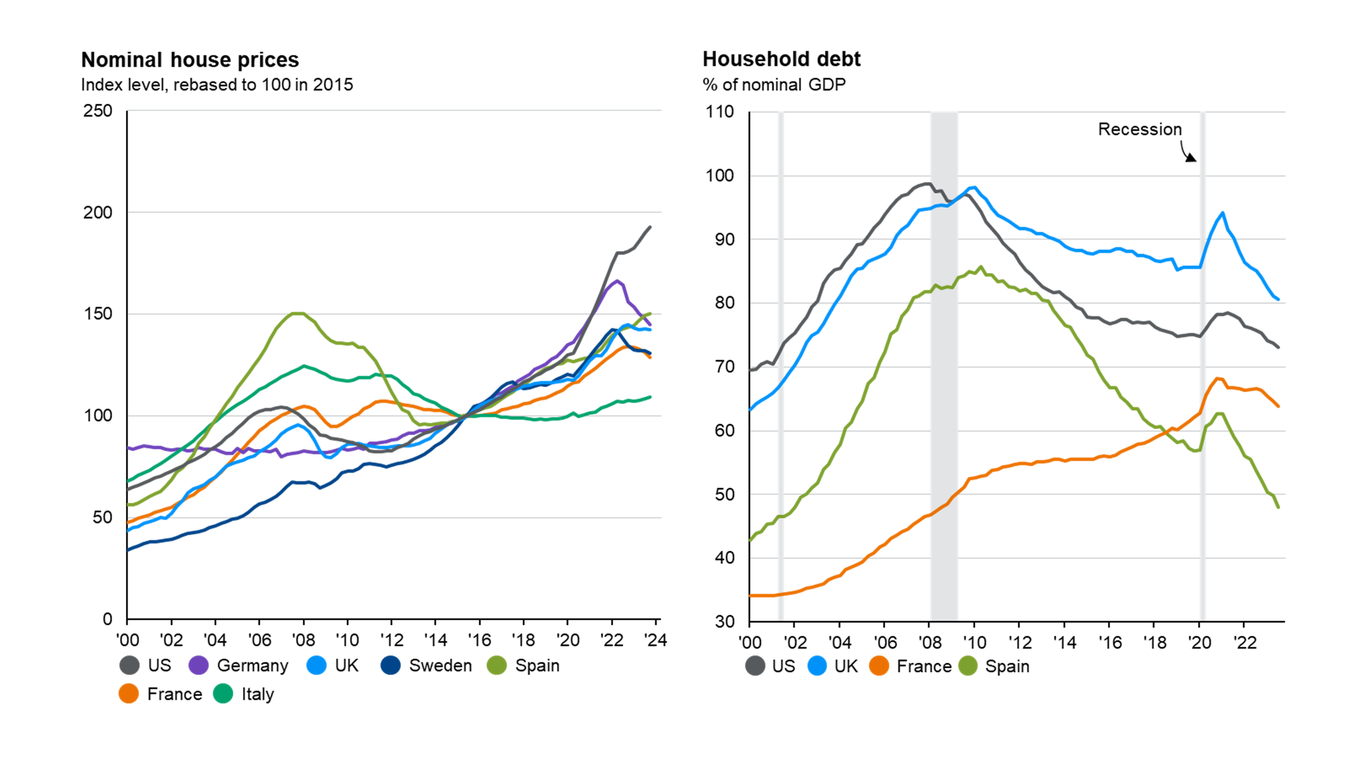
This page highlights how vulnerabilities in the economy today are a lot lower than they were in the run up to the global financial crisis. The left-hand chart plots the evolution of household debt to GDP in the US, UK, France and Spain. This shows that, broadly, households are much less indebted than they were ahead of 2008. The right-hand chart plots fixed investment in construction as a percentage of GDP for the same economies. This metric is also much more muted today than it was 15 years ago.