This page shows real gross domestic product (GDP) levels and growth for China, eurozone, Japan and the U.S. GDP fell sharply in the first half of 2020, but is forecasted to rebound in the second half with the economies gradually reopening. China appears to have been the first of the major economies to have felt the impact, but also the first to recover. The right chart shows that some countries may take some time to recover back to pre-virus outbreak growth trends.
This page shows the Purchasing Managers' Indices (PMI) for the manufacturing and services sector, as well as a heat map of various countries to gauge activity levels. A reading above 50 indicates expansion, below 50 indicates contraction.
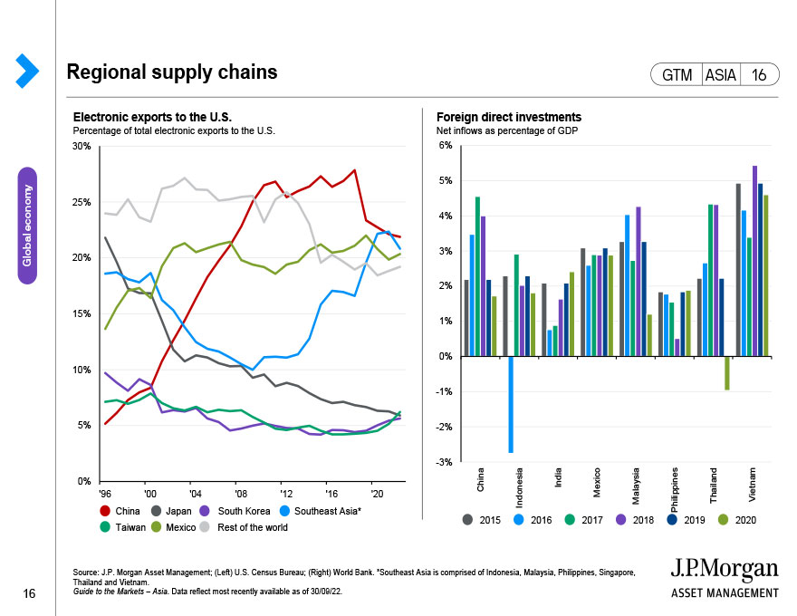
This page shows the interconnectedness of global supply chains, from this we can try and see where manufacturing activity will be affected. Specifically, the left chart shows how supplier delivery times were affected by major events. The top right chart shows the indirect impact of trade linkages, and the bottom right chart shows manufacturing as a share of global total.
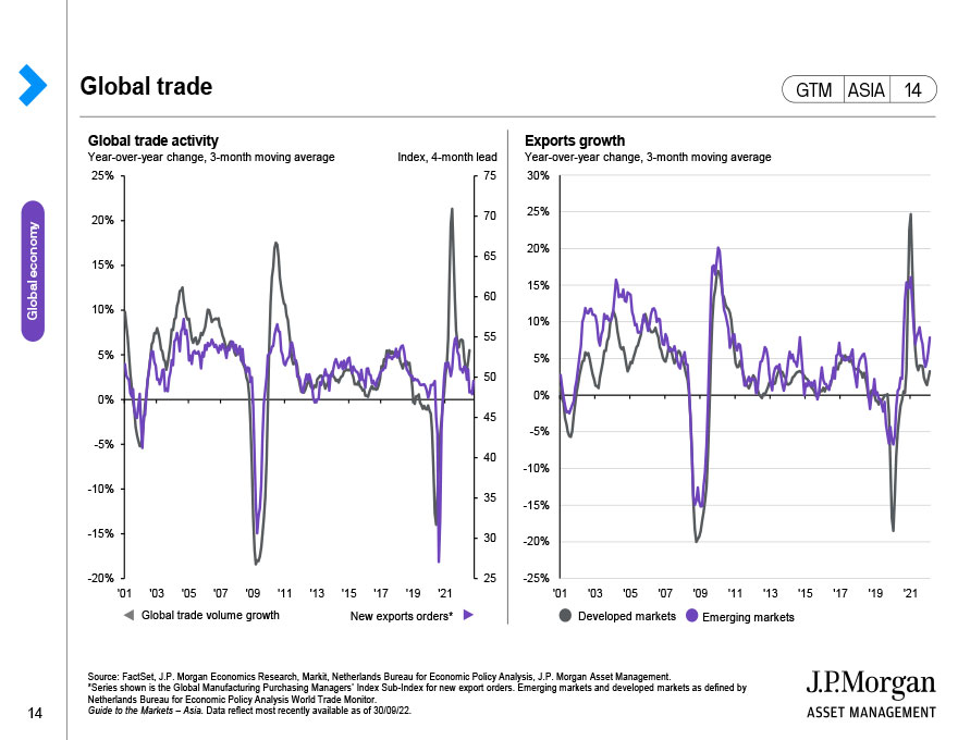
This page highlights the global trade story and the importance of trade to major economies and selected countries. Specifically, the left-hand side page shows the global trade volume growth along with the leading indicator of new export orders, and the right chart shows the growth in exports for both developed economies and emerging economies. In general, emerging market economies tend to be more reliant on exports for economic growth.
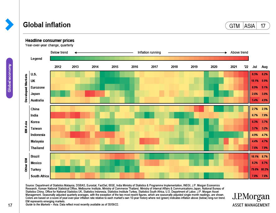
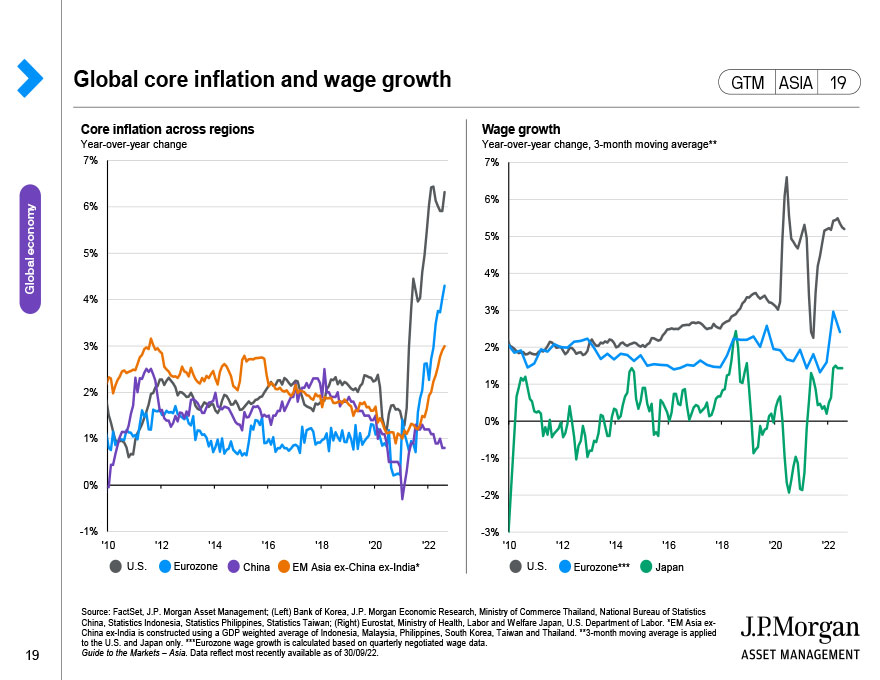
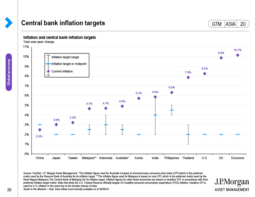
This heat map shows recent inflation trends in major countries across the world. This is a useful guide for considering policy moves central banks may make in response to inflationary developments. For instance, if inflation is running below trend, central banks may need to cut policy rates, and increase policy rates for above-trend inflation.
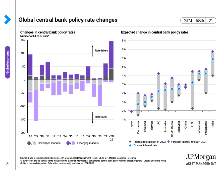
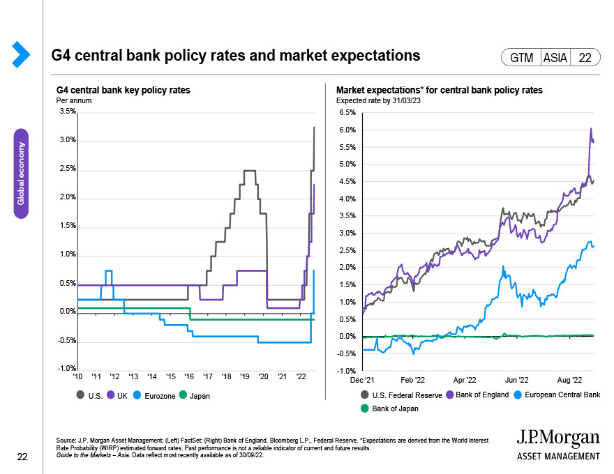
This page looks at central bank policy rates. On the left, the U.S. and UK have eased monetary policy to support growth, while Japan and Europe are maintaining their accommodative stances as they do not have as much flexibility to maneuver. The right side of this page displays the global trends in central banks loosening (cutting rates) or tightening (raising rates) policy.
This page shows G4 central banks' net asset purchases and their governments' net bond issuance along with current balance sheet levels and forecasted holdings. The impact of COVID-19 is likely to force central banks to resume balance sheet expansion to ensure sufficient liquidity in the system and maintain low bond yields.
This page shows the monetary policy of central banks globally in response to COVID-19.
This page shows the fiscal stimulus measures governments have taken in response to COVID-19 as a percentage of Gross Domestic Product (GDP).
Politics grab investor attention and occasionally move markets. This page highlights the important political events that have been scheduled in the next 12 months.
Geopolitical issues between China and the U.S. continue to be a point of interest for markets. Policy between such large and important countries could have a number of spillover effects into other sections of the world economy. Here we look at how trade and investment between the two countries have developed.
This page shows the result of the last U.S. president election in 2016, as well as the current composition of the House of Representatives and Senate. It also shows the number of seats each party will need to take control of the Electoral College for the presidential race, House and Senate in the upcoming election in November. The latest polling results of the two presidential candidates in a number of important swing states is shown as these will likely have significant impact on the final election results.
The U.S. is still a major driver of events in the world and the upcoming economic election could change policy direction. Here we compare the policy platform of the two presidential candidates.
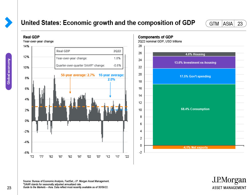
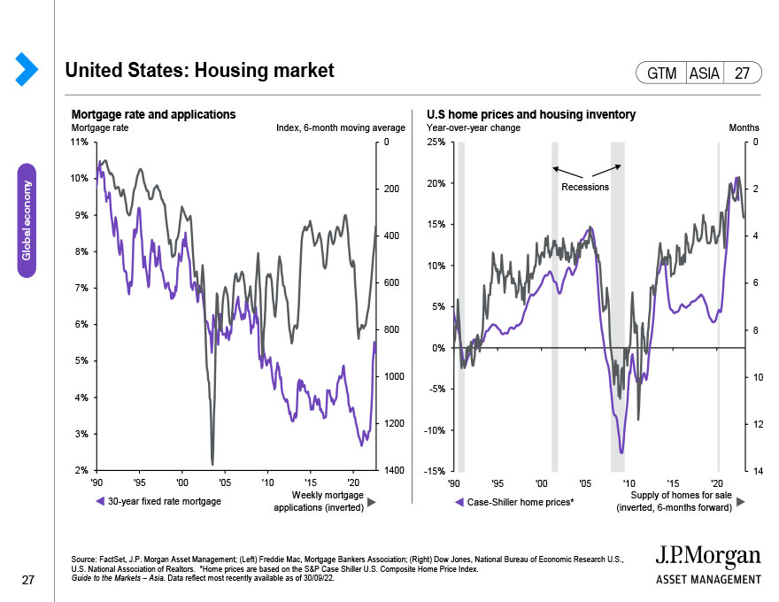
This page shows the U.S. real gross domestic product (GDP) growth vs. its historical average and the components of GDP based on an aggregate expenditure breakdown.
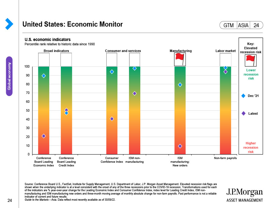
This chart looks at a selection of important indicators to try and determine whether the U.S. economy is heating up or running cold. This can also let us try to determine where the U.S. is within the business cycle.
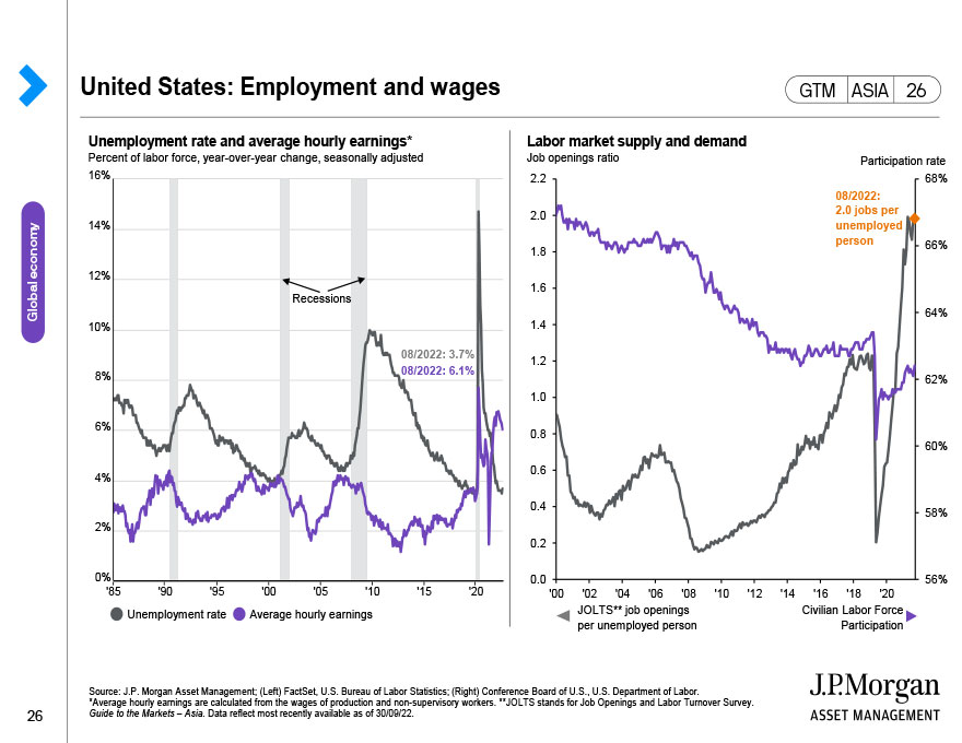
This page shows the historical inverse relationship between the unemployment rate and wage growth, along with recession and timing of the first policy rate hike in its respective interest rate cycle. Despite the sharp rise in unemployment rate due to COVID-19, average hourly earnings have also increased.
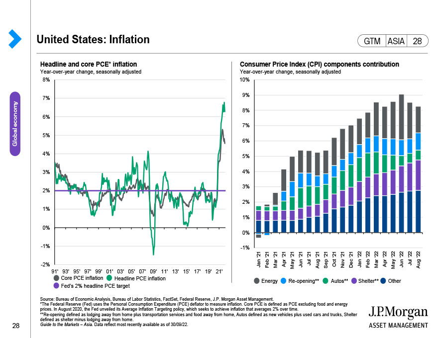
This page shows both the headline and core Consumer Price Index (CPI) over the last 50 years. Core CPI excludes food and energy prices. The table shows the average and most recent reading for headline and core CPI (in addition to breakouts for food and energy separately), along with headline and core Personal Consumption Expenditure (PCE) price deflator, which is another measure of prices in the economy that the Federal Reserve will consider when setting policy.
This compares the Federal Reserve's (Fed) forecasts for interest rate policy and market expectations. We also include a look at the size and degree of participation for the Fed's various credit facilities they have introduced to maintain market liquidity.
This page looks at the European economy. The left chart shows export and industrial production activity, both of which have fallen sharply due to the pandemic. On the top-right, we have price movements, showing whether inflation is on European Central Bank's prescribed target. While consumer spending looked strong going into 2020, the pandemic has eroded sales and consumer confidence. Poor data and inflation under control are strong reasons for the European Central Bank to opt for more easing.