Slide Image

Global inflation
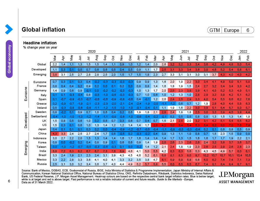
This heatmap provides a snapshot of global inflation relative to central bank targets. Blue signifies an annual pace of headline inflation which is below target, white is at target and red is above target. The intensity of the colour defines the level of deviation vs. the target rate.